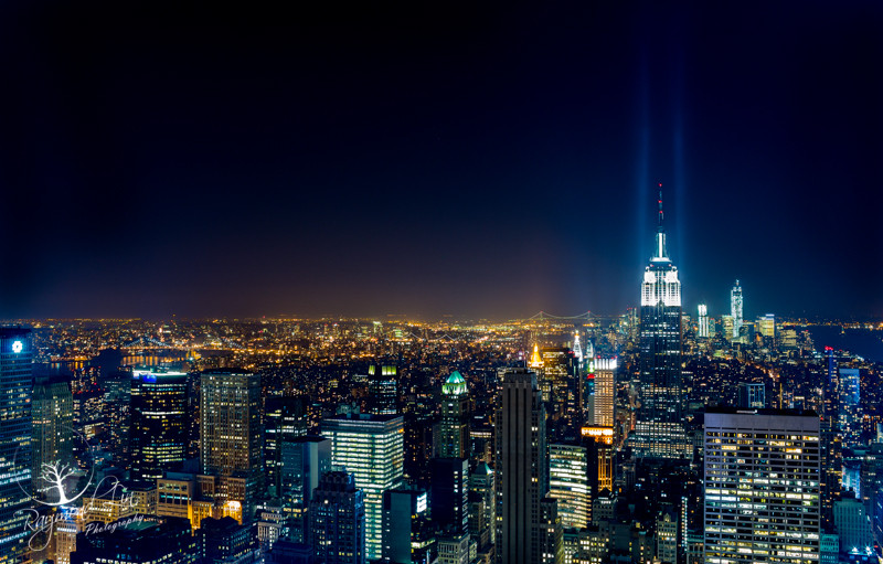
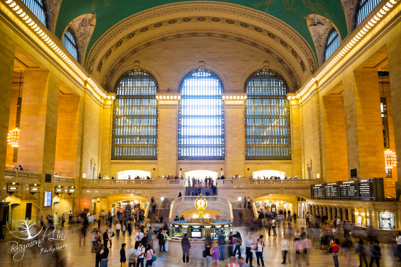
#1 and #4 are the best of the bunch. Great shots, Raymond.
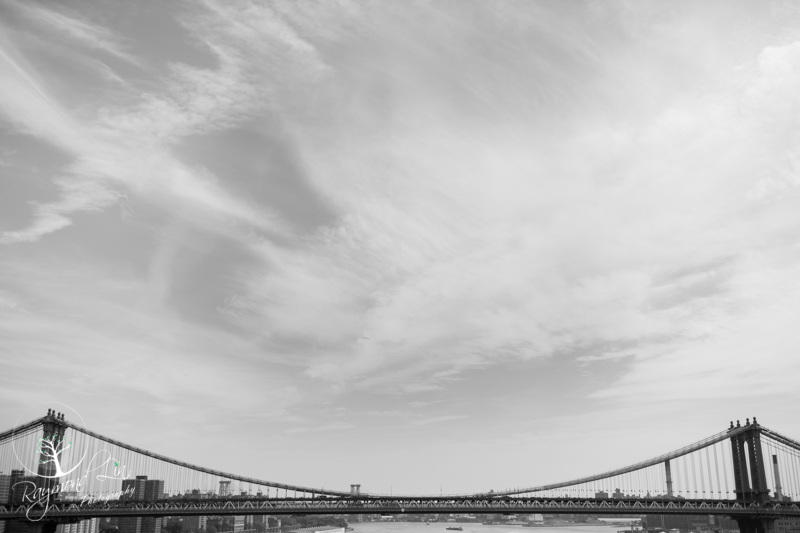
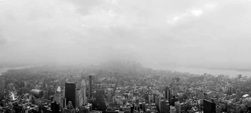
#2 could be improved, by getting a lot more contrast out of that sky. I'm not one for hugely dramatic looking skies, but this one looks too flat, even for me. I like the crop though.
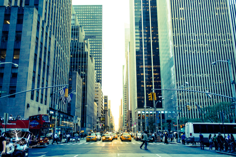
#3 The shot is good, but the editing lets it down. It looks like you've applied too much split toning in Lightroom and that never looks good. It appears very unnatural.
#5 Superb view, but looks very distorted. If that's corrected, I could also see this as a big print, pride of place in a house.

")

