Critique A Church

RKC

Messages
4,341
Name
Bob
Edit My Images
Yes
This was a spur of the moment opportunity, my tripod was at home so used prayer kneeling matts to place the camera on which meant some not very straight photos :) so straightening was the first process which led to some cropping and loosing bits that I did not want to, like loosing the bottom edge of the door in 3.
5 Bracketing shots run through HDR and converted to B&W bit of dodging and burning.
Your thoughts will be appreciated

1.
West Putford 0050 by rkcphotos, on Flickr

2.
West Putford_0065 by rkcphotos, on Flickr

3.
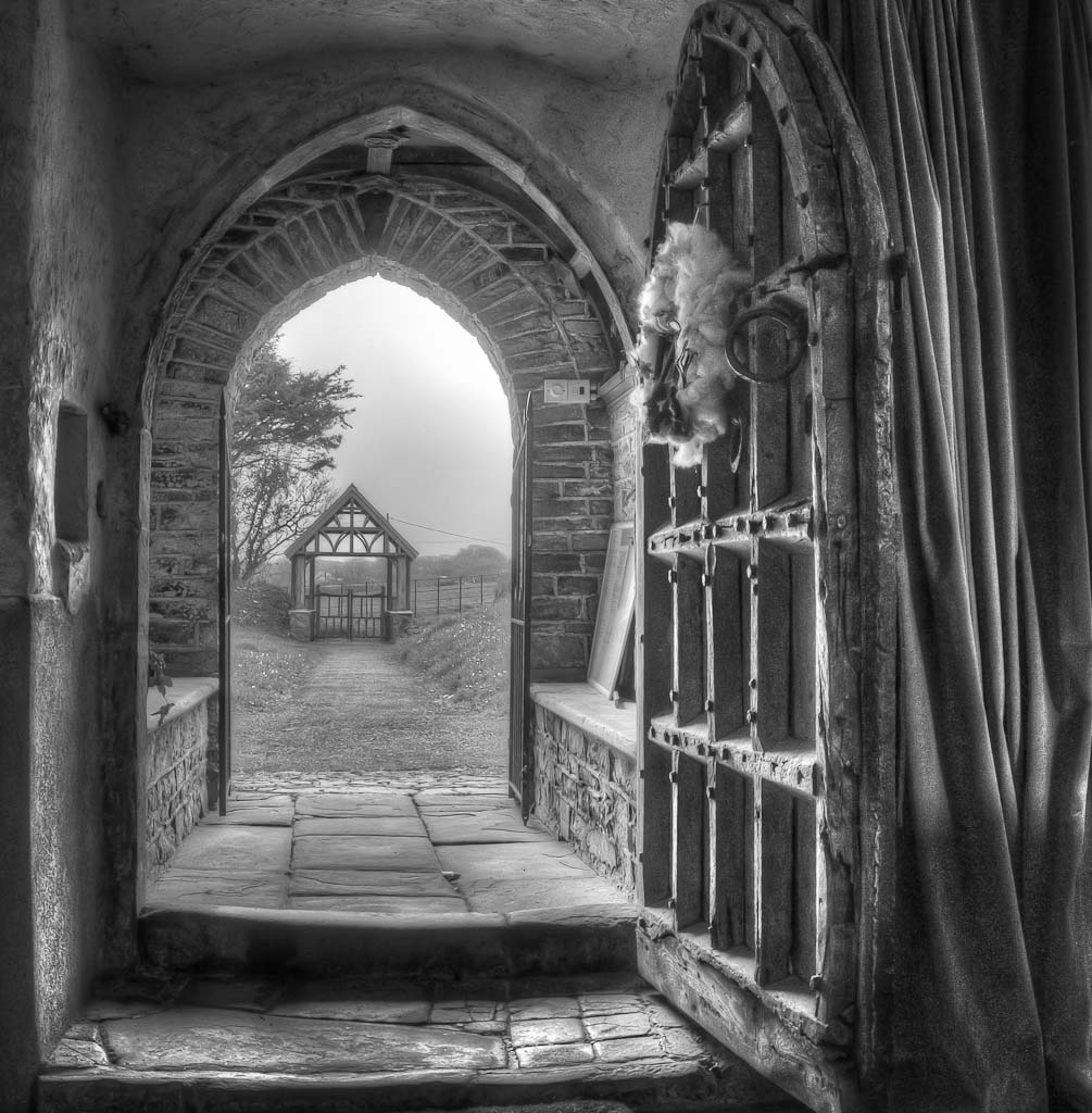
West Putford_0040 by rkcphotos, on Flickr
 
I do not very often comment on other peoples work because mine is not all that clever. However, the thing which strikes me about these three images is that they are too flat. I can't find a black anywhere in fact there is hardly a really dark tone to be seen.
 
I like No.1:)
 
Nice set but I like 3 the most.

I do not very often comment on other peoples work because mine is not all that clever. However, the thing which strikes me about these three images is that they are too flat. I can't find a black anywhere in fact there is hardly a really dark tone to be seen.

These may not have many blacks but that is sometimes a choice made to give an image a particular feel.
 
I like the "frame within a frame" on the third picture. Good lead in to the lych gate.
 
I do not very often comment on other peoples work because mine is not all that clever. However, the thing which strikes me about these three images is that they are too flat. I can't find a black anywhere in fact there is hardly a really dark tone to be seen.

Nice set but I like 3 the most.These may not have many blacks but that is sometimes a choice made to give an image a particular feel.

Thank you for your feed back
re blacks I did have a play and increased the blacks and can see what you mean, the idea was to try and show detail which meant too much black blocked out detail.
This was the first time I have done it and will defiantly be doing it again, will bear in mind about the blacks
 
The lack of solid black isn't a problem, and some deliberately produce this style of attenuated tonal range as part of their 'look'. I quite like this treatment.

Number 3 seems to work best because it's a nicely framed clear composition with a natural flow, great textures and all the verticals & horizontals line up well. Numbers 1 & 2 have lots of visual elements cut off and the verticals aren't straight - 1 is better in this regard than 2 - and there's much less visual flow to the images.
 
3 is the most popular one
If I could trouble you all again :)

This is the colour image, all that I have done is straightened it and sharpened
would you have cropped differently?

West Putford Colour by rkcphotos, on Flickr
 
1&2 are just "typical" church interiors without concentrating on any particular focal point so the eye doesn't have a resting point to go to. Just hunting around the picture.

There are lots of possibilities, details etc that are crying out for attention.

Pay another visit with your tripod, it will be worthwhile.

Just seen that you have sharpened & straightened no.3. Even better.

I would crop the original a little as I find the pew distracting.
 
Last edited:
Maybe would have stepped back a bit to get all of the door in the frame, and then cropped as you did. Wonderful shot.
 
The lack of solid black isn't a problem, and some deliberately produce this style of attenuated tonal range as part of their 'look'. I quite like this treatment.

Number 3 seems to work best because it's a nicely framed clear composition with a natural flow, great textures and all the verticals & horizontals line up well. Numbers 1 & 2 have lots of visual elements cut off and the verticals aren't straight - 1 is better in this regard than 2 - and there's much less visual flow to the images.

Thank you Toni, must admit the lines/flow is something I struggle with
 
1&2 are just "typical" church interiors without concentrating on any particular focal point so the eye doesn't have a resting point to go to. Just hunting around the picture.

There are lots of possibilities, details etc that are crying out for attention.

Pay another visit with your tripod, it will be worthwhile.

Just seen that you have sharpened & straightened no.3. Even better.

I would crop the original a little as I find the pew distracting.

Thank you Ian, will go back with tripod when I have more time to think about composition
 
Maybe would have stepped back a bit to get all of the door in the frame, and then cropped as you did. Wonderful shot.

Thank you Bob, could not stand back as was using furniture in the church as a tripod :D
 
Hi Bob
As said, No 3 looks VG and stands out - reminds me of Italian Old masters painting ... and I like that a lot.
just wanted to say I think the processing can very easily be improved, well I think so anyway.
I dropped N0 3 into Intensify pro and with one click thought I got a much improved result.
You have Edit image ticked, but will only post if you give OK.
Again, really good image - well done.
 
I do like the idea of number 3, but as has already been mentioned, it is just too flat. There is no contrast to the shot, and where you have lightened the shadows, you have introduced quite a lot of noise.

A short while ago, @Pookeyhead posted a very good HDR tutorial which would help you create a well balanced shot. I think this would benefit from that.
 
Last edited:
Hi Bob
As said, No 3 looks VG and stands out - reminds me of Italian Old masters painting ... and I like that a lot.
just wanted to say I think the processing can very easily be improved, well I think so anyway.
I dropped N0 3 into Intensify pro and with one click thought I got a much improved result.
You have Edit image ticked, but will only post if you give OK.
Again, really good image - well done.


Hi Charles
Thank you for feedback, please post your edit I will look forward to seeing it
 
I do like the idea of number 3, but as has already been mentioned, it is just too flat. There is no contrast to the shot, and where you have lightened the shadows, you have introduced quite a lot of noise.

A short while ago, @Pookeyhead posted a very good HDR tutorial which would help you create a well balanced shot. I think this would benefit from that.


Hi Nick
Thank you for feedback, have had a look at the tutorial and will give it a go and post an edit
 
@Rockshifter
Hi Charles
Thank you, when first looking at your edit I thought a bit over the top re colours, bit too saturated/vibrant, the walls in the foreground looked over the top, then I started looking more closely and realised there was more detail showing possibly down to contrast.
So I edited as the original and must admit it has more punch so a big thank you


Rockshifter edit
by RKC on Talk Photography
 
Nice set but I like 3 the most.


These may not have many blacks but that is sometimes a choice made to give an image a particular feel.
Maybe Alf but its a dark church interior and for me it loses some of that in the way it has been processed. Also the window in the church in the first is showing very little detail.
 
Back
Top