Hi Jim,
I agree with all what is said before. Two great shots but they do look a bit 'floaty' on the background which is a shame as they aren't!
If I took these I would think my problem is the DoF. It looks like the sharp area/window whatever you want to call it ends on the subject as from what I can see at the bottom, the foreground looks to be in focus too (I think they call it front focusing or something). Maybe try to get your focus centered on the scales/urn?
Sorry I'm not up with the technical terms but I hope you get my drift.
I hope this serves to motivate rather than de-motivate as you are 99% there and these are better than most!
Happy snapping, Gary


 Newborn Aria 01 by pricelessmomentsuk, on Flickr
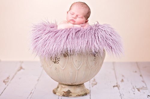 Newborn Aria 02 by pricelessmomentsuk, on Flickr
")