Critique A few from last week

Messages
160
Name
Andy
Edit My Images
Yes
Hi all,

Last week I managed to get a few shots I am quite happy with. But, I'd really like to work on improving and developing, so any critique is welcome, as I would like to use it to get better!

All the pictures were taken with a Canon 60D and 100m 2.8 in natural light. I have processed them in lightroom and done a tiny bit of photoshop,but I am a complete beginner with both.
pool_1.jpg


outside.jpg


Tree.jpg


Hair.jpg


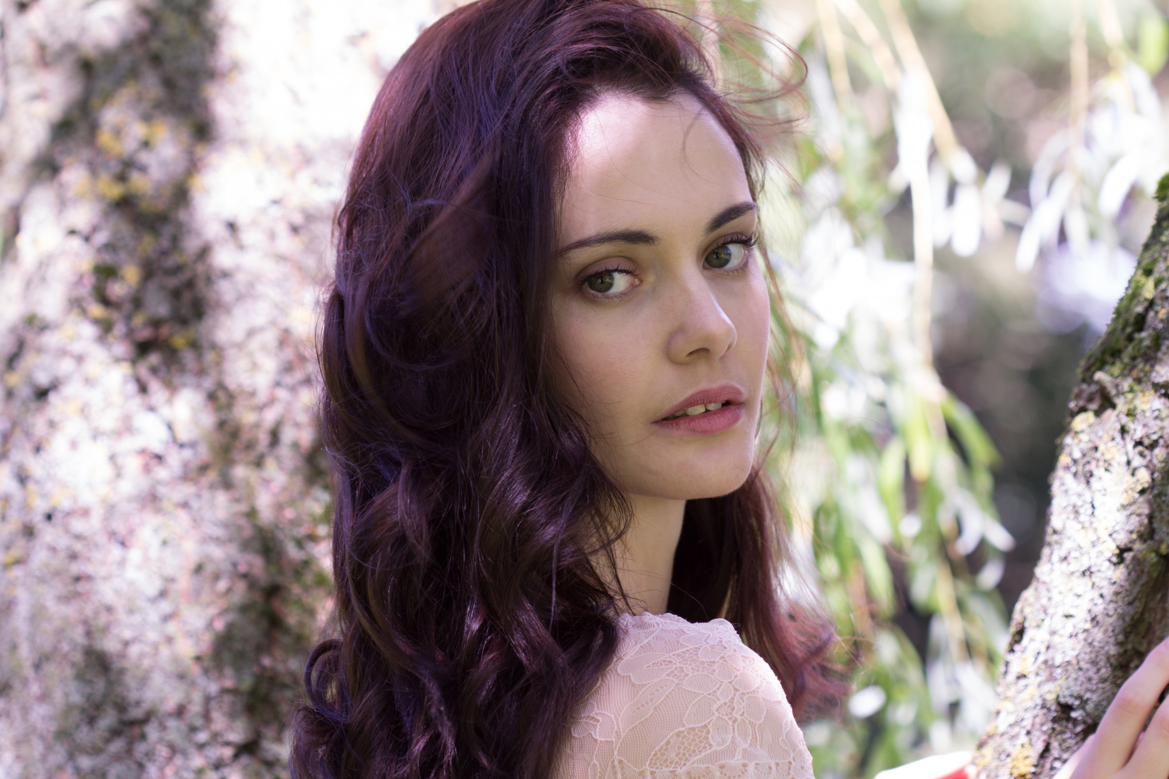
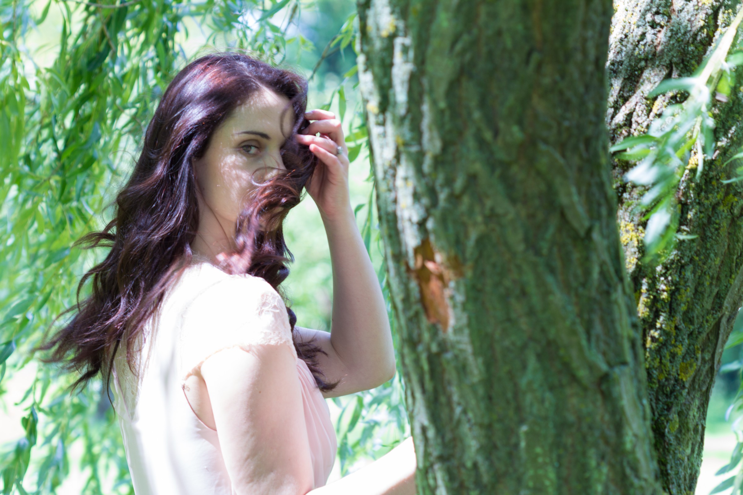
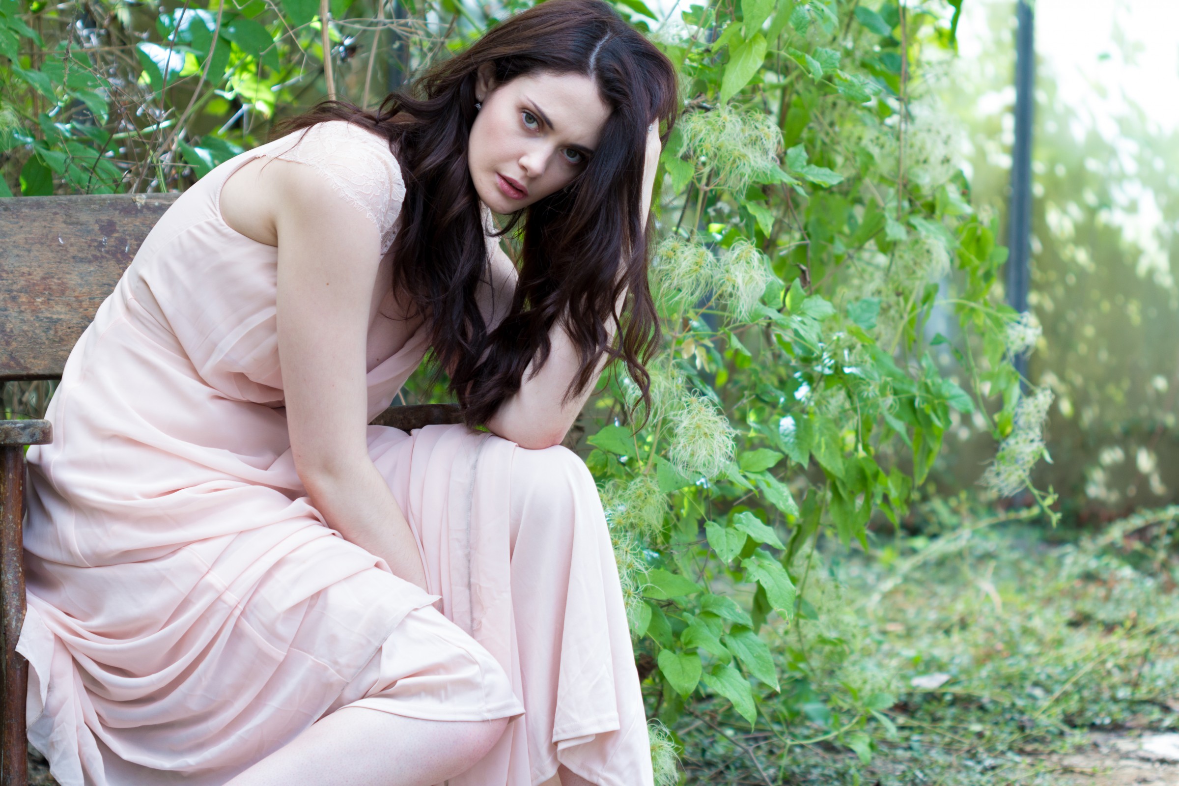
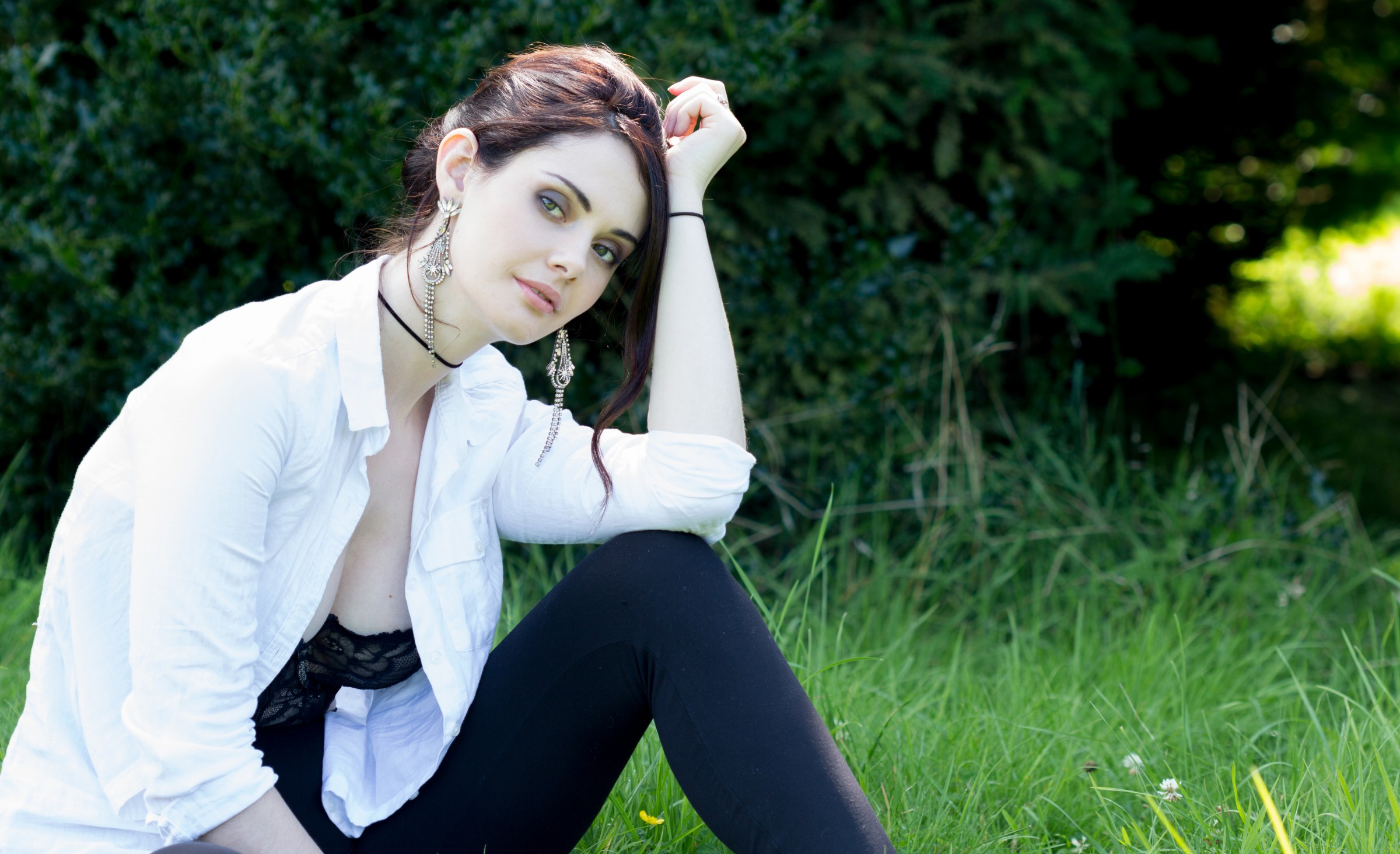
With Number 3, I think cropping closer might work

I debated included 4 because the shutter speed was a little slow, and focus not quite spot on. But it is one I still like because of how the wind has taken her hair. But, any critique is welcome!

Thanks!
 
Thanks Orangecroc,

The Apertures were:
1 - f/2.8
2 - f/4
3- f/4
4- f/4

I agree with the shallower DoF, I think more seperation between subject and back drop might have helped. I think the crop sensor also may have made the DoF slightly less shallow than it could have been, making me wonder what a FF sensor would have done with the image (and makes me think about FF too much!).

I really enjoyed taking them though, and now I've got my set up somewhat sorted, I'm chomping at the bit to start taking photos and improving.
 
This is exactly the sort of photography I have been pursuing. I started out with landscape photography so a lot of my influences come from that background and I used to look at a scene and decide what I didn't want in the image. I have applied this tactic with my people photography which brings me to the very first image in your set, I would have avoided the blue down pipe or cropped it out or even cloned it. Your 3rd image could do with a little added light on her face. keep up the good work and don't take my advice too seriously as I'm still a beginner myself.
 
This is exactly the sort of photography I have been pursuing. I started out with landscape photography so a lot of my influences come from that background and I used to look at a scene and decide what I didn't want in the image. I have applied this tactic with my people photography which brings me to the very first image in your set, I would have avoided the blue down pipe or cropped it out or even cloned it. Your 3rd image could do with a little added light on her face. keep up the good work and don't take my advice too seriously as I'm still a beginner myself.

I would agree with the pipe, well spotted! I might try and clone it out or crop and see how it looks! With the third, i might try and notch the exposure up and see if it brightens it a bit

Thank you for looking, I appreciate it
 
Maybe not so tight a crop on the first and eliminate blue pole. Second one , this I would crop tighter, could be the best of the set. Third maybe a tad more light on her face. Fourth I don't think her eye is sufficiently focused or illuminated to warrant covering the rest of her face with hair.
 
The dappled light in 3 & 4 isn't doing you any favours, otherwise nice set.

Thanks Juggler, it will be something i take more in to consideration, as I can see what you mean.

Maybe not so tight a crop on the first and eliminate blue pole. Second one , this I would crop tighter, could be the best of the set. Third maybe a tad more light on her face. Fourth I don't think her eye is sufficiently focused or illuminated to warrant covering the rest of her face with hair.

Where should I put the frame in the first, or is it more a case of pulling back from the subject to give room for the head and more of her legs?

I can see a closer crop working in number two. In number 4, I can see that too, it's a shame the focus didn't quite lock exactly where i would have liked, and that i didn't use a faster shutter speed.
 
I would just pull back a bit as you say to give a little more room around her.
 
Pretty nice set overall. A generally good job on posing which is one of the harder things to do well.
The images have a bit of a color cast and lacking contrast DR... 1 is a little green/flat, 2 is a bit blue/green (in blacks/skin), 3 is a little magenta, 4 is a bit green- possibly due to being under the tree but it's also on her face/eye. As a set #2 seems a bit out of place as it makes her much paler in skin tone... almost like a different person.

Here's a quick levels adjustment (in PS) of the first, nothing major... just a refinement on this one (rt side).
Untitled-1.jpg
 
Last edited:
Pretty nice set overall. A generally good job on posing which is one of the harder things to do well.
The images have a bit of a color cast and lacking contrast DR... 1 is a little green/flat, 2 is a bit blue/green (in blacks/skin), 3 is a little magenta, 4 is a bit green- possibly due to being under the tree but it's also on her face/eye. As a set #2 seems a bit out of place as it makes her much paler in skin tone... almost like a different person.

Here's a quick levels adjustment (in PS) of the first, nothing major... just a refinement on this one (rt side).
View attachment 109703

I like what you have done here! it has brought out the colour of her hair and made her skin more vibrant.
One of the areas I need to improve upon is photoshop and lightroom - what did you do to the image? Just so I can have a play and get a bit more to grips with it.

In terms of as a set, I can see what you mean and possibly made the mistake of including images from different outfit changes rather than a coherent set, which is something I will bear in mind for the future.
 
Back
Top