
- Messages
- 3,673
- Name
- Rory
- Edit My Images
- Yes
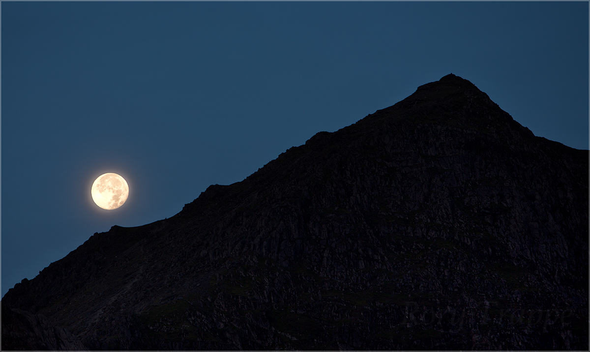 halo-halo by Rory Trappe, on Flickr
 hill by Rory Trappe, on Flickr
 Llyn Teyrn by Rory Trappe, on Flickr
 on reflection by Rory Trappe, on Flickr
Last edited:
 halo-halo by Rory Trappe, on Flickrhill by Rory Trappe, on FlickrLlyn Teyrn by Rory Trappe, on Flickron reflection by Rory Trappe, on Flickr
•
There are two things I know may disturb in a good photo:
a. poles and wiresYour #4 is scarred with the second… this is easy to remove.
b. jet trails
I like the idea in #5
#3 could be a version of a "watery moon", very cool
#2 great perception of depth
#1 too bright white range, great layering
Very good rendition
Very nice set, I particularly like the colours & composition of #4 (without the car).
imo the logo and frame really don't add anything to the image but that's personal taste.
More problematically, there are some halos introduced by clarity / local contrast manipulations / sharpening in most of them, especially along the horizon. There's a couple of bright pixels just above the horizon and a wider 'glowing' region beyond that. It's most obvious on the left of the last one (Snowdon).
It's not that bad but I mention it 'cos I was guilty of this kind of error for ages before I realised.
Halo's...I have looked at my Imac and expanded on my Ipad to something like 200%.....I have also cleaned my reading glasses. Not sure what you mean?
The glowing region is probably the moon reflecting off the mist in the valley as I was shooting with it just out of the frame.
Enjoy your tripThree and four cement my decision to head to Snowdonia before the year is through! Absolutely lovely shots!
")
 grazing