

You are using an out of date browser. It may not display this or other websites correctly.
You should upgrade or use an alternative browser.
You should upgrade or use an alternative browser.
Critique A few snaps
- Messages
- 82
- Name
- Mark
- Edit My Images
- No
I would say that you are being a little harsh on yourself, by calling these 'snaps'. They are lovely photos, but I see what you mean about the white area in pic no.1. I'm sure there is an easy way to edit that out or even tightly crop the image.
I prefer the colour image to the b&w, but don't ask me why
I prefer the colour image to the b&w, but don't ask me why
- Messages
- 8,309
- Name
- Ian
- Edit My Images
- No
Please take what you like etc, etc....
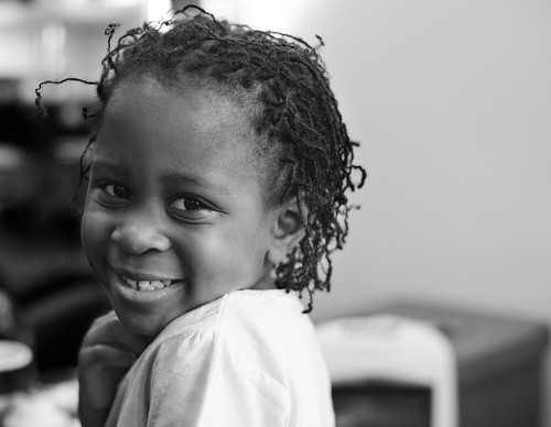
1 is fine with the white bit at the top IMO - it's more the white bit coming out of her shoulder that's an issue. I think positioning your subject at the other end of the frame may have worked better. Bit more space to the left (the direction her body is facing).
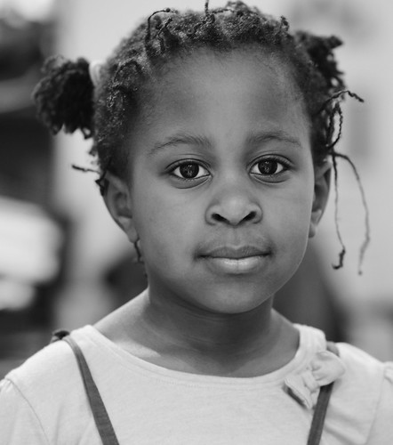
2 is really nicely lit and creative use of depth of field is noticeable (in a good way) with errant hairs being a bit more out of focus than in #1. Personally, I find it a bit of a tight claustrophobic crop. Maybe a bit more space above her head, and to the left and/or right. Maybe even a centre posed subject would have worked here in a 3:2 format. Expression is very... expressionless...
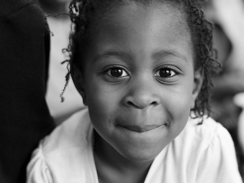
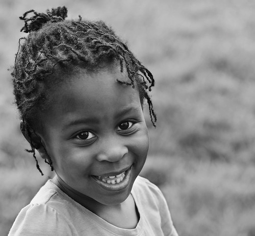
3 is the best of the set for me. The tight crop works, and could probably be even tighter, lifting the bottom up to the chin line (or even higher). Lighting is really nice, expression is lovely and engaging. Background is black on one side and messy on the other, but because you're in close, it doesn't matter so much
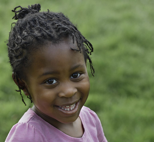
4 is another lovely shot. Not sure on the crop again (it's not square and it's not 3:2). Could probably go 3:2 and have more space to the right. Expression is lovely, tilt to the head is really nice, angled shoulders - again works well. Exposure is bob on for me although maybe a tad more contrast. It's difficult to rank colour vs black & white when almost all the images are black & white, but I'll plumb for B&W because the pink top is a bit distracting.
Overall, a really nice set of memories. Well done!
1 is fine with the white bit at the top IMO - it's more the white bit coming out of her shoulder that's an issue. I think positioning your subject at the other end of the frame may have worked better. Bit more space to the left (the direction her body is facing).
2 is really nicely lit and creative use of depth of field is noticeable (in a good way) with errant hairs being a bit more out of focus than in #1. Personally, I find it a bit of a tight claustrophobic crop. Maybe a bit more space above her head, and to the left and/or right. Maybe even a centre posed subject would have worked here in a 3:2 format. Expression is very... expressionless...
3 is the best of the set for me. The tight crop works, and could probably be even tighter, lifting the bottom up to the chin line (or even higher). Lighting is really nice, expression is lovely and engaging. Background is black on one side and messy on the other, but because you're in close, it doesn't matter so much
4 is another lovely shot. Not sure on the crop again (it's not square and it's not 3:2). Could probably go 3:2 and have more space to the right. Expression is lovely, tilt to the head is really nice, angled shoulders - again works well. Exposure is bob on for me although maybe a tad more contrast. It's difficult to rank colour vs black & white when almost all the images are black & white, but I'll plumb for B&W because the pink top is a bit distracting.
Overall, a really nice set of memories. Well done!

- Messages
- 1,764
- Name
- David Williams
- Edit My Images
- No
Lovely photos, your subject certainly doesn't seem to mind having her photo taken - make the most of that as it doesn't last!
My only advice would be to get down lower, these are taken from a very "adult to child viewpoint" and I find pictures of small children look much better taken from their eye level or below.
You do not see too many adult portraits taken from this view.
Unfortunately a low viewpoint normally means crawling round on the floor. I used to sit my sons at a tall table and give them something to do - this keeps them in one place and distracts them from noticing the camera too much
This one I was lying on my side on the floor - hoping he didn't fall over as he was only just sitting up unaided!!
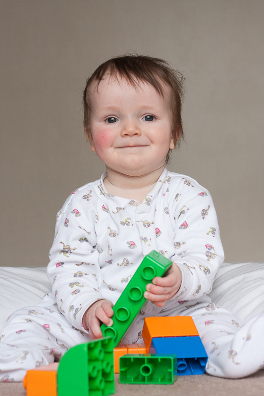
OP
- Messages
- 455
- Edit My Images
- Yes
He’s lovely, such a cheeky smile I see what you mean about viewpoint. I’ll bear it in mind in future. And yes, she loves having her photo taken. If the camera comes out, she asks me to photograph herLovely photos, your subject certainly doesn't seem to mind having her photo taken - make the most of that as it doesn't last!
My only advice would be to get down lower, these are taken from a very "adult to child viewpoint" and I find pictures of small children look much better taken from their eye level or below.
You do not see too many adult portraits taken from this view.
Unfortunately a low viewpoint normally means crawling round on the floor. I used to sit my sons at a tall table and give them something to do - this keeps them in one place and distracts them from noticing the camera too much
This one I was lying on my side on the floor - hoping he didn't fall over as he was only just sitting up unaided!!
LongLensPhotography
Th..th..that's all folks!
- Messages
- 17,621
- Name
- LongLensPhotography
- Edit My Images
- No
1. No, it is the white chair and the framing that is causing the issue for me. It has too little space on the left and the left looks pretty dark.
2. Technically OK, but the look is very flat and uninterested.
3. That's a lot better and perfectly fine for a family photo.
4. I'd say black and white. I don't like the combination of pink and green. Also the exposure is better in the converted photo.
2. Technically OK, but the look is very flat and uninterested.
3. That's a lot better and perfectly fine for a family photo.
4. I'd say black and white. I don't like the combination of pink and green. Also the exposure is better in the converted photo.
OP
- Messages
- 455
- Edit My Images
- Yes
Thanks for your viewpoint Truth Teller.1. No, it is the white chair and the framing that is causing the issue for me. It has too little space on the left and the left looks pretty dark.
2. Technically OK, but the look is very flat and uninterested.
3. That's a lot better and perfectly fine for a family photo.
4. I'd say black and white. I don't like the combination of pink and green. Also the exposure is better in the converted photo.
I agree re #4. A few things I’ll have to learn to watch out for, background being one.