

You are using an out of date browser. It may not display this or other websites correctly.
You should upgrade or use an alternative browser.
You should upgrade or use an alternative browser.
A fruity arrangement
- Thread starter JohnBW83
- Start date

- Messages
- 2,691
- Name
- Andrew
- Edit My Images
- Yes
I do like that, nice.
- Messages
- 17,349
- Name
- Bob
- Edit My Images
- Yes
I like that. I had a look at your website, but only as far as the "about " page.
There are several errors in the text that you should look at. Ive highlighted in bold. Hope you don't mind.")
"Freelance photography based in Bury, Lancashire. I cover a wide varity of genres from abstract to wildlife. I am a real passion for photography to capturing those special moments for myself and others. All images of this site can be purchased using the contact me page we you will find all my contact infomation."
There are several errors in the text that you should look at. Ive highlighted in bold. Hope you don't mind.
"Freelance photography based in Bury, Lancashire. I cover a wide varity of genres from abstract to wildlife. I am a real passion for photography to capturing those special moments for myself and others. All images of this site can be purchased using the contact me page we you will find all my contact infomation."
- Messages
- 6,401
- Edit My Images
- No
I like that. I had a look at your website, but only as far as the "about " page.
There are several errors in the text that you should look at. Ive highlighted in bold. Hope you don't mind.
"Freelance photography based in Bury, Lancashire. I cover a wide varity of genres from abstract to wildlife. I am a real passion for photography to capturing those special moments for myself and others. All images of this site can be purchased using the contact me page we you will find all my contact infomation."
 should have used spell and grammer checker
Nod
Tootles
- Messages
- 45,523
- Name
- Nod (UK)
- Edit My Images
- Yes
- Messages
- 3,323
- Name
- Maria
- Edit My Images
- Yes
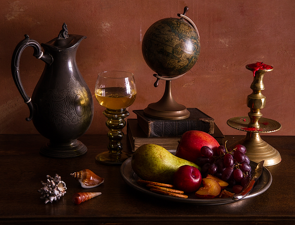
I'm not so sure your still life works that well - let me explain...
There doesn't appear to be any 'flow' around the image either with composition or viewpoint, and there are a lot of components (which isn't always a bad thing - take a look at TheBigYin's work on here) which makes it look a bit unthoughtful and just thrown together. The viewpoint isn't working for me as it's very 'head on' to the fruit which just makes them look like round blobs of colour and the wine bottle, although giving height to the composition, is also too square on and that label is really distracting. The very big highlights on the wine glass don't work for me either as they're a bit overpowering
On the plus side, I really like the reflections you've got on the substrate the arrangement is placed on and also the way the light falls off on the background.
Still life is much harder than you think - getting a good composition is the starting point, and you've mentioned you're using off camera flash - lighting from one side with flash and using a reflector on the other can really accentuate the shapes and textures.
Maybe try again and reduce the amount of things you're using - the wine glass stem would be nice to see, and the grapes and melon are far more pleasing to look at because of the contrast in size, colour and texture, whilst they harmonise with their shapes.
Sorry if I sound negative, I really enjoy doing still life work and I always appreciate a nudge in the right direction - hopefully you do too and this might help you improve too
TheBigYin
Moderator
- Messages
- 16,655
- Name
- Mark
- Edit My Images
- No
Again, I'm afraid I'm slightly in the camp of "sorry, its nor quite working for me"...
Generally, I agree with all the points that Maria made... the composition isn't quite "doing it" - because you're looking head on at the fruit, not only do they become "colour blobs", they make a "barrier" between the viewer and the Glass and Bottle...
Generally, I find that it's easier to work with the fruit ON or IN something, either a platter or fruitbowl. I also prefer to have a viewpoint that's more "natural" to a tabletop arrangement, i.e. looking downwards slightly onto it - okay, as I'm 6'1", maybe not QUITE that far down an angle but certainly not at 4" above the table view.
The other thing with using fruit, is choosing the "face" of the fruit to show... Apples aren't round, there's shape in them, or there's the stalk end, or the opposite end to the stalk (can't remember the proper botanical/biological name for it - creeping seniltity) - USE those "features" to give the fruit character.
What's that you say, fruit doesn't have a character... https://www.flickr.com/photos/the_big_yin/6170160903
but really, the biggest thing for me is (are) the reflections of the "window light" - as you've said it was shot with off-camera flash, should I take it that the flash was behind some form of "diffuser" - in an attempt to create a large soft light emulating gentle window light ?? if that's the case, I'm afraid you've missed the mark there - because the reflections of the "diffuser" just completely wipe out the bottle and the glass...
it's something I've spent AGES messing around with to get right in some of my stuff... as Maria mentioned, my Still Life work is often quite "busy" with lots of components in there, and I do often try and add "window lights" to the shots... tricky when you've got glassware and lots of other reflective and semi-reflective surfaces on there... but it's possible...
 Ontbijtjes 1 by The Big Yin, on Flickr
sorry for "bombing" your thread - but the above picture kind of illustrates a couple of things in one go - getting a slightly elevated perspective, not being afraid of leaving spaces in the arrangement to let items at the back still stay in view, the use of "piling things up" to gain extra perspective or emphasise possibly "lesser" items in the composition" and presenting items with the most "characterful face" to camera - oh - and the careful use of highlight reflections (with a cheeky use of a "gobo" on a softbox to make it look like a sash-window light for the main light, a "dark wall" (read a mahoosive sheet of expanded polystyrene insulation board painted matt-black on one side - its normal white on the other also makes a good reflector if I need one...) on the far side from the softbox to control any untoward reflections coming back on the "wrong side" of any glassware. I'm struggling to remember, but I also added a small amount of light from the "front" into the shot, but I can't remember if it was a second softbox on VERY VERY low or if it was actually just a reflector or two... Sorry, it's a long time since I took this shot - over 2 years ago.
Sorry I can't be more positive about your shot - and I hope I've not discouraged you, because I really, really enjoy looking at Still Life work, and would love to see you try some more, and watch your progression...
its quite a learning curve, but it's fun to play around with.
Generally, I agree with all the points that Maria made... the composition isn't quite "doing it" - because you're looking head on at the fruit, not only do they become "colour blobs", they make a "barrier" between the viewer and the Glass and Bottle...
Generally, I find that it's easier to work with the fruit ON or IN something, either a platter or fruitbowl. I also prefer to have a viewpoint that's more "natural" to a tabletop arrangement, i.e. looking downwards slightly onto it - okay, as I'm 6'1", maybe not QUITE that far down an angle but certainly not at 4" above the table view.
The other thing with using fruit, is choosing the "face" of the fruit to show... Apples aren't round, there's shape in them, or there's the stalk end, or the opposite end to the stalk (can't remember the proper botanical/biological name for it - creeping seniltity) - USE those "features" to give the fruit character.
What's that you say, fruit doesn't have a character... https://www.flickr.com/photos/the_big_yin/6170160903
but really, the biggest thing for me is (are) the reflections of the "window light" - as you've said it was shot with off-camera flash, should I take it that the flash was behind some form of "diffuser" - in an attempt to create a large soft light emulating gentle window light ?? if that's the case, I'm afraid you've missed the mark there - because the reflections of the "diffuser" just completely wipe out the bottle and the glass...
it's something I've spent AGES messing around with to get right in some of my stuff... as Maria mentioned, my Still Life work is often quite "busy" with lots of components in there, and I do often try and add "window lights" to the shots... tricky when you've got glassware and lots of other reflective and semi-reflective surfaces on there... but it's possible...
Ontbijtjes 1 by The Big Yin, on Flickrsorry for "bombing" your thread - but the above picture kind of illustrates a couple of things in one go - getting a slightly elevated perspective, not being afraid of leaving spaces in the arrangement to let items at the back still stay in view, the use of "piling things up" to gain extra perspective or emphasise possibly "lesser" items in the composition" and presenting items with the most "characterful face" to camera - oh - and the careful use of highlight reflections (with a cheeky use of a "gobo" on a softbox to make it look like a sash-window light for the main light, a "dark wall" (read a mahoosive sheet of expanded polystyrene insulation board painted matt-black on one side - its normal white on the other also makes a good reflector if I need one...) on the far side from the softbox to control any untoward reflections coming back on the "wrong side" of any glassware. I'm struggling to remember, but I also added a small amount of light from the "front" into the shot, but I can't remember if it was a second softbox on VERY VERY low or if it was actually just a reflector or two... Sorry, it's a long time since I took this shot - over 2 years ago.
Sorry I can't be more positive about your shot - and I hope I've not discouraged you, because I really, really enjoy looking at Still Life work, and would love to see you try some more, and watch your progression...
its quite a learning curve, but it's fun to play around with.
TheBigYin
Moderator
- Messages
- 16,655
- Name
- Mark
- Edit My Images
- No
I have done very well on Flickr 230 favorite and 8j views but it's all individual taste.
That's a good reception I suppose on Flickr, I don't "do much" with my stuff on there, I'll admit - pretty much just use it as a hosting service rather than "playing the social media side of it"...
I do know that I've learned more from a single critique of my images on here than I ever gained from all the "likes" and "favourites" I've ever had from Flickr, 500px, Facebook, Instagram or any other media sharing site. Even if I disagreed with the critique, going through it step by step, either taking it onboard, or repudiating it and justifying my own artistic reasons for making an alternative decision was a great exercise in exploring the thought processes behind the image.
Still, as you say, it's individual taste isn't it... for me, I'll take a learning experience over getting smoke blown up my fundament any day.
Last edited: