A little more marmite

I like them Toni
The first has another shot within it just looking through the tunnel
 
It's easy to get bogged down in 'pretty' pictures, soft landscapes, warm tones etc. Canals are industrial transport systems, and I wanted to emphasise the hardness of their origins while simplifying the images down to (mostly) just black or white.

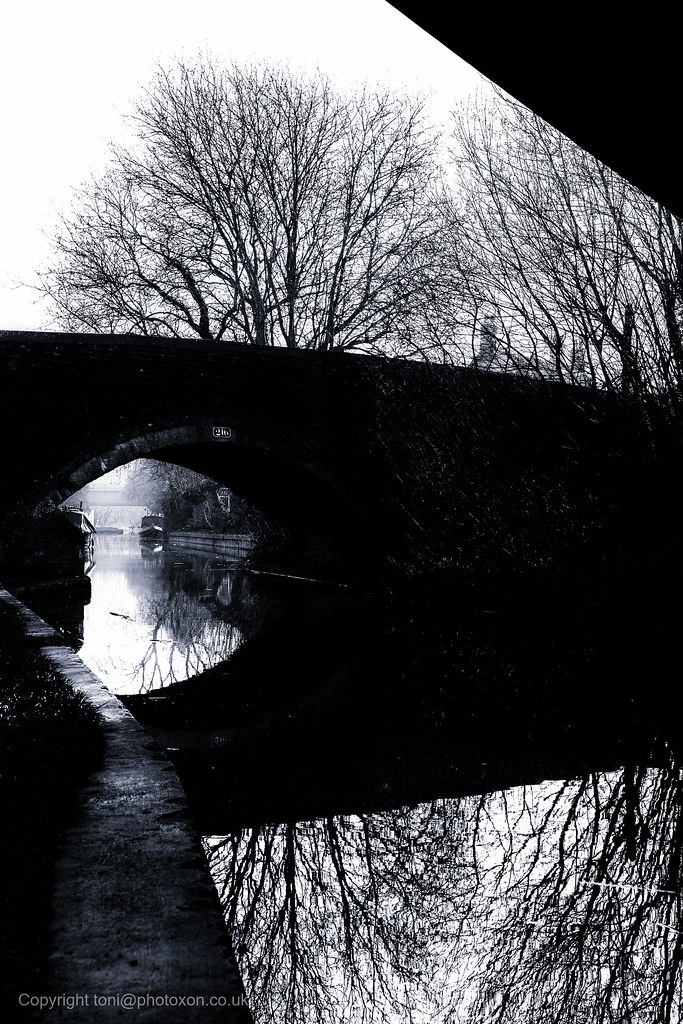
Enslow canal 1 by Toni Ertl, on Flickr

Enslow canal 2 by Toni Ertl, on Flickr

C&C welcome as long as it's constructive.

I do like how you have processed these - it does give the photos a thought provoking atmosphere to them.

I do agree with @alfbranch in that the first photo had another photo within it and think it would look better cropping the right hand side enough to lose the black at the top right hand corner.
 
I like the first just how it is; there is a slight ambiguity about the different areas of highlight that makes you stop and think. Just the tunnel would be a bit boring/seen it before. Similarly the black at top right nicely balances the near-black at bottom left.
 
Thank you gentlemen, very kind.

I do agree with @alfbranch in that the first photo had another photo within it and think it would look better cropping the right hand side enough to lose the black at the top right hand corner.

While I agree that it's a little bit 'photo within photo' a part of what works for me is that the interesting bits of the image run as a stripe across the frame from top-left to bottom-right. Also the black areas on the corners help the image layer up, giving a depth that's not there in the other images I took with different compositions. It can work as a bit of a vertical pano - a tall, narrower strip cropping in about 1/3 from the right, but that's slightly awkward to view.
 
Thank you gentlemen, very kind.


While I agree that it's a little bit 'photo within photo' a part of what works for me is that the interesting bits of the image run as a stripe across the frame from top-left to bottom-right. Also the black areas on the corners help the image layer up, giving a depth that's not there in the other images I took with different compositions. It can work as a bit of a vertical pano - a tall, narrower strip cropping in about 1/3 from the right, but that's slightly awkward to view.

The second shot within the first shot is as well as the original which I really like as it is.
 
Last edited:
Just one more from the set, taken further back under the bridge. It has a different feel to the first image with more darkness and greater compression due to a longer focal length/cropping.

Enslow canal 3 by Toni Ertl, on Flickr
 
Last edited:
Back
Top