Critique A recent wedding with a trip to the beach

Messages
3,650
Name
Andy
Edit My Images
No
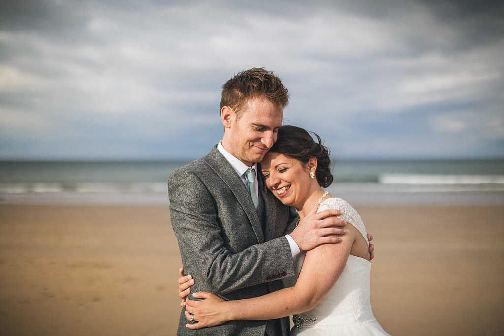
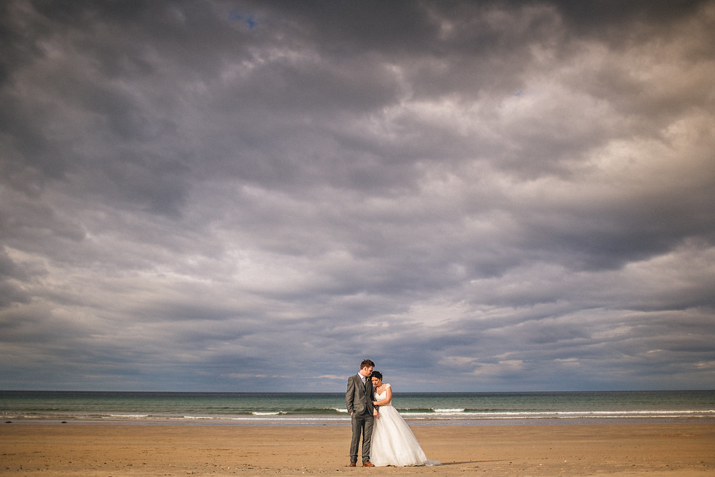
It's been about 18 months since I posted anything for critique and I feel my work has definitely improved since then, albeit still plenty of room to keep improving!!! So rather than just ploughing on through wedding season without really reflecting on what I can tweak and fine tune it would be great to get some feedback on these images but ideally on the full blog post below :)


Newcastleweddingphotographer027.jpg


Newcastleweddingphotographer031.jpg


Newcastleweddingphotographer067.jpg


Newcastleweddingphotographer069.jpg


Full blog post here - http://www.andyhudsonphotography.co.uk/portfolio-item/newcastle-wedding-photographer-sara-dan/
 
Hey Andy. From the ones posted, they are all really good, IMO of course, but that last one is an awesome couples portrait. The blog post looks ace and I am fairly envious of the semi outdoor ceremony and beach location for portraits afterwards. I also really like your processing and I know how many tweaks it has gone through to get to where it is.

Can't believe this hasn't had more comments to be honest in 24 hours. People used to be quick to respond to wedding threads in particular, but I feel overall the level of critique has taken a downward turn here of late, especially from some of the more experienced photographers.

Thanks for the feedback Gareth, yeah the location is top notch, not the most enjoyable of venues to work in as the staff dictate things and it's very regimented. Lovely couple though, like THE best people to work with, a bit stiff in front of the camera but so so nice and friendly. She didn't actually want to go to the beach as he dress would get dirty she thought but luckily I convinced her! :)
 
I am probably the wrong person to comment but from the blogI only had a quick look:

I am not too sold on the flower photos but understand that they are there more to tell the story of the day.
The Miss to Mrs one, I like but would probably crop the right hand side bit where the mirror is showing at the bottom (but that it just me), and the second Miss to Mrs one it is a pity you could not crop out the hand on the left side.
The first one of the children my eye is slightly drawn to the eye of the child next to the baby.
The one with the 4 people getting ready is, for me personally a little too high up, as two of the people seem cut off at slightly different angles, but I do like a 16:9 isn crop of the same photo.
The first of the dress hanging up i like but again would be tempted to crop off the darkish chair in the bottom left.
The black and white of the bride with the child, I would crop in slightly from the right to remove the darkish chair
The lady on the stairs laughing i would be tempted to crop off the lady on the left as her head is missing
Towards the end there is one of the couple walking i think towards the beach, and the sky looks like a lot of highlight recovery has been applied to it.
I really like a lot of the others though he bride looks slightly worse for wear in the last.

I think that the things above are probably more pedantic 'photographer type' things than 'client things' as the photos themselves tell the story of the day brilliantly.
 
In order to redress Gareth's point in wedding threads not getting much feedback...

1). Nice for what it is.
2). Nice moment captured.
3). Nice expression but I'd have lowered her right arm to reduce the armpit showing.
4). Almost. Her right hand just looks weird.

I'll take a look at the full blog when I get a mo.
 
I am probably the wrong person to comment but from the blogI only had a quick look:

I am not too sold on the flower photos but understand that they are there more to tell the story of the day.
The Miss to Mrs one, I like but would probably crop the right hand side bit where the mirror is showing at the bottom (but that it just me), and the second Miss to Mrs one it is a pity you could not crop out the hand on the left side.
The first one of the children my eye is slightly drawn to the eye of the child next to the baby.
The one with the 4 people getting ready is, for me personally a little too high up, as two of the people seem cut off at slightly different angles, but I do like a 16:9 isn crop of the same photo.
The first of the dress hanging up i like but again would be tempted to crop off the darkish chair in the bottom left.
The black and white of the bride with the child, I would crop in slightly from the right to remove the darkish chair
The lady on the stairs laughing i would be tempted to crop off the lady on the left as her head is missing
Towards the end there is one of the couple walking i think towards the beach, and the sky looks like a lot of highlight recovery has been applied to it.
I really like a lot of the others though he bride looks slightly worse for wear in the last.

I think that the things above are probably more pedantic 'photographer type' things than 'client things' as the photos themselves tell the story of the day brilliantly.

Thanks Nguss,

Yeah I see what you are saying about some of the crops, I tend to not crop too tight from a stylistic point of view more than anything, and I shoot 35mm not 50mm for that reason, but there's definitely some merit in what you're saying in some of them... I'll keep that in mind for my next one :)

With that sky in the walking shot you're right as the sun was behind them and it was quite overcast... I think in hindsight just leaving it as totally or almost totally blown would have been better.
 
In order to redress Gareth's point in wedding threads not getting much feedback...

1). Nice for what it is.
2). Nice moment captured.
3). Nice expression but I'd have lowered her right arm to reduce the armpit showing.
4). Almost. Her right hand just looks weird.

I'll take a look at the full blog when I get a mo.

Yeah your right about that hand... It's something I need to concentrate more on as I've noticed it myself a few times in other shots too. I probably just need to pause for a second and scan the full picture before shooting, I'm probably in too much of a rush to capture the moment before it goes but just a little scan over everything could make a big difference, same with the arm pit that I hadn't considered until you mentioned it :)
 
would be great to get some feedback on these images


1, blown highlights and slanted
2, a great moment captured… and all those smiles!
3, a very sweet take with cool shallow DoF
4, a better take and rendition but, IMO, too bad you did
not get much closer and/or further… I don't mind the hand
but the half bodies. The scene composition of clouds, Sun,
water and beach is quite pleasing.
 
Wonderful set Andy. Really enjoyed the blog images.
 
In order to redress Gareth's point in wedding threads not getting much feedback...
4). Almost. Her right hand just looks weird.

Yeah your right about that hand... It's something I need to concentrate more on as I've noticed it myself a few times in other shots too. I probably just need to pause for a second and scan the full picture before shooting, I'm probably in too much of a rush to capture the moment before it goes but just a little scan over everything could make a big difference, same with the arm pit that I hadn't considered until you mentioned it :)

Wouldn't you agree though about the poeple offering critique in general as a whole? We seem to have lost some very good, creative photographers from here, whether professional or not who would offer great advice and could back it up with their portolfios. We still have those people but alas, some don't contibute as much which is a shame. I know I have learned things from here, even if at times I may have took some critique a little personal. Sometimes of course I didn't and still don't agree with some things, but sometimes things stick with me which I take to the next shoot.

Just looked at that again after Ryan's comment about the hand in number 4 and yeah, he does have a point I think. I think just her arm behind him would have worked here too. Something I did in Wednesday evenings engagement shoot was to see where her arm was appearing if she had it around him and at least once I asked her to take the stray fingers off his shoulder. That was based on comments I had read here in the past. Just looked better without them altogether. :)

Shame I have to wait up to two weeks to see if I made any errors though. :D
 
Last edited by a moderator:


1, blown highlights and slanted
2, a great moment captured… and all those smiles!
3, a very sweet take with cool shallow DoF
4, a better take and rendition but, IMO, too bad you did
not get much closer and/or further… I don't mind the hand
but the half bodies. The scene composition of clouds, Sun,
water and beach is quite pleasing.

Good spot on the highlights on 1, I hadn't actually noticed that! The slant is either the building and her straight, or vice versa... I'd rather her straight and the building slanted than the other way round tbh :)

As for 4, I did, I just didn't blog those:

28798785130_5389fa2259_b.jpg


29008417871_f134ef6094_b.jpg


LOVE the wider one.
 
Wouldn't you agree though about the poeple offering critique in general as a whole? We seem to have lost some very good, creative photographers from here, whether professional or not who would offer great advice and could back it up with their portolfios. We still have those people but alas, some don't contibute as much which is a shame. I know I have learned things from here, even if at times I may have took some critique a little personal. Sometimes of course I didn't and still don't agree with some things, but sometimes things stick with me which I take to the next shoot.

Just looked at that again after Ryan's comment about the hand in number 4 and yeah, he does have a point I think. I think just her arm behind him would have worked here too. Something I did in Wednesday evenings engagement shoot was to see where her arm was appearing if she had it around him and at least once I asked her to take the stray fingers off his shoulder. That was based on comments I had read here in the past. Just looked better without them altogether. :)

Shame I have to wait up to two weeks to see if I made any errors though. :D

I do agree. And I've found myself staying away from TP a few times in the past. Especially from the critiquing part of my time here. I believe we have too many people who want to hear "great set" and too many people who say "wonderful set" when it's clearly not. So much so that when any "negative" (AKA correct) critique is given people either ignore it or deride it as wrong or invaluable.

On the subject of hands. They should be in a natural place and not distracting. So anytime I see hands on shoulders I get them to move them - "squeeze her bum" usually works. In picture number 4 that Andy posted I personally believe the right hand to be in an unnatural position (behind his back is where I'd expect it to be) and the it's distracting as a result. HTH
 
Last edited:
Lovely set as always mate. Your mono conversions look great!

Love working at that venue as it's in a cracking location. You're right though, it can be a bit regimented at times.

Thanks Danny, yeah the venue itself is spot on and the location tough to beat... just not always as fun as it could be, depends on which staff and particular toast master is working that day :)
 
I do agree. And I've found myself staying away from TP a few times in the past. Especially from the critiquing part of my time here. I believe we have too many people who want to hear "great set" and too many people who say "wonderful set" when it's clearly not. So much so that when any "negative" (AKA correct) critique is given people either ignore it or deride it as wrong or invaluable.

On the subject of hands. They should be in a natural place and not distracting. So anytime I see hands on shoulders I get them to move them - "squeeze her bum" usually works. In picture number 4 that Andy posted I personally believe the right hand to be in an unnatural position (behind his back is where I'd expect it to be) and the it's distracting as a result. HTH

It works with that hand position if she puts it on top of her other hand, or even better if she's holding the bouquet, I do it often and it looks good... however if I get it a bit wrong and don't check it's where it should be I agree it looks odd. Something for me to remember for future shoots.
 
I was just about to say there's a massive bit of sensoe dirt in the first one.............................................................. until I cleaned my work's monitor :(
 
That wide shot of the bride and groom is superb. I was at a wedding recently as a guest and appreciate how difficult it must be to be a wedding photographer, and i do think these are ace. About the crops, I always tend to find that I crop too much so please feel to ignore my comments about the crops as it is just a personal thing really. I used a 35mm at the wedding I went to, and sort of wished I had the sigma 50 instead.
 
That wide shot of the bride and groom is superb. I was at a wedding recently as a guest and appreciate how difficult it must be to be a wedding photographer, and i do think these are ace. About the crops, I always tend to find that I crop too much so please feel to ignore my comments about the crops as it is just a personal thing really. I used a 35mm at the wedding I went to, and sort of wished I had the sigma 50 instead.

I've been playing around a bit with 50mm during the day recently but still seem to prefer 35mm, there's definitely merit with both though and 50mm does cut our some if the distractions round the edges that you get with 35mm, I just need to find the right times to use it which I think will take some practice. I won't discount what you said as there is definitely some validity in your feedback :)
 
I haven't read any comments above, so FWIW ...

#1 Meh. It's a grab shot. There was a great picture to be had there, but this isn't it because you were in the wrong place and/or you didn't spot the potential. Shooting up from closer in and lower down would have got you a hero shot of the bridesmaid and the kiddie on the right, with the bride and dad coming towards them, hopefully timed right so the bride's looking at camera. All it needed was anticipation.

#2 Excellent.

#3 Think how much better that would have been if only you'd moved slightly left ...

#4 Her hands are weird, but they won't have a problem with that. If that was posed, the hands are down to you. If it was just directed (i.e. basically asked to stand there, be squidged up and do their own thing), fair enough.

#5 Fine for them despite his fingertips but I wouldn't use it in the portfolio: too much upper arm and double chin.

#6 Very nice, although it's maybe a bit too tight on the bottom if they want to frame or wrap it.


Cheers for the critique :)

Yeah good point on 3, it's the danger that taking that extra second may loose that 'moment' of them laughing but maybe setting them up correctly first to get both that and the better angle is the key to that. Hadn't considered that for 6, it is the type of photo they might frame or get on a canvas so something to consider next time for sure :)
 
Back
Top