Age old question - b&w or colour? Do your own version.

sunnyside_up

<span class="poty">POTY (Joint) 2016</span>
Messages
3,622
Name
Bethy
Edit My Images
No
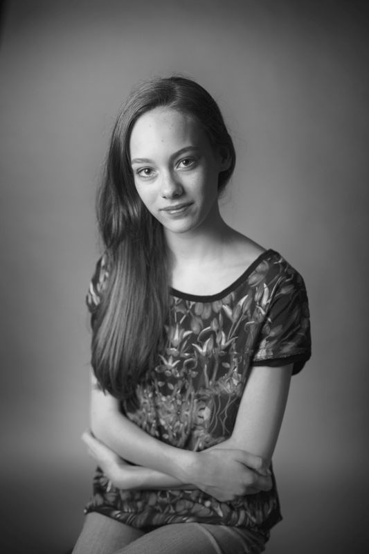
I'm torn on this one. Really wondering what people's opinions are on this? Would you choose B&W or Colour?

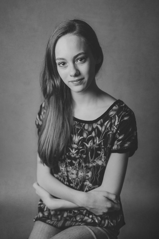
Thanks for looking and for your input in advance! :)

[EDIT] I've added a dropbox link to the raw file and have offered up to anyone to show me their own versions of B&W. Be interesting to see the results. The link is waaaay down in a post from today 17.04) The dropbox file will be available til Sunday night.

Black and White or Colour by Beth Botterill, on Flickr
 
Last edited:
your colour is muted and quite in order, thus your black to white follows that regime
composition is important here and the leg area could be cropped
dont let the sensor parameters be your final format
crop to just below the arms and you will get a 'resting' on the border effect...ie a window
cheers
geof

she says no
 
The colour one looks the best.:)
 
Colour is better, IMO. The colours are quite muted, which works in colour, but doesn't work well in B&W. I think a small amount of cropping would work well, as Geof says.
Nice portrait!
 
Colour.... um... black and white.... no... colour..... no.. ermmm... black and white....

Oh god I've gone cross eyed, can't decide.

Both work well. I think the good thing about this image is that it works in both so you have a choice if it was to be included in a set or part of something else that required one or t'other look.
 
Of the two images presented I agree that the colour one is better.

However..... I can't help feeling that a black and white with greater contrast and richer shades would be a fairer comparison.
 
Another vote for the colour version Bethy.
It's a shame to lose those wonderful warm and subtle colour tones in your models hair and skin tones.

I find the crop just right too. Any closer to the hands I feel would be too tight in the frame.
 
I like both, but if I had to choose I would probably go colour. Nice shot :)
 
Thanks all - interesting comments. I think it might be the B&W conversion that perhaps is wrong for this photo as well... not my greatest forté I will admit.
Composition wasn't really in question here as these were not my final compositional crops, but the images dropped into a side by side viewing template. But thanks anyway @mrtoad, @BintyMcFrazzles for your feedback on this.

@minnnt - straightforward and to the point lol... is 'sucks' the new technical photography critique term? lol! Good thing we're mates eh! :)

@Elines - I think you're quite right... the conversion is a bit blah and could do with more contrast, perhaps the reason why it doesn't work as well as I thought.

I actually had to mute the tones down considerably in the 'colour' version as her top was VERY bright and colourful!

Anyway, thanks again everyone, I take on board what you're all saying. It was an interesting exercise. I posted it on my facebook page as well and got pretty much the same sort of returns on it - Colour.

Cheers!
 
I think it might be the B&W conversion that perhaps is wrong for this photo as well... not my greatest forté I will admit.

I was going to say exactly that. I'm still wrestling with conversion methods myself. In this case I wonder whether there's too much of the red & orange component contributing to the luminosity? In the b&w her skin is a bit bright and lacks some of the subtle graduation of the colour one, and the vignette is a bit too pronounced.

I'm struggling to convey what I mean here but it's resulted in something which is simultaneously muted and over contrasty, if that makes sense.

PS I love your soft colour processing, btw.
 
Colour- 100% The mono shot has little to offer against the colour version, I also agree that a crop would be beneficial

Les ;)

PS- I would not take on board too much from face book, they will give a LIKE to a Dog Turd if you photographed one, I don't use Face Book for that very reason

Your images are always interesting to me - I love your style and PP too
 
Last edited by a moderator:
Who's they?

I have a love/hate relationship with facebook but it and it's groups have been instrumental in supporting my development as a photographer. Don't dismiss it lightly.

I am not dismissing it in any shape or form Simon, I personally don't use it. I have a hate hate relationship with Fake Book, that's all.....

I you want fair honest critique of your Photography, then Photographic forums are the place in my humble opinion, but what do I know :D

Les ;)
 
Colour- 100% The mono shot has little to offer against the colour version, I also agree that a crop would be beneficial

Les ;)

PS- I would not take on board too much from face book, they will give a LIKE to a Dog Turd if you photographed one, I don't use Face Book for that very reason

Your images are always interesting to me - I love your style and PP too

To be fair it's not Facebook that would "LIKE" the dog turd - it would be the people on facebook....quite a generalisation as I suspect most on TP are also on Facebook....
 
Colour in this instance... but and a big BUT... a higher contrast Mono might work :D
 
Anyone want to have a play with the raw file and show me an awesome B&W conversion?
 
Anyone want to have a play with the raw file and show me an awesome B&W conversion?

That would be interesting to see what could be done and I hope stage by stage instructions as well.

There does seem to be a lot to do to make a Black and White image sing.
 
I'm up for the challenge... but can't do it straight away. Sometime over the weekend If that's ok with you ;)
 
Ok.. here's the 'naked' raw file. Lets see your stuff... I'll leave it up til the end of the weekend.
*Link removed*

EDIT - this link is no longer available.
 
Last edited:
Anyone want to have a play with the raw file and show me an awesome B&W conversion?


Nope.... but I processed it as I would have if it was my shot.... so it's in colour. I'll do a B&W later though.

Click for full res... click again to zoom.


Forgive Imgur's compression.

I'll post a drop box link to the .PSD file later so you can see what I did... I'll put it in this post... so check back later.


[edit]

Link to .PSD file. (Adobe RGB1998)

https://dl.dropboxusercontent.com/u/23953768/Edit this-layers.psd
 
Last edited:
Thanks guys... interesting to see how you all work. I wonder if I can convince @onform to have a go.. he's got some pretty awesome B&W conversions.
 
That's really funny!! I was editing it before you posted that! I couldn't resist with it being such a beautiful image.
 
Back
Top