

- Messages
- 11,756
- Name
- David
- Edit My Images
- No
@sunnyside_up
Can I nick this image as a retouching skills test for work? It's almost perfect for a test: Subtle skin tones... freckles... spots... bit of flaky skin, grey background to check white balance... subtle but dark shadow detail. Basically.... it's a very easy image to mess up if you don't know what you're doing.
Any objections? It wil only be on the college network... not online anywhere (unless a student blogs their digital practice). You'll be attributed of course and the image will have a copyright notice applied. Essentially.... its' already plastered all over the net now anyway, as we've all had a go at it, and all hosted it on a variety of external sites")
Can I nick this image as a retouching skills test for work? It's almost perfect for a test: Subtle skin tones... freckles... spots... bit of flaky skin, grey background to check white balance... subtle but dark shadow detail. Basically.... it's a very easy image to mess up if you don't know what you're doing.
Any objections? It wil only be on the college network... not online anywhere (unless a student blogs their digital practice). You'll be attributed of course and the image will have a copyright notice applied. Essentially.... its' already plastered all over the net now anyway, as we've all had a go at it, and all hosted it on a variety of external sites
 Edit this
 Edit this_BW
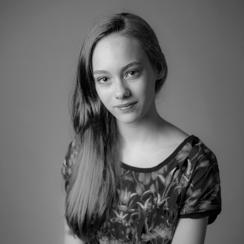
 Bethy Edit