

You are using an out of date browser. It may not display this or other websites correctly.
You should upgrade or use an alternative browser.
You should upgrade or use an alternative browser.
Allan.H 52 for 2019 WEEK 52 OUT TAKE AND FINISHED
- Thread starter Allan.H
- Start date
D
Deleted member 59779
Guest
Object: lovely snowdrop image. Like the composition and colour tones. Agree with others re the blemish under the snowdrop.
Wet: stunning image of a simple umbrella. Great use Of the rule of thirds, makes the image really stand out. Good detail in the rain drops and brolly material.
Wet: stunning image of a simple umbrella. Great use Of the rule of thirds, makes the image really stand out. Good detail in the rain drops and brolly material.
OP
- Messages
- 11,087
- Name
- Allan
- Edit My Images
- No
ThanksLike the choice to have the brolly off centre and a slight vignette to make the wet surface stand out. Really suits Mono, nice!
OP
- Messages
- 11,087
- Name
- Allan
- Edit My Images
- No
Object and wet both great images Allan but the snow drop in its simplicity is so nice. I showed this to the wife and she said it’s one for a gallery ! Nice
Thats very kind of her to say, thanks for looking in
Object: lovely snowdrop image. Like the composition and colour tones. Agree with others re the blemish under the snowdrop.
Wet: stunning image of a simple umbrella. Great use Of the rule of thirds, makes the image really stand out. Good detail in the rain drops and brolly material.
Cracking shot for Wet. Composition, tonality and the vignette all combines to make a really eye catching image.
Thanks
OP
- Messages
- 11,087
- Name
- Allan
- Edit My Images
- No
Wet
Really good, I like the vignetting and the light.
Thank you bothLove that brolly image. Superbly done, amazing detail
- Messages
- 5,432
- Name
- Andrea
- Edit My Images
- Yes
I do enjoy visiting your thread for each new theme, Allan, as it's usually a top notch idea and image - and this is no exception! An original idea that hits the 'simple but effective' mark yet again, well composed and especially well processed in B&W with an effective vignette 
- Messages
- 4,640
- Name
- Pete
- Edit My Images
- Yes
Hi Allan
Catching up on comments
Distance, on theme, good B&W tones, plenty of nice details, I like the sky.
Cold, Well on theme, I like the subtle colours and the details are sharp.
Waiting, well on theme, dogs are good at waiting, lovely portrait.
Rough, every thing is so dead on theme. love the textures everywhere.
Object, less is more works for this image. Nice processing.
Wet, very good exposure on this shot. Nice take on the theme.
Pete
OP
- Messages
- 11,087
- Name
- Allan
- Edit My Images
- No
I do enjoy visiting your thread for each new theme, Allan, as it's usually a top notch idea and image - and this is no exception! An original idea that hits the 'simple but effective' mark yet again, well composed and especially well processed in B&W with an effective vignette
Thats very nice of you to say Andrea
Hi Allan
Catching up on comments
Distance, on theme, good B&W tones, plenty of nice details, I like the sky.
Cold, Well on theme, I like the subtle colours and the details are sharp.
Waiting, well on theme, dogs are good at waiting, lovely portrait.
Rough, every thing is so dead on theme. love the textures everywhere.
Object, less is more works for this image. Nice processing.
Wet, very good exposure on this shot. Nice take on the theme.
Pete
Thanks for the catch up Pete
OP
- Messages
- 11,087
- Name
- Allan
- Edit My Images
- No
WEEK 10 FREE (SOOC)
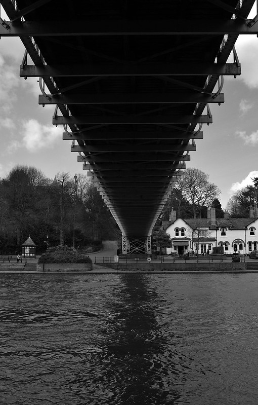
 Queens Park Bridge by Allan Howe, on Flickr
Taken on a Fuji x100f shot in jpeg which is something I never do but as I have only had the camera for a few days thought I would try the Acros setting, so its SOOC
I think the shadows could do with a slight lift and the highlights could do with pulling back a bit but otherwise quite impressed with it
 Queens Park Bridge by Allan Howe, on Flickr
This is another view of the same bridge, jpeg SOOC but I rotated this slightly in PS so I suppose it doesn't count
Queens Park Bridge by Allan Howe, on FlickrTaken on a Fuji x100f shot in jpeg which is something I never do but as I have only had the camera for a few days thought I would try the Acros setting, so its SOOC
I think the shadows could do with a slight lift and the highlights could do with pulling back a bit but otherwise quite impressed with it
Queens Park Bridge by Allan Howe, on FlickrThis is another view of the same bridge, jpeg SOOC but I rotated this slightly in PS so I suppose it doesn't count
Last edited:
- Messages
- 3,817
- Name
- Carl
- Edit My Images
- Yes
Perfect exposure with the clouds being nice and white and the shadows nice and dark. The shadows of the trees and the people going about their day add more interest to keep you looking. And of course the bridge disappearing into the distance behind the tree too. Great image.
OP
- Messages
- 11,087
- Name
- Allan
- Edit My Images
- No
Perfect exposure with the clouds being nice and white and the shadows nice and dark. The shadows of the trees and the people going about their day add more interest to keep you looking. And of course the bridge disappearing into the distance behind the tree too. Great image.
Thanks
OP
- Messages
- 11,087
- Name
- Allan
- Edit My Images
- No
Nice mono shot and very good for SooC. I agree re your own comments re the highlights and shadows but the camera has done well with such a massive dynamic range in the scene.
Thank you
OP
- Messages
- 11,087
- Name
- Allan
- Edit My Images
- No
Either image for the Sooc Allan, both well taken and they go great in Acros too.
Thanks bothI really like the first one. It's weird seeing all the people in it just as silhouettes. Make it a tad spooky
-Oy-
Worzel Gummidge
- Messages
- 9,066
- Name
- Dave
- Edit My Images
- No
Although I do like the shot - it's a good illustration as to why we edit photos. In order to retain the sky the rest is undereexposed. Of course an ND grad would be the traditional way to solve the problem but a slight shove on the shadow/highligh filter is all that's needed.
OP
- Messages
- 11,087
- Name
- Allan
- Edit My Images
- No
I agree I don’t see the point in a SOOC technique I would never use an unprocessed picture normallyAlthough I do like the shot - it's a good illustration as to why we edit photos. In order to retain the sky the rest is undereexposed. Of course an ND grad would be the traditional way to solve the problem but a slight shove on the shadow/highligh filter is all that's needed.
ThanksFree week
I'm not too sure I can pick between the two, both are very good for sooc. The first photo, does show 'life' (if you know what i mean), a kind of historical shot (not a record shot).
GarethB
Likes to peek
- Messages
- 2,291
- Name
- I don't even know anymore!
- Edit My Images
- Yes
Both images are superb Allan!
I couldn't really choose between the two to be honest, both have so much going for them.
I love the way the silhouettes of the people are framed by the trees on the slope, very effective.
The symmetry on #2 is marvellous.
Great work Allan!")
I couldn't really choose between the two to be honest, both have so much going for them.
I love the way the silhouettes of the people are framed by the trees on the slope, very effective.
The symmetry on #2 is marvellous.
Great work Allan!
OP
- Messages
- 11,087
- Name
- Allan
- Edit My Images
- No
Thank youBoth images are superb Allan!
I couldn't really choose between the two to be honest, both have so much going for them.
I love the way the silhouettes of the people are framed by the trees on the slope, very effective.
The symmetry on #2 is marvellous.
Great work Allan!
- Messages
- 4,562
- Name
- Mark Gameson
- Edit My Images
- Yes
Wet - Nice and simple image love the processing and composition very nicely done.
Free - 2 great images there Allan really like No 2.
Free - 2 great images there Allan really like No 2.
OP
- Messages
- 11,087
- Name
- Allan
- Edit My Images
- No
Thanks MarkWet - Nice and simple image love the processing and composition very nicely done.
Free - 2 great images there Allan really like No 2.
OP
- Messages
- 11,087
- Name
- Allan
- Edit My Images
- No
 Doors
Doors
Last edited:
OP
- Messages
- 11,087
- Name
- Allan
- Edit My Images
- No
I see your point Dave but I wanted to include some of the building and particularly the two signs which I have no idea what they mean.Entrance is a nice image Allan, might of been better to crop down though.
OP
- Messages
- 11,087
- Name
- Allan
- Edit My Images
- No
ThanksI like the simplicity of the Entrance image, very nicely done
OP
- Messages
- 11,087
- Name
- Allan
- Edit My Images
- No
I do like a door - and here we have two nice ones
ThanksI like that Allan, nice colour and I like the composition. The 2 signs add a something extra too, makes you wonder what is through those doors.
D
Deleted member 59779
Guest
Free: Two very good images. I prefer the first plenty of detail and tones. Lots to keep the viewer interested. Those clouds really pop.
Entrance: well composed image with some nice colours.
Entrance: well composed image with some nice colours.
OP
- Messages
- 11,087
- Name
- Allan
- Edit My Images
- No
Free: Two very good images. I prefer the first plenty of detail and tones. Lots to keep the viewer interested. Those clouds really pop.
Entrance: well composed image with some nice colours.
ThanksA nice and very symmetrical image and l like the contrasting light/dark top and bottom halves.