

You are using an out of date browser. It may not display this or other websites correctly.
You should upgrade or use an alternative browser.
You should upgrade or use an alternative browser.
Allan.H TP52 2017 WEEK 52 WEATHER ADDED
- Thread starter Allan.H
- Start date
OP
- Messages
- 11,087
- Name
- Allan
- Edit My Images
- No
Wood is a beautiful shot imo, great lighting and mono too with good texture.
Wall is a good shot, maybe a little lift on the light but I do like the shadows")
Thanks Dave
- Messages
- 7,548
- Name
- susie
- Edit My Images
- Yes
Hurrah you're back ....I didn't notice, I must pay more attention!
You ...you don't get much more specific than that, excellent idea.
Arch ...love the composition the way those arches fade into the distance
Display ...well that's certainly different, very unusual ...the cat and the baboon!
Wood ...top notch processing, I love it.
Wall ... smashing dappled shade along that walkway
Ooops I missed Occupation...interesting take on theme, it works really well, I like the triptych
Last edited:
- Messages
- 662
- Name
- John
- Edit My Images
- Yes
Bent, what a simple and effective idea Allan. B&W works well too
Wood, again the B&W adds a lot tho the atmosphere. They've lost their leaves early and the bright light shows the detail well.
Wood, again the B&W adds a lot tho the atmosphere. They've lost their leaves early and the bright light shows the detail well.
OP
- Messages
- 11,087
- Name
- Allan
- Edit My Images
- No
Thanks for looking inBent, what a simple and effective idea Allan. B&W works well too
Wood, again the B&W adds a lot tho the atmosphere. They've lost their leaves early and the bright light shows the detail well.
OP
- Messages
- 11,087
- Name
- Allan
- Edit My Images
- No
Bent; simple and very apt for the theme.
Wood; good idea to use black and white for the shot. However, I find the contrast a bit strong resulted in halos in the tree trunks.
Wall; like the straight-on viewpoint.
Thanks Stan, its not halos more the light hitting the back of the trees, it does make it very contrasty though
OP
- Messages
- 11,087
- Name
- Allan
- Edit My Images
- No
 War Graves
OP
- Messages
- 11,087
- Name
- Allan
- Edit My Images
- No
Thank youYou-very clever idea and well shot
Arch - one of the best shots in this years 52 IMHO...LOVE IT
display - quite freaky but interesting none the less
Bent -yep, that is
Wood-likeing the b/w , works well
- Messages
- 13,760
- Edit My Images
- Yes
Hey Allan
Somehow missed your 'You' image, what a great idea, very simple but extremely effective, like it !!
Bent - Another cool idea, I wish I had thought of it !! - Liking the simplicity again, the portrait crop and the vignette focusing my eye, nice one
Wood - Interesting highlights on the twigs, is that an effect or just very strong light ?? either way a good choice for the theme
OP
- Messages
- 11,087
- Name
- Allan
- Edit My Images
- No
Hey Allan
Somehow missed your 'You' image, what a great idea, very simple but extremely effective, like it !!
Bent - Another cool idea, I wish I had thought of it !! - Liking the simplicity again, the portrait crop and the vignette focusing my eye, nice one
Wood - Interesting highlights on the twigs, is that an effect or just very strong light ?? either way a good choice for the theme
Very srong light, thanks for looking
OP
- Messages
- 11,087
- Name
- Allan
- Edit My Images
- No
Thanks DaveA good symmetrical shot Allan, good colours and like the reds showing in the photo.
OP
- Messages
- 11,087
- Name
- Allan
- Edit My Images
- No
Lucky with the light storm Brian hit about half an hour afterwards, thanks for looking inPoignant image for symmetrical with good light picking out the details on the headstones
OP
- Messages
- 11,087
- Name
- Allan
- Edit My Images
- No
Very nicely done for the theme Allan, you've caught the light and really lined that up beautifully ... such young lives, very sad.
Thanks Susie, a lot of the graves are people in their early 20s, very sad indeed
OP
- Messages
- 11,087
- Name
- Allan
- Edit My Images
- No
ThanksA well taken shot Allan, good idea for the theme too
- Messages
- 9,071
- Name
- David
- Edit My Images
- Yes
The fingerprint ... top idea for You, very nicely done.
Bent ... yeah that works. They're not good with road markings up north are they? looks like water based paint, anyway, liking the vignette.
Wood ... works well, nice processing.
Wall ... says fence to me.
Bent ... yeah that works. They're not good with road markings up north are they? looks like water based paint, anyway, liking the vignette.
Wood ... works well, nice processing.
Wall ... says fence to me.
OP
- Messages
- 11,087
- Name
- Allan
- Edit My Images
- No
The fingerprint ... top idea for You, very nicely done.
Bent ... yeah that works. They're not good with road markings up north are they? looks like water based paint, anyway, liking the vignette.
Wood ... works well, nice processing.
Wall ... says fence to me.
"top idea for You, very nicely done.
" Thanks I think
"Bent ... yeah that works. They're not good with road markings up north are they? looks like water based paint, anyway, liking the vignette."
We do all our road markings in poster paint
"Wall ... says fence to me."
City walls d00d to keep out the southerners with their dodgy paint
The gravestones ... excellent idea, colour, detail and symmetry.
Thanks David and thanks for amusing me
OP
- Messages
- 11,087
- Name
- Allan
- Edit My Images
- No
 Oak leaves
OP
- Messages
- 11,087
- Name
- Allan
- Edit My Images
- No
Nice take on theme Allan, like the old worn wood and petals, nice colour and tones in the photo.
Thanks Dave
OP
- Messages
- 11,087
- Name
- Allan
- Edit My Images
- No
thank youNice shot for work Allan
OP
- Messages
- 11,087
- Name
- Allan
- Edit My Images
- No
Thank you, the light was very flat and I did desaturate it quite a bit, maybe not the best ideaHi, warn, nice contrast between the plant and the wood. Nice detail and sharp. A little under expose and the flat light didn't help.
Great POV, though.
Regards.
LC2
Negan
- Messages
- 10,447
- Name
- Tim
- Edit My Images
- Yes
Hi Allan,
Arch - Agree that there are plenty of arches, yet somehow it doesn't work for me for the theme. Possibly because there is so much going on that they take a back seat to the overall image? I like the lighting and the starburst that you've captured and the clever use of god rays in a god based location
Display - I so want to believe that the cat has just snuck into that case to take a nap. What's that all about? And why is it below a pulpit?
I didn't realise the figure was a baboon but once mentioned I can see it.
Bent - Bang on, simple, to the point. The mono processing suits it.
I think this is my favourite of my comment catchup on your thread.
Wood - Spot on theme again, but I can't help feeling more is less as I don't get a feel of a focal point in the image, just an overall wooden impression.
Wall - A bit too dark for me (though I've only calibrated the screen using the windows 10 inbuilt calibration tool).
Good use of leading lines. I've only been to chester once, and that was very recently for work, Didn't get a chance to look at the walls, we didn't get far from the canal and railway (and offices).
Symmetrical - Very nicely done. Not only on theme for the challenge, but appropriate for this time of year too.
Worn - I think that you've got the saturation about right. Too much vibrancy in an image like that would look plain odd, but this looks natural.
OP
- Messages
- 11,087
- Name
- Allan
- Edit My Images
- No
Hi Allan,
Arch - Agree that there are plenty of arches, yet somehow it doesn't work for me for the theme. Possibly because there is so much going on that they take a back seat to the overall image? I like the lighting and the starburst that you've captured and the clever use of god rays in a god based location
Display - I so want to believe that the cat has just snuck into that case to take a nap. What's that all about? And why is it below a pulpit?
I didn't realise the figure was a baboon but once mentioned I can see it.
Bent - Bang on, simple, to the point. The mono processing suits it.
I think this is my favourite of my comment catchup on your thread.
Wood - Spot on theme again, but I can't help feeling more is less as I don't get a feel of a focal point in the image, just an overall wooden impression.
Wall - A bit too dark for me (though I've only calibrated the screen using the windows 10 inbuilt calibration tool).
Good use of leading lines. I've only been to chester once, and that was very recently for work, Didn't get a chance to look at the walls, we didn't get far from the canal and railway (and offices).
Symmetrical - Very nicely done. Not only on theme for the challenge, but appropriate for this time of year too.
Worn - I think that you've got the saturation about right. Too much vibrancy in an image like that would look plain odd, but this looks natural.
Thanks for the mega catchup,
to answer the question about the cat and baboon its was part of an art display in the Cathedral they are two separate pieces.
The cat (by a taxidermist Emily Mayer) and the baboon (Michael Cooper) were both in the Consistory court they just looked odd together,
- Messages
- 104,463
- Name
- The other Chris
- Edit My Images
- Yes
Worn leaves (pardon the pun) me wondering what the oak leaves are doing there. I think they do make a reasonably good foil for the worn wood behind and I think I the edges of the leaves on the turn makes a sort of reference to the theme.. I'm probably just over-thinking it
OP
- Messages
- 11,087
- Name
- Allan
- Edit My Images
- No
Worn leaves (pardon the pun) me wondering what the oak leaves are doing there. I think they do make a reasonably good foil for the worn wood behind and I think I the edges of the leaves on the turn makes a sort of reference to the theme.. I'm probably just over-thinking it
Thats a good question, the worn table top was the first thing that I saw and thought would fit the theme but on taking the photo it was a little bland, nice texture but lacking a focal point,
I tried a pot of winter pansies which I liked the juxtaposition of the perfect against the worn wood but thought everyone would think it was about the pansies as they were very bright in the image and not at all worn,
found the oak leaves while out walking the dogs and they were a little worn which seemed to fit, so basically they are there to break up the BG
If that makes any sense.. its probably me overthinking things to be honest
- Messages
- 104,463
- Name
- The other Chris
- Edit My Images
- Yes
May be a few other leaves or bits of twig scatterd across the table top to make it look they had blown there on a windy day would do it? Anyway it works as it is and I can see that the table on its own would need something.
OP
- Messages
- 11,087
- Name
- Allan
- Edit My Images
- No
ThanksIt's got the thirds, it's got contrasting textures ... I like.
OP
- Messages
- 11,087
- Name
- Allan
- Edit My Images
- No
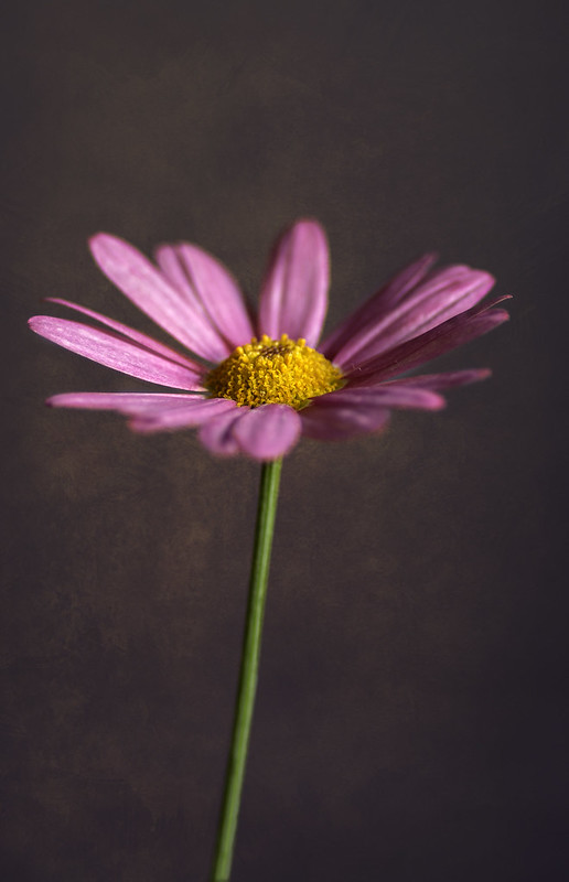 Flower