

You are using an out of date browser. It may not display this or other websites correctly.
You should upgrade or use an alternative browser.
You should upgrade or use an alternative browser.
An old favourite, critique welcome
- Thread starter Ham
- Start date
OP
- Messages
- 300
- Name
- Ham
- Edit My Images
- Yes
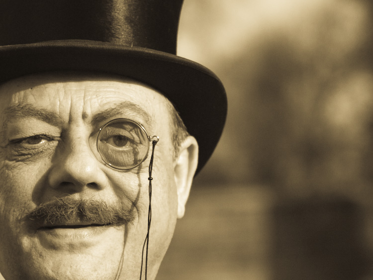
Yes, I can answer those questions. The subject is a local character, not a guest to a wedding or some such, this is more like his everyday garb. The off centre placement makes it, well, eccentric which is entirely suitable for the subject and in my view helps convey the nature of the person. The three sided crop is intended to place the person in closer proximity to the viewer than otherwise, I'd have to check but I think that was full frame rather than a post production decision. Finally the choice of monochrome (orange? if you say so) seemed to suit the subject, bridging to sepia/antique tone, yet being clearly modern.
My view of the definition of a good photo is one that makes the viewer want to have been there, to have seen what the photographer saw, I think this achieves that objective which is another reason why I like it. Interested if people agree. As I say, coming back to it after a while, there are aspects I can see could have been improved.
Here's another shot in colour, square on, which might be more suitable for nan to put on the mantelpiece but is very ordinary
- Messages
- 4,907
- Name
- Simon
- Edit My Images
- No
Yes, I can answer those questions. The subject is a local character, not a guest to a wedding or some such, this is more like his everyday garb. The off centre placement makes it, well, eccentric which is entirely suitable for the subject and in my view helps convey the nature of the person. The three sided crop is intended to place the person in closer proximity to the viewer than otherwise, I'd have to check but I think that was full frame rather than a post production decision. Finally the choice of monochrome (orange? if you say so) seemed to suit the subject, bridging to sepia/antique tone, yet being clearly modern.
My view of the definition of a good photo is one that makes the viewer want to have been there, to have seen what the photographer saw, I think this achieves that objective which is another reason why I like it. Interested if people agree. As I say, coming back to it after a while, there are aspects I can see could have been improved.
Here's another shot in colour, square on, which might be more suitable for nan to put on the mantelpiece but is very ordinary
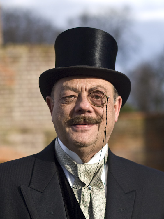
ok, I get your thinking.
I think what's really jarring is that the composition - and to some extent the lighting, shallow DoF, sharpness and pose - don't really look very Edwardian, while the processing and styling are pretty convincing.
A straight b&w conversion & more traditional 8x10 crop would look just as striking, even if the outdoor location would be a bit unusual.
