Critique Barry

Messages
6,561
Name
Gary
Edit My Images
Yes
Hi

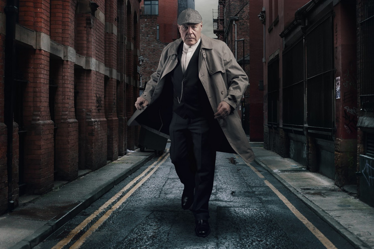
Took this photo at our camera club. Barry attends and is fast becoming more a model than a photographer. That said Barry attends the club with his wife Jen. They are very good at model photography generally doing composites.
I'm not good/confident at model photography and have not done the composite thing before.

I generally stand up when it's my turn and fire my allotted shots off "which are the same as everyone else" then delete them when home.

On this evening though I did actually suggest Barry try do this move. A week or so later I took this street snap in Manchester and attempted to put them together.
Tbh I have looked at it loads on and off and have no idea if I was on the right track or not.

Any feedback tips on how to edit it more or in a different way or even scarp it altogether. It's only for fun


Gaz

Barry-test9.jpg


'
 
He does look very dominent in the image almost like a giant , maybe scale him down to suit the road / buildings
 
looks like chatham docks...
its a tropical illusion in some ways...psychologists used photos like this to illustrate perception variations
like it
ps...i thought we were getting a shot of Barry vale of glamorgan...:oops: :$
 
I find the catch-light in only one eye is distracting, and I don't think the disparity in scale between the two photos works. Sorry.
 
Overall I think it was a good first attempt.
The lighting direction is consistent which is HUGE in a composite. And he looks "planted" in the scene rather than hovering in it.
IMO, the only thing that doesn't quite work is the scale. If it were me, I would make him smaller and I would place him a bit farther back in the scene to take more advantage of the leading lines. Tonally, I think he is a touch warmer than the lighting in the scene.
 
Last edited:
If scaling the figure down as Steven suggests, then you could perhaps try moving him a bit to the left to hide the paladin (bin on wheels) in the background and see how that looks?
 
Thats great I got some replies.Not sure why but I thought it may not throw up any response.
So thanks to everyone responding.
He does look very dominent in the image almost like a giant , maybe scale him down to suit the road / buildings
Yes you are correct Allen. I did do that intentionally but maybe it's not cool. The fact you picked it up though means I did get that right.
its a tropical illusion in some ways...psychologists used photos like this to illustrate perception variations
like it
We ll you learn something everyday :)
I find the catch-light in only one eye is distracting, and I don't think the disparity in scale between the two photos works. Sorry.
Never thought about the catchlight. Well spotted. Would you remove it or add one to the other ? Remove it looks a bit more moody then ?
No probs if the idea is not your cuppa tea.
Overall I think it was a good first attempt.
The lighting direction is consistent which is HUGE in a composite. And he looks "planted" in the scene rather than hovering in it.
IMO, the only thing that doesn't quite work is the scale. If it were me, I would make him smaller and I would place him a bit farther back in the scene to take more advantage of the leading lines. Tonally, I think he is a touch warmer than the lighting in the scene.
Hi Steven. Great info. I explained the scale above but i'm not averse to playing with this. Didnt think of the lines.I placed him up front as to get the feeling he was coming at ya. I did a layer without the lines but seemed to prefer them left in.
Surprised he looks a bit warm as I thought I had desaturated him quite a bit. If you seen the colour of him at the begining. "Orange in comparison" Again I can play with that.
If scaling the figure down as Steven suggests, then you could perhaps try moving him a bit to the left to hide the paladin (bin on wheels) in the background and see how that looks?
Good point.
Thanks Heath.

Gaz
 
Last edited:
Excellent first attempt this. I like the dominant aggression of the MC you have gone for to match the BG scene with the vanishing point behind the MC. Do leave the bins in, as it adds context. As though he is about to pull a gun. But I also agree you need to scale and tone match for better realism. Make him blend into the shadows more, as it will be even more threatening. Good shot!
 
Excellent first attempt this. I like the dominant aggression of the MC you have gone for to match the BG scene with the vanishing point behind the MC. Do leave the bins in, as it adds context. As though he is about to pull a gun. But I also agree you need to scale and tone match for better realism. Make him blend into the shadows more, as it will be even more threatening. Good shot!
Hi Nick. Thanks for stopping by and leaving some great feedback. I will give it some more looking at as soon as poss. Blend into shadows more ? I'm assuming you mean darken the lighter areas on the subject.

Gaz
 
Fabulous attempt.
Overall I think it was a good first attempt.
The lighting direction is consistent which is HUGE in a composite. And he looks "planted" in the scene rather than hovering in it.
IMO, the only thing that doesn't quite work is the scale. If it were me, I would make him smaller and I would place him a bit farther back in the scene to take more advantage of the leading lines. Tonally, I think he is a touch warmer than the lighting in the scene.

Agreed, but I quite like the tonal distinction. It's something I occasionally aim for in non-composites.

The next thing to get right after scale & lighting direction is the position of the horizon; the implied horizons of all the elements need to line up. You've pretty much done that here.

The shadows under his feet don't look quite right to me. Can you use more of the shadow from the original?
 
Fabulous attempt.
Thanks Simon. Great feedback.Appreciate the time taken. There is no shadows on the original image. When I get chance to have a play at re scaling Barry and darkening him down a touch. I'll upload the starting photo's. I am a bit hesitant at scaling him to much as I sort of like the giant figure.

Gaz

Creating realistic looking shadows from scratch is one of the hardest things to do in photoshop IMO.

Sometimes you can get some mileage out of creating a solid black & white version of the original figure, then blurring, inverting & transforming it, possibly with a perspective warp. It needs to be harder edged & darker near the feet, more graduated further away.
 
Creating realistic looking shadows from scratch is one of the hardest things to do in photoshop IMO.
I must admit it didnt take to long to create those. Thats maybe why they don't look to good ! I just painted black onto a new layer at various flow rates most likely added some blur and maybe transformed it a touch to fit roughly the area I thought looked ok.

Gaz
 
Apologies for not getting back to the post. I got carried away with other things and forgot this photo. Probably not the best time for me to re scale the fella before going to bed !
So I made him smaller, darkened him a bit and deepened the shadow below him. Also tweaked the overall image.
Not sure if it's worse or better. I have no doubt that when I see this in the morning i'll think why on earth didnt I take some more time over it and do it at a sensible time.

Gaz

Barry hat eye fix.jpg
 
Last edited:
Really good to see the starting point, I really like either of the edits. I can see the potential issue in scale on the first, but it still works for me.
Thanks Rick

@juggler Mentioned the shadows on the ground and tbh I didnt know what to do with them. Just coming back to reply and I can now see that the shadows should fall as they do in the original photo of Barry. Which for some reason I couldnt see them before.

Thanks again.

Gaz
 
Last mess around with this. Putting it to bed now ! I keep coming accross it and messing a bit more each time.

Gaz

Barry Comp.jpg
 
Last edited:
Back
Top