Bear, Fish, Bride, Groom.

Messages
3,884
Name
Danny
Edit My Images
No
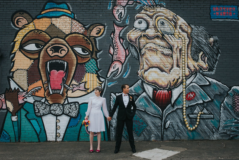
Just started the usual culling process from yesterdays wedding and thought I'd share this one. I'd scouted for portrait locations a few times leading up to the wedding but only came across this spot the day before.

Fully expect this to be marmite too but it hit the couples brief :)

Hope & Ben Preview by Danny Birrell, on Flickr
 
The brief, to summarise, contained the words urban, slightly edgy, different and colourful.

It's definitely busy but I think it works.

Urban - defo
slightly edgy - I'd say slightly is an understatement
different - errrr yes
colourful - bang on

If the above is the brief, you've nailed it, and some!

Other than the white patch, for me the groom is looking too much to the left.
But I'm nitpicking here.
 
I think It would have worked better as a portrait orientation with the couple in front of the left character. It would put them bigger in the frame and remove the need to clone out the white patch in the floor.
And my weird imagination would have stood them in those poses with the fish spine coming out at the line of their mouths. I may even have lined that up and got them to scream, but like I said, I'm a bit weird.
 
Very nice. Although I think the two should have swapped positions and come a little closer to the lens as it would make their outfits 'pop' a little more from the colours in the background. Just my opinion :)
 
I think It would have worked better as a portrait orientation with the couple in front of the left character. It would put them bigger in the frame and remove the need to clone out the white patch in the floor.
And my weird imagination would have stood them in those poses with the fish spine coming out at the line of their mouths. I may even have lined that up and got them to scream, but like I said, I'm a bit weird.

Like it, but it looks a smidge under-exposed and lacks contrast for my taste - both dress and suit look very grey rather than white and black.

Very nice. Although I think the two should have swapped positions and come a little closer to the lens as it would make their outfits 'pop' a little more from the colours in the background. Just my opinion :)

Thanks for the feedback guys! (y)
 
Back
Top