

- Messages
- 1,080
- Name
- Shaun
- Edit My Images
- Yes
Right Guys let rip ")
Got to be more to Photography than Sports
I have put up the non cropped version and a A & B cropped version
which way would you of gone,
Oh on a side note hows the image
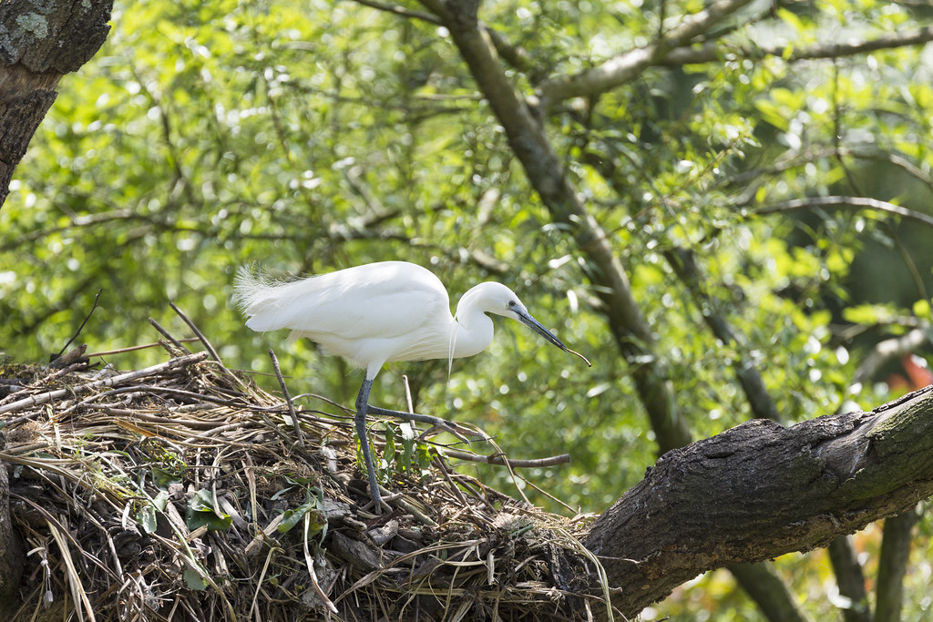 No Crop by Shaun Lafferty, on Flickr
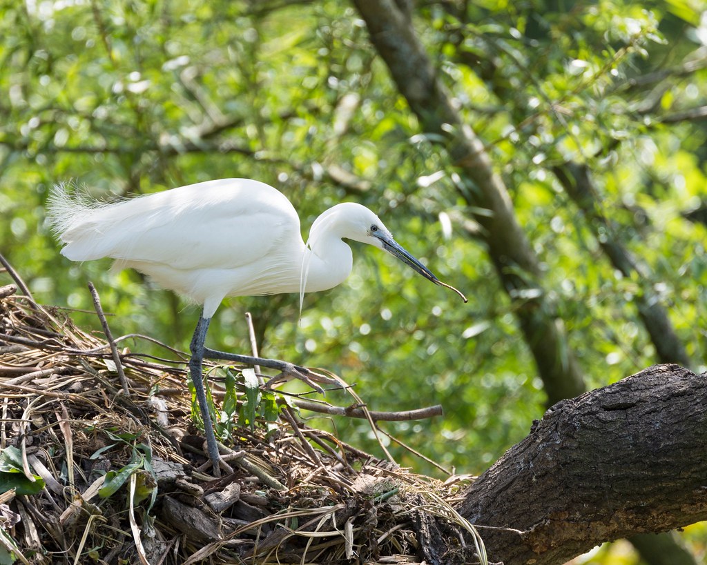 Crop A by Shaun Lafferty, on Flickr
 Crop B by Shaun Lafferty, on Flickr
Got to be more to Photography than Sports
I have put up the non cropped version and a A & B cropped version
which way would you of gone,
Oh on a side note hows the image
- Nikon D7200
70.0-200.0 mm f/2.8 - ƒ/2.8
- 200.0 mm
- 1/1000
- 100
No Crop by Shaun Lafferty, on FlickrCrop A by Shaun Lafferty, on FlickrCrop B by Shaun Lafferty, on Flickr
Last edited:
 No Crop 2