Critique Black and white, long exposure, silhouette

Messages
29
Name
Dave
Edit My Images
No
Hi all, I wasn't really sure where to post this as you can guess by the title.

Its a picture of my dad when we were out photographing a lighthouse. I know it is probably wrong to call a 25sec shot a 'snapshot' but i just turned my camera and managed to catch him waiting on an exposure to develop. I don't do much (any) B&W so I would appreciate critique on both in camera and post and what I could have done to improve the image.

My opinion is that the foreground is too dark, but a few people I've asked have disagreed. I was using a graduated filter, but perhaps i could have used a longer exposure to capture more detail in the foreground but that could have washed out the sky?
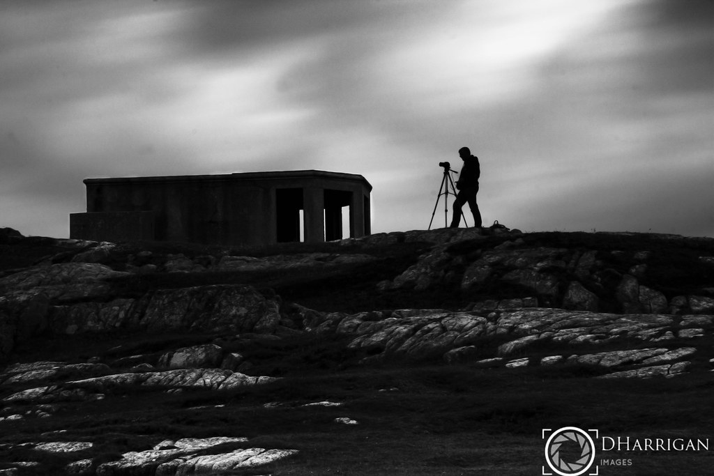
The lonely stand by David Harrigan, on Flickr
 
Hi Dave. I absolutely love b&w. This is a really good shot - the silhouette is perfect and I think the foreground is fine - just enough detail to give a sense of it's rugged nature. I suppose the only slight critique is with regard to the absence of detail in the rear part of the building. Could you lighten that a shade do you think? Great shot either way.:clap:
 
More or less as Carl says, but for sure I'd lose the watermark ...
 
Hi Dave. I absolutely love b&w. This is a really good shot - the silhouette is perfect and I think the foreground is fine - just enough detail to give a sense of it's rugged nature. I suppose the only slight critique is with regard to the absence of detail in the rear part of the building. Could you lighten that a shade do you think? Great shot either way.:clap:

Thanks very much.

I appreciate your thoughts on the foreground, that's pretty much what I've been told before so that adds validity to what I've already heard.

I actually darkened the building to tie in with the silhouette, it's an old military bunker/building and was a very boring shade of plain grey concrete.
 
More or less as Carl says, but for sure I'd lose the watermark ...

I do quite a bit of Motorsport photography and have had a good few images stolen in the past and used without credit, so it's a habit of mine when posting anything online.

I know it's completely unnecessary on an image like this, but I do it purely through habit.
 
How about cropping the foreground to bring the horizon on the lower third and just a touch more detail in the building?
 
I agree with above. Adding more to the foreground would have detracted from the silhouette. Great image!
 
Or cropping a bit of sky to bring the horizon to the upper ground? With such strong blacks and a lot of stone in the frame it makes a really strong/bold picture.
 
How about cropping the foreground to bring the horizon on the lower third and just a touch more detail in the building?

I think cropping the foreground would loose what ever detail is there and would take to focus towards the darker unlit areas.

I'll have a play with the cropping this evening though and see how it looks (y)
 
I agree with above. Adding more to the foreground would have detracted from the silhouette. Great image!

Thanks, that's an interesting viewpoint that I hadn't even considered. Could also have made the frame cluttered in contrast to the clean lines of the silhouette. Thanks very much
 
Or cropping a bit of sky to bring the horizon to the upper ground? With such strong blacks and a lot of stone in the frame it makes a really strong/bold picture.

When I am looking at the cropping, I'll consider cropping this way too. Thanks
 
Back
Top