
- Messages
- 2,993
- Name
- Clive
- Edit My Images
- Yes
Great idea and well done!Loved the old B&W Batman series with Adam West and Burt Young, good shot.
Fuji Dave are we the same age?

Great idea and well done!Loved the old B&W Batman series with Adam West and Burt Young, good shot.
Great idea and well done!
Fuji Dave are we the same age?
1959 so 61!1961, so 59.
Batman! ... don't suppose there's anything more instantly recognisable. Well done!
The other one is adorable.
Film
Well I didn't have to use too many brain cells guessing what the film is, which is good.
A clever use of shadow and light. I don't have any issues with the sharp or not sharp bits, it all works pretty well.
I do wonder if an elongated shadow would work too.
Your second shot is also very good.
For me, Silence of the Lambs wins out (if that's what it is?). I think the inventiveness in it stands out over Batman.
Really nice lighting control on both. I got a few polystyrene heads for lighting tutorials at college. Since that job went bang they're just cluttering up the house making people think we're weird.
As much as I like the Batman one, the Silence of the Lambs one is breathtaking.
Thanks Stuart, I get the point about the different sharpness in the shadow, some others have mentioned it too. I think it would be difficult to change that to be honest because of the way the shadow falls off as it gets further away.Film title
It's always interesting to play with light and shadow creating something that doesn't exist. The sharpness of the bottom edge breaks the simplicity of the shadow image, for me anyway. Butterfly image is fantastic, a great use of your already proven skills with the wire. I might pick up one of those head's for a future theme, though I've got that much material I've kept a hold of just incase, it might not be a good idea. I've regularly stopped something going in the bin as I see potential in its re-use!!
 ) and you are quite welcome to have one or two (male & female) if you wish. Just private message me your address and I will post them on to you if you like.
The Batman shot it brilliant in it's simplicity (of the graphic, not the shot.... I bet it took ages). Just the iconography and the mood. Direct and foreboding.
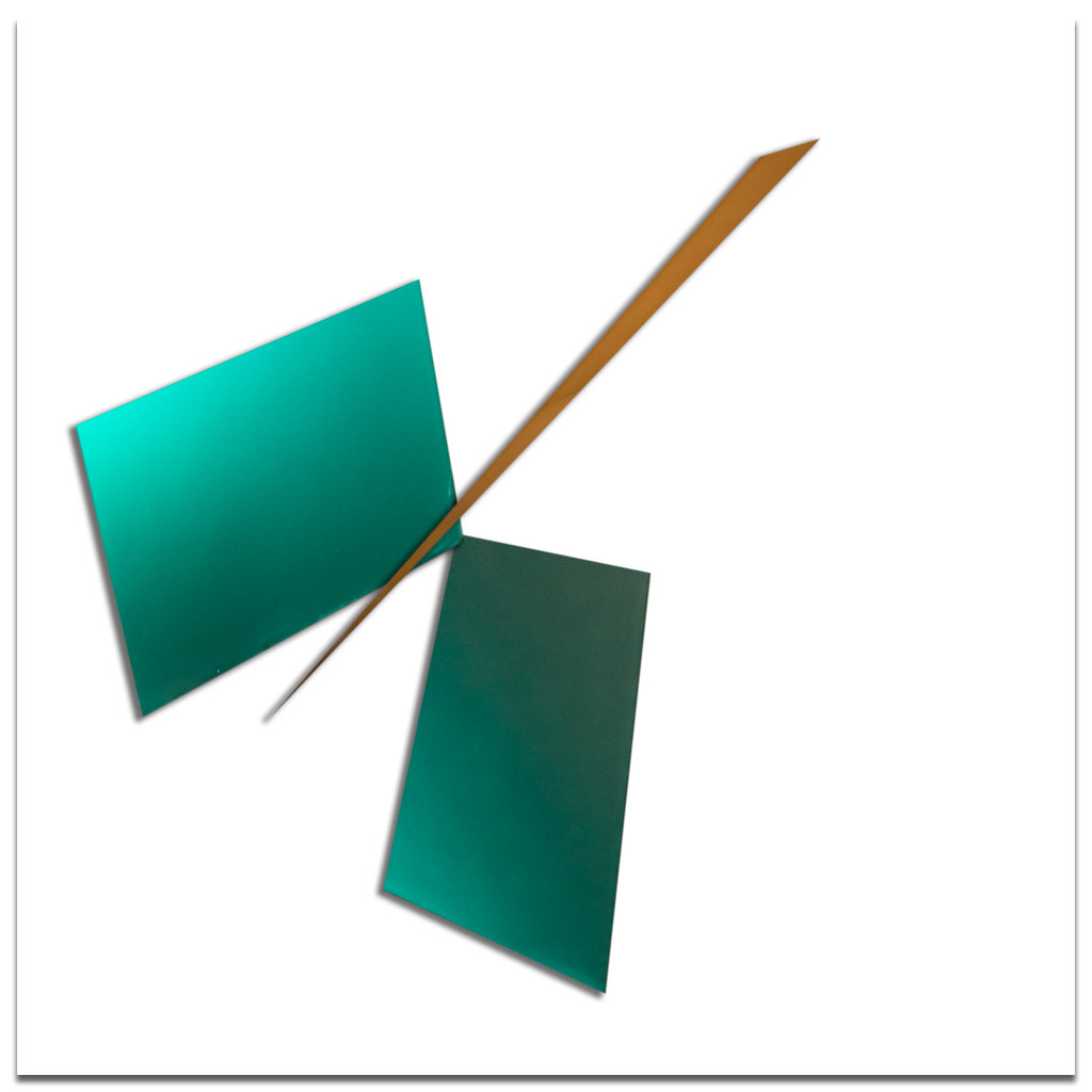 Week 8 - Half by Iain Blake, on Flickr
I can't really offer anything more constructive than "I like it" I'm afraid.
I think it's quite interesting in that one knows that the artist has chosen to display these elements in this arrangement and thus there is not really any element of randomness that usually accompanies a traditional photograph. I'd probably go so far as to say it's not really a photograph any more even though it "came from" one.
Inventive, and as you say, thought provoking...
I guess it kinda looks like a knife cutting something into two pieces. That was my first reaction before I read your summary. But whether that was because I was coming into the thread expecting "halves" I don't know. When I read that it was something you'd constructed, I went back to it for a bit longer but nothing more triggered. The colours are pleasing, and I like the sharp edges and angles, but it doesn't "speak" to me like (for example) that other piece you did a while ago which was an arrangement of architectural abstracts.
But I'm no art critic that's for sure!
Well I thought knife cutting paper on first glance Iain, as far as the image goes I really like it, I think simple clean lines can be really effective.
I followed your link to Kazimir Malevich. I’m not sure if I actually get it, I think the images are pleasing on the eye but I feel there is little resemblance to anything other than abstract shapes in the final result. I hope I’m not sounding too negative, I love the way you think outside the box and present something so different each week.
Iain, when I first saw your photo for this week, knowing that the subject was half or halves, I thought it must be some kind of fraction depiction, with the numeric parts replaced by coloured shapes.
Having now seen your explanation, I must admit to being even less clear on quite how the image fits the theme - but I'll be honest and admit that I haven't referred to the linked website on Malevich. The only work of his I know is the black square.
I suspect this beholder's share is lacking.... sorry
No worries Paul.Excellent idea and well executed. I really like the depth of field and colours.
Don't know much about knots even though I like fishing. I like the shot very colourful and vibrance.
Iain, that knife thing is certainly intriguing, nice to study, with classy colours.
The rope is striking too. But doesn't fill the frame
Mrs d00d's just walked in, saw your Half, said "ooh that's nice"
Was it my initial shot that your good lady liked?
Yep, I don't know what she saw in it. But like me, she likes the colours and the simplicity/minimalism.
Half stitch knot for me, as easier to understand.
Half
The abstract image certainly makes me think. The green parts look a bit like bird wings, although that vision doesn't work with the brown thin slice. Can you use any part of the donor image or just the physical elements? I see an interesting image using the triangle of sky with the two adjacent slim triangles, one of which you use in the image
I've just spotted your other half, so to speak. I had thought it looked like a chopstick that had split a pane of green glass in half - and thus is on theme.
Fascinating idea and sounds like a fun project.
Two good images for half, for quite different reasons.
#1 Growing up, art was always taught as being quite literal and it's only really been recently that I have got into more abstract forms of art. This is partially due to my son being very frustrated by art at school being largely about accurate drawing which he finds very hard. We have been trying to encourage him to look at other representations of art that he might be able to express himself in. While I didn't really get the theme through your image I did appreciate the thought and background that has gone into it and do like the image overall.
#2 Nice bright and vibrant and a knot that fits the theme. I also love a nice thin DOF which this has yet still shows the detail in the important parts.
Interesting concept although probably not my cup of tea - too much of a "purist photographer". My first thought was a butterfly.
The colour and light on the second image is really vibrant.
I think that's really cool. From your post you would never know the geometric shapes were parts of a building, the long object actually puts me in mind of a (styalised) chop stick.
 Double Half Hitch