

- Messages
- 3,307
- Name
- Nick
- Edit My Images
- Yes
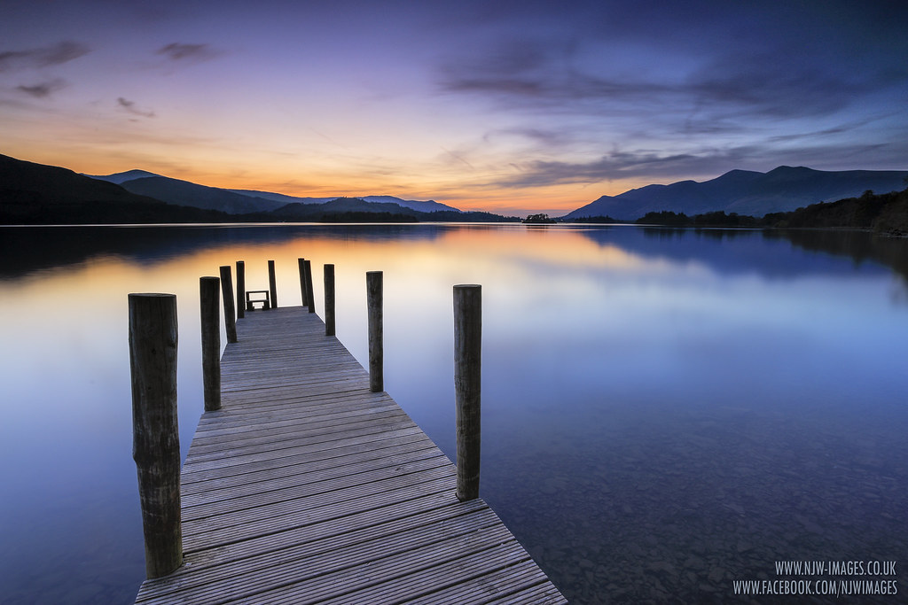
Sunset from Ashness Landing, Derwentwater on Thursday night.
CANON 6D + 17 - 40L
LEE 0.9 Soft grad
30 sec // f11 // iso 50 // 17mm
Thanks for stopping by")
Nick
CANON 6D + 17 - 40L
LEE 0.9 Soft grad
30 sec // f11 // iso 50 // 17mm
Thanks for stopping by
Nick


