

You are using an out of date browser. It may not display this or other websites correctly.
You should upgrade or use an alternative browser.
You should upgrade or use an alternative browser.
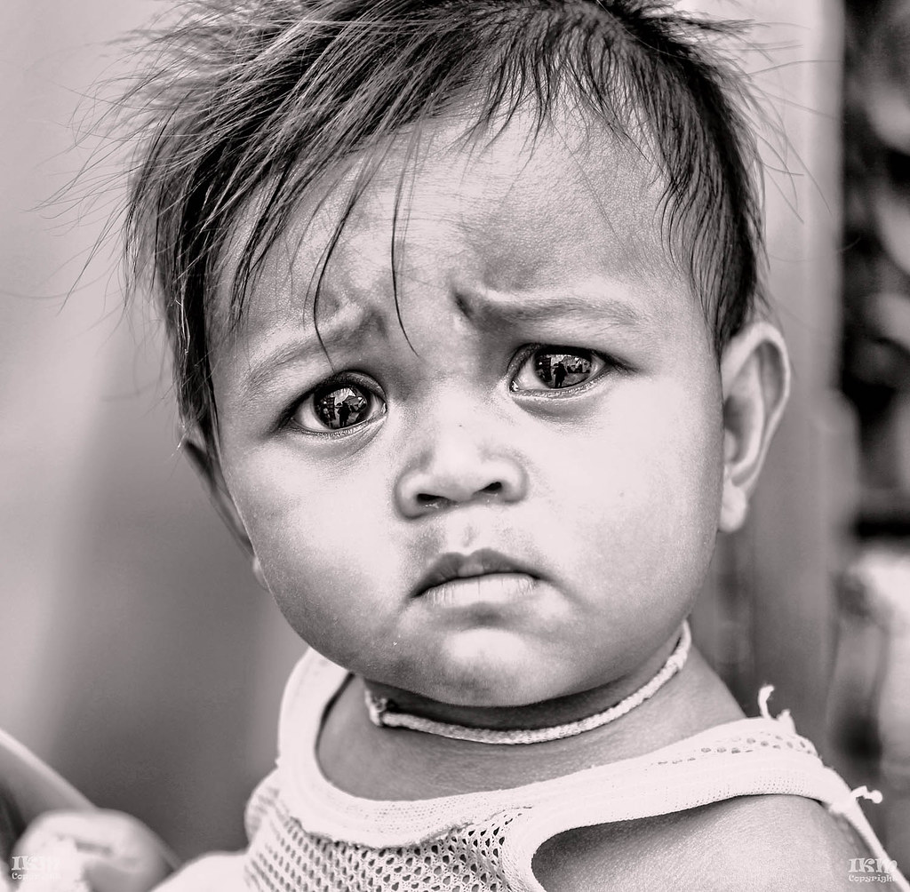
B&W Cambodian Child
- Thread starter kissfoto
- Start date
- Messages
- 50
- Name
- Mark
- Edit My Images
- Yes
Wow those eyes!
")
- Messages
- 2,040
- Edit My Images
- No
A dramatic picture, no doubt with a dramatic story behind it.
A good capture, but so sorry for the little blighter.........
A good capture, but so sorry for the little blighter.........
OP
- Messages
- 1,777
- Name
- Ian
- Edit My Images
- Yes
Great expression & light but I'm not a huge fan of the processing. It's a personal thing but for my taste it's somewhat oversharpened and looks like the clarity/structure is turned up a bit far.
Of course everyone has their different likes and dislikes with regard to processing. Take your point !! Very little post done on this apart from turning it BW and a little toning.
Last edited:
- Messages
- 17,349
- Name
- Bob
- Edit My Images
- Yes
Works for me. I find it a very thought provoking image. I like the processing.
- Messages
- 12,611
- Edit My Images
- No
Ian, a lovely image and expression - which i am sure that you enjoyed taking and reflecting upon
IMHO - I find the processing too harsh especially in the highlight areas, which although not technically blown, have lost detail and almost turned to "silver"
I am also not too much of a fan of seeing that much reflection (of the photographer and his bg) in the subjects eyes
I would liked to have seen a softer version, but hey, that's just my opinion and anyway it is a good image reflecting meaning and quizical surprise
Well done
Last edited:
OP
- Messages
- 1,777
- Name
- Ian
- Edit My Images
- Yes
Ian, a lovely image and expression - which i am sure that you enjoyed taking and reflecting upon
IMHO - I find the processing too harsh especially in the highlight areas, which although not technically blown, have lost detail and almost turned to "silver"
I am also not too much of a fan of seeing that much reflection (of the photographer and his bg) in the subjects eyes
I would liked to have seen a softer version, but hey, that's just my opinion and anyway it is a good image reflecting meaning and quizical surprise
Well done
Thanks for your comments and I take on board what you have said it has given me food for thought.
- Messages
- 13,582
- Name
- Dean
- Edit My Images
- No
Heartbreaking but beautiful.
OP
- Messages
- 1,777
- Name
- Ian
- Edit My Images
- Yes
OP
- Messages
- 1,777
- Name
- Ian
- Edit My Images
- Yes
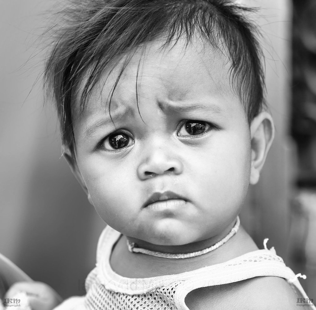
Much nicer!
I agree but I still like to experiment its what photography is about to me, not perfection (always) but interpretation, if you get my meaning.
- Messages
- 23,496
- Name
- Toni
- Edit My Images
- No
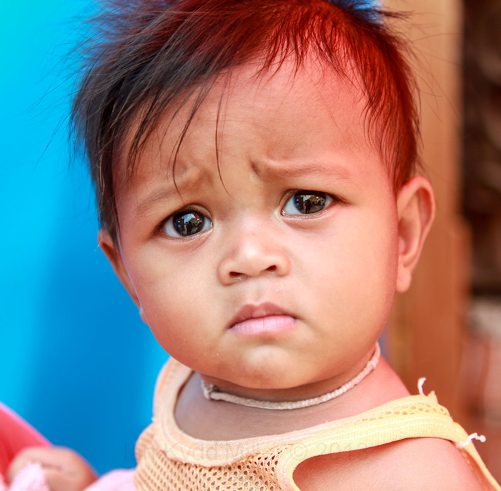
The rework is more aesthetically pleasing and less like a picture in a newspaper, but also lacks a little of the impact of the first. I'd be inclined to try variations running between the 2.
- Messages
- 2,469
- Name
- Adam
- Edit My Images
- Yes
Nice shot Ian. For me I prefer the colour but like you say, always best to go with how you interpret a scene.
For what it's worth, I'd consider keeping these as a set on one thread rather than post every shot on a new one... The photo board's starting to feel a little flooded
For what it's worth, I'd consider keeping these as a set on one thread rather than post every shot on a new one... The photo board's starting to feel a little flooded
OP
- Messages
- 1,777
- Name
- Ian
- Edit My Images
- Yes
The rework is more aesthetically pleasing and less like a picture in a newspaper, but also lacks a little of the impact of the first. I'd be inclined to try variations running between the 2.
I am experimenting with those variations until I get what pleases me. Sometimes good to go back and start again.
Nice shot Ian. For me I prefer the colour but like you say, always best to go with how you interpret a scene.
For what it's worth, I'd consider keeping these as a set on one thread rather than post every shot on a new one... The photo board's starting to feel a little flooded
I thought this was one thread.
- Messages
- 4,906
- Name
- Simon
- Edit My Images
- No
I thought this was one thread.
I think @UaeExile means your various other threads on similar themes. It's tricky to find a balance between putting too much in one thread and flooding the forum.
Whichever - keep 'em coming, though.
- Messages
- 2,469
- Name
- Adam
- Edit My Images
- Yes
I think @UaeExile means your various other threads on similar themes. It's tricky to find a balance between putting too much in one thread and flooding the forum.
Whichever - keep 'em coming, though.
This.
Didn't mean to sound arsey. Just think it's quite clearly a set of images with a similar theme.. So one place would be better (and avoid flooding the board)
OP
- Messages
- 1,777
- Name
- Ian
- Edit My Images
- Yes
This.
Didn't mean to sound arsey. Just think it's quite clearly a set of images with a similar theme.. So one place would be better (and avoid flooding the board)
No problem just did not understand what you were meaning as it was not my intent to have the discussion that has developed in numerous threads, just the way it happened. Apologies.
OP
- Messages
- 1,777
- Name
- Ian
- Edit My Images
- Yes
I prefer the first but then I do like my B&W 'gritty'
It's more dramatic and not as soft as the reprocessed and original.
Personally I agree with you but just wanted to show that the original image was capable of producing a softer, and to some, more acceptable result. Thanks for looking and commenting