
- Messages
- 232
- Name
- Roxanne
- Edit My Images
- No
Soooooo sweet... Brilliant shot!

Thanks Helen.I agree Pete, the colour is gorgeous. Good dof and those water droplets make a lovely image.
Thanks Allan, for your comments on both pics.Seemed to have missed your needle shot good use of depth of field and nicely composed agree about the colour on your flowers the water droplets add something too
Cheers Tim.Colours work well and the droplets add to it.
No issue with the lighting from me, I like strong light, it gives strong contrasts.
Thanks Phil. I'd just watered and thought I'd try a couple of pics.The water drops make the image more interesting.
Cheers Clive.Great colour, nice detail and the water makes it better.
Thanks Stan. Much appreciated.The colour is beautiful and the water droplets just add that extra special touch.
Merci Chris.Nice colours, Pete, and as already said the droplets add a little je ne sais quoi to it.
Thanks Dave.That's a superb shot! Looks like they're stiking their tongues out to catch a drop")
Cheers Jim.Really nice detail on your SC image., the colours are really nice and the DoF really works well.
Much appreciated Graham.Nice, the water droplets certainly draw the eye to it as well.
Thanks Mark.Small: Excellent use of DoF The colours work really well too.
Snappers Choice: Very nice detail and colour.
Thanks very much Roxanne.Soooooo sweet... Brilliant shot!
 TP52 Week 26 by Peter C, on Flickr
Thanks Pete. The yellow dot was on the petal and I was going to take it out but forgot!Hi Pete
I like the colour and DOF of the main flower against the muted background. Top Shot. There is a small yellow dot on one of the lower petals, not sure if its should be there or not (It shows more on Flickr.
Pete
Thanks Clive.Nice detail and composition, and a nice colour too.
Thanks GrahamThat's quite some separation between the subject and background, it almost looks unreal! Lovely gradients in the flower.
Very nice image for Mother Nature Pete
Thanks Allan.That flower really does stand out perfect bit of focus and depth of field
Cheers Alex. It was a bit of an experiment with that focal length but the separation made it a bit different from my usual pics of flowers.Great colours - the droplets make it, and the DoF force the eyes to focus on the most relevant point. Nicely done.
For Mother Nature - the separation is almost too much for me. But the colours are stunning.
Thanks Tim.Interesting effect around the in focus flower. I know it isn't, but it has the effect of an un-feathered mask and composite.
Cheers for that Dave.Nice flower shot Pete
Thanks again Mark.Very nice image for Mother Nature Pete
 TP52 Week 27 by Peter C, on Flickr
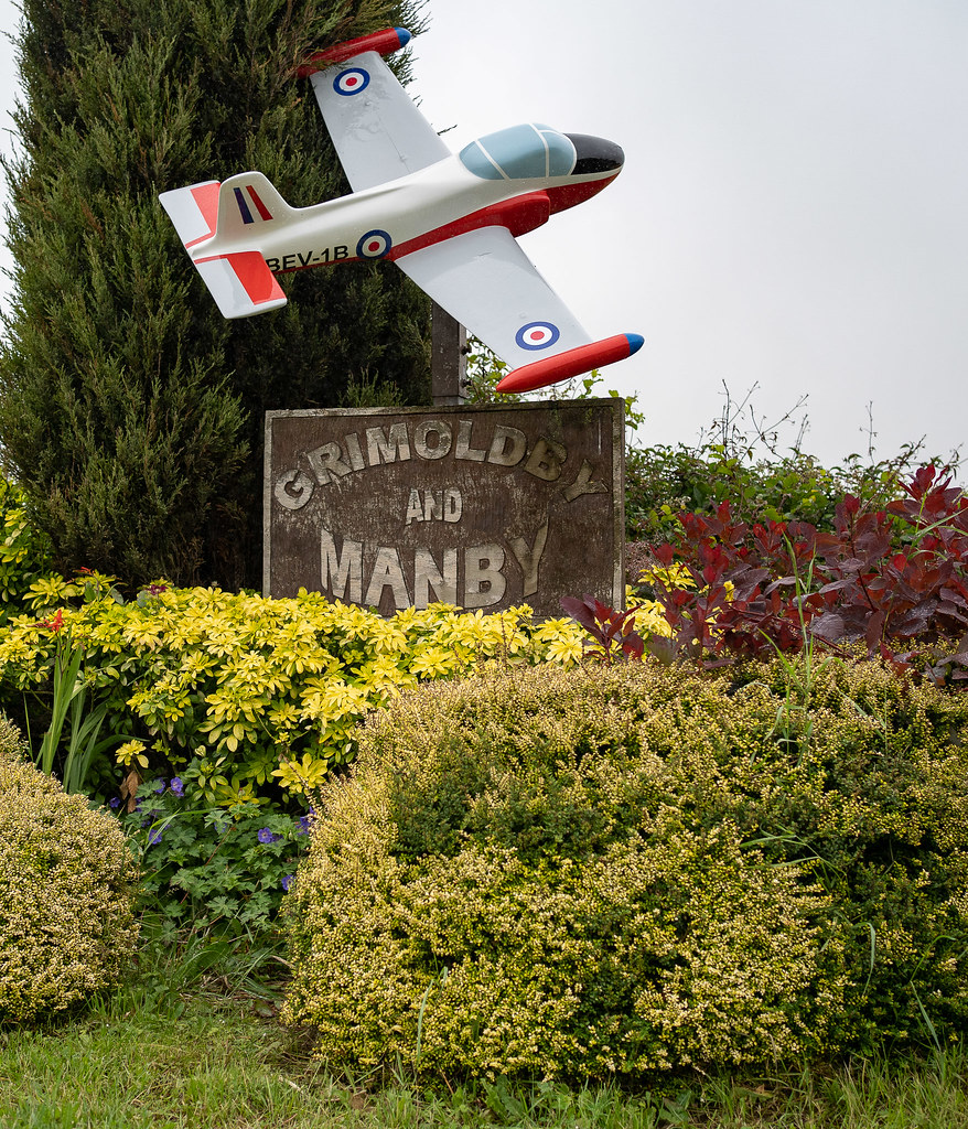
At first glance I thought that someones toy plane had got stuck in a tree
Thanks Dave. Lots of old RAF bases in that area.Nice sign - "Toy planes ahead?"
Thanks Clive.Nice signage and good colours to contrast with the grey sky.
Cheers Jim. You're right about the grey sky setting the colours off.I'm not sure it was the worst day to photograph it, for me the flat grey sky really sets the rest of the image off, not sure if a blue/cloudy sky would have worked so well. Plenty of interest and nice colours and the foliage really works to draw the eye around the image.
Very colourful shot... and if very sunny there may have been too much shadow.
The colours make it - sure the sky is a little dull, but the would have been hellish contrast otherwise I'm guessing.
A good colourful photo. I like the textures in the sign.
Interesting contrast of the old sign and shiny model plane.
Sign - Nice and colourful draws you in to the image.
Thanks Clive. It's diffused natural light and a tinfoil reflector in front of the camera.Nicely lit Pete you have lost the shadows really well
Thanks Allan.Nicely composed picture and bang on theme
Cheers Bob.Nice take and very well set out.
Thanks Chris. The two larger ones are keys to medieval churches and I thought I'd add the modern one for size comparison.Interesting old keys Pete,
As mentioned well lit too.
Thanks Tim. I was going to take a shot with the key in the church door but the church was 40 minutes drive away and as usual I didn't shoot it until 20 minutes before work on a Thursday morning!Bang on for the theme.
Very well shot with the even lighting on the background, but dunno, I think I'd like to have seen some context... Maybe...
Many thanks Alex.Great technique shown there on the lighting - nice collection of old keys.
Cheers Phil.Nice composition of keys old and modern.
Thanks Jim. There was a certain amount of Lightroom work to bring out a bit more detail.That's a really well thought out, and executed image. You've got the light bang on and a lovely amount of detail. Also, smack on the theme.
Thanks Dominic. That's a good way of looking at it.Good clean white background.
It's like a Goldilocks scene, one's too big, one's too small and one's just right.
 TP52 Week 29 by Peter C, on Flickr
 TP52 Week 28