

- Messages
- 573
- Name
- Derek
- Edit My Images
- Yes
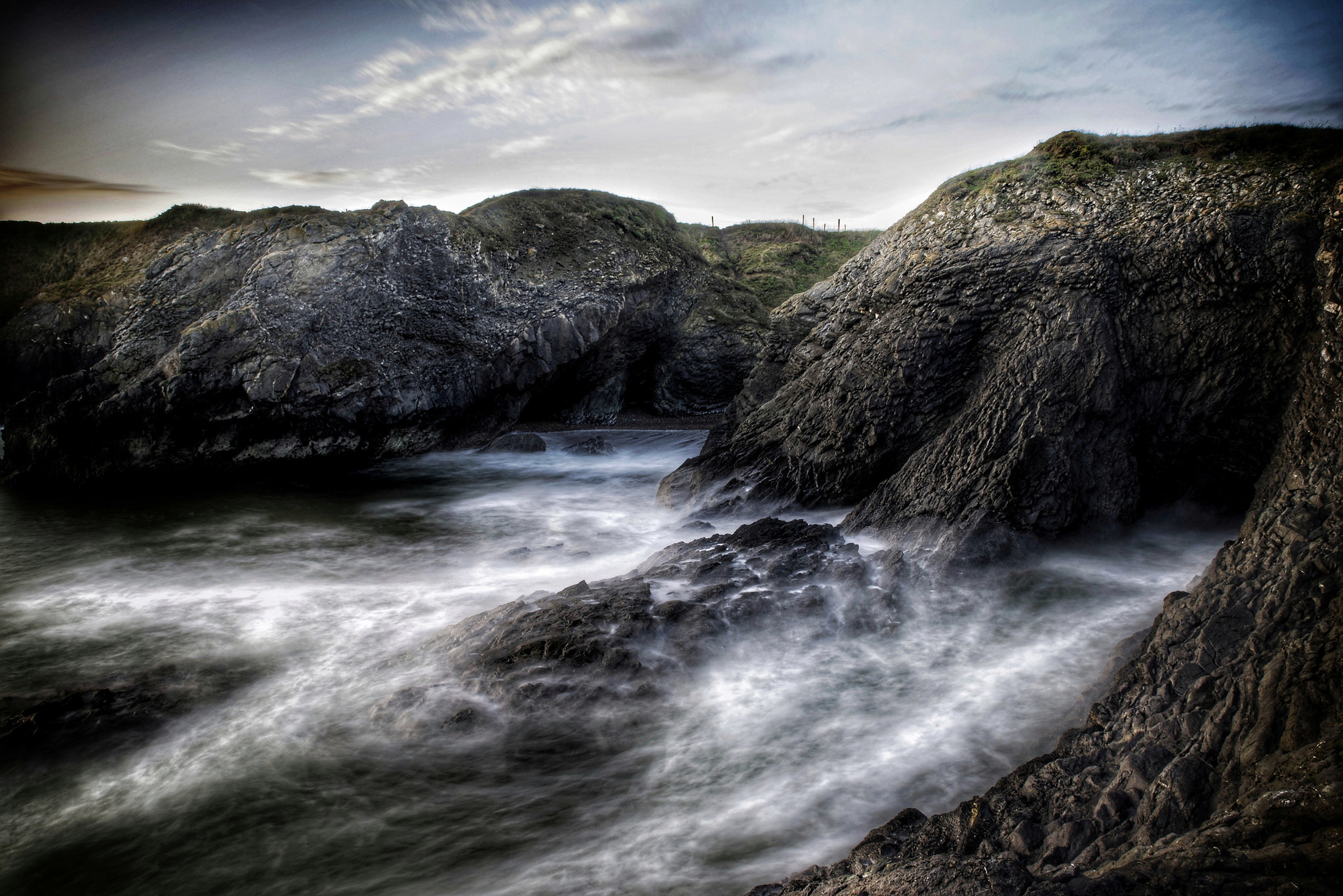
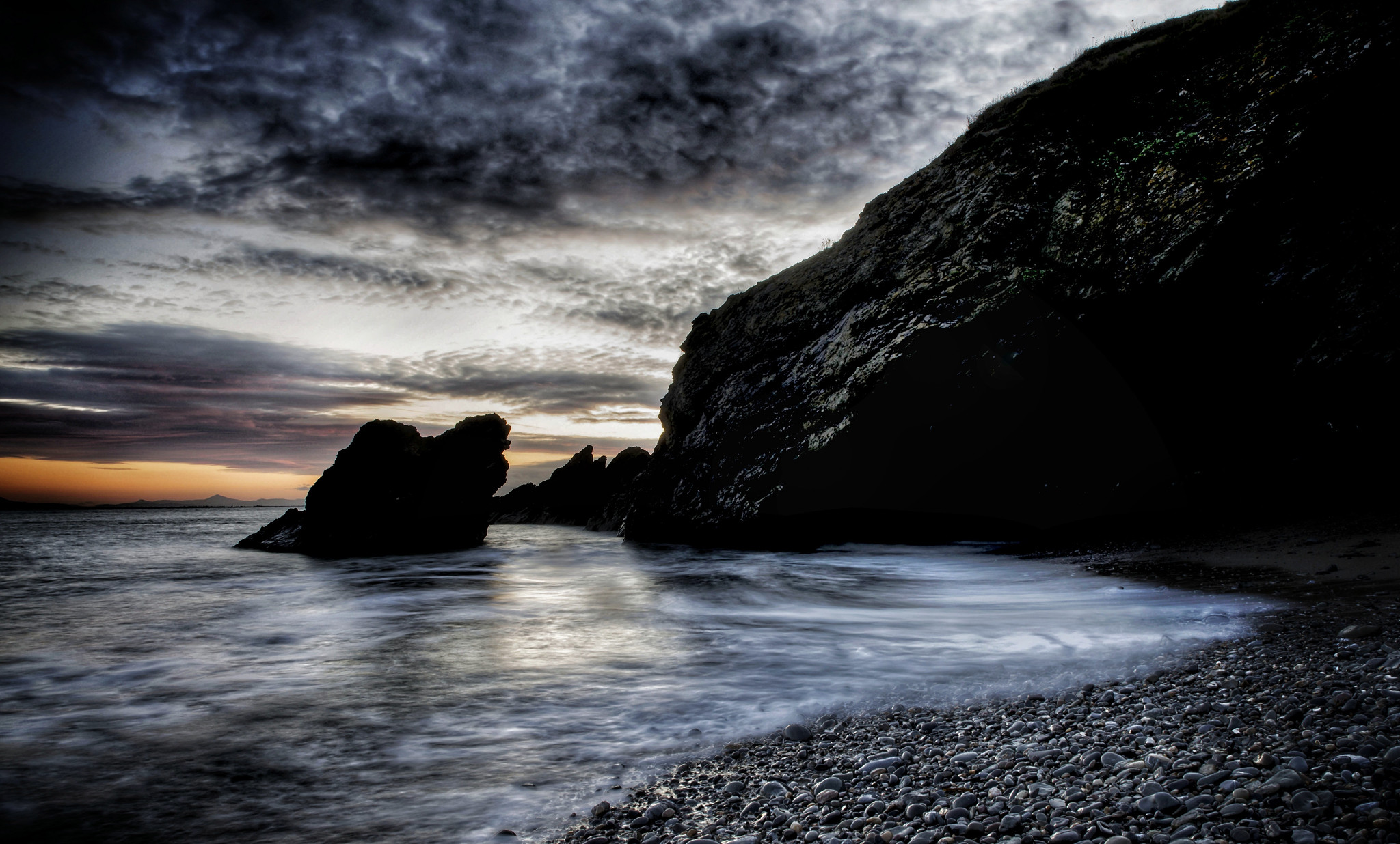
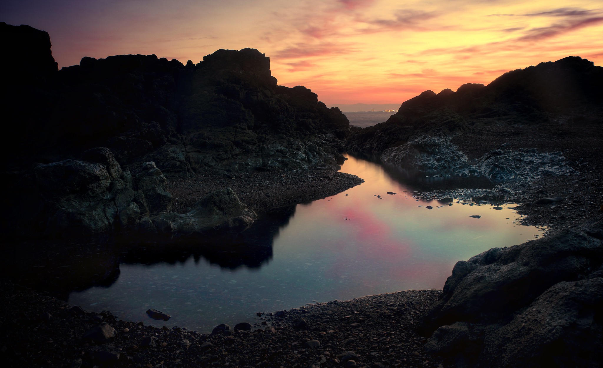
Discovered a new coastal spot to visit, Its only an hours drive away so not too far to travel,
Been shooting mostly macro so its nice to try my hand at something else.
PP wont be to everyones taste, but optimized for ph based viewing
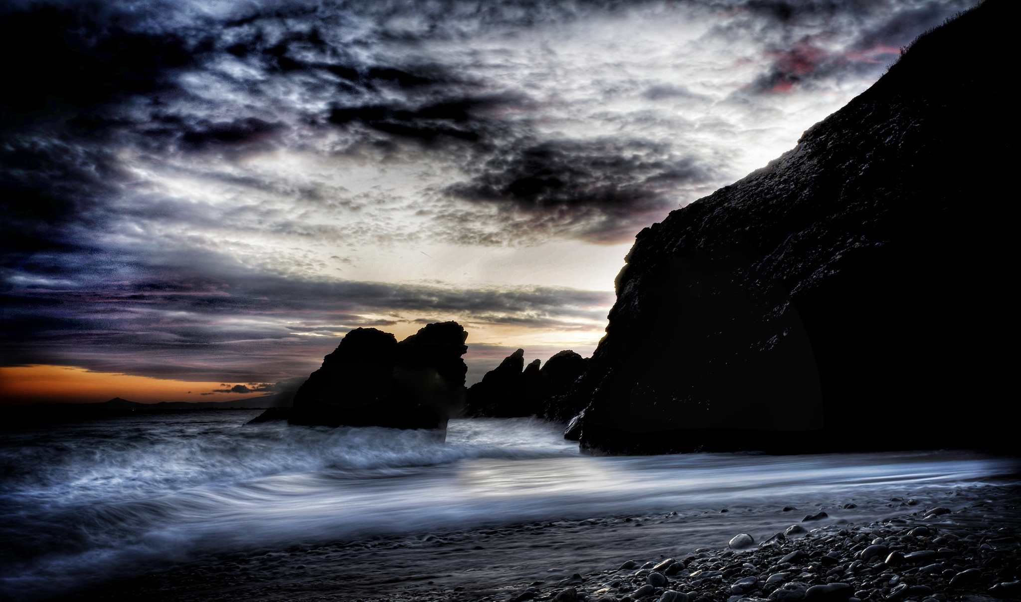 portraine 123_o by dr.shutter, on Flickr
 portraine123456b_o by dr.shutter, on Flickr
 portraine 23-1 by dr.shutter, on Flickr
 portraine1234_o by dr.shutter, on Flickr
 portrainecliffo by dr.shutter, on Flickr
 portraine12345o by dr.shutter, on Flickr
Been shooting mostly macro so its nice to try my hand at something else.
PP wont be to everyones taste, but optimized for ph based viewing
portraine 123_o by dr.shutter, on Flickrportraine123456b_o by dr.shutter, on Flickrportraine 23-1 by dr.shutter, on Flickrportraine1234_o by dr.shutter, on Flickrportrainecliffo by dr.shutter, on Flickrportraine12345o by dr.shutter, on Flickr")
 2020-01-01_11-29-38-01
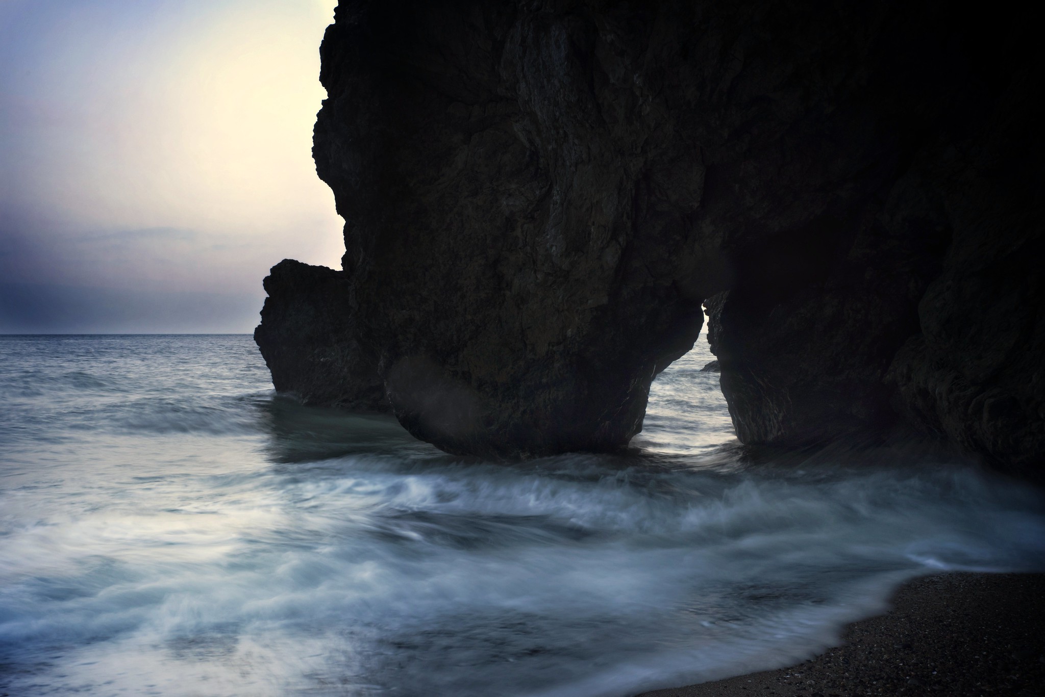 2020-01-01_11-30-05-02-01
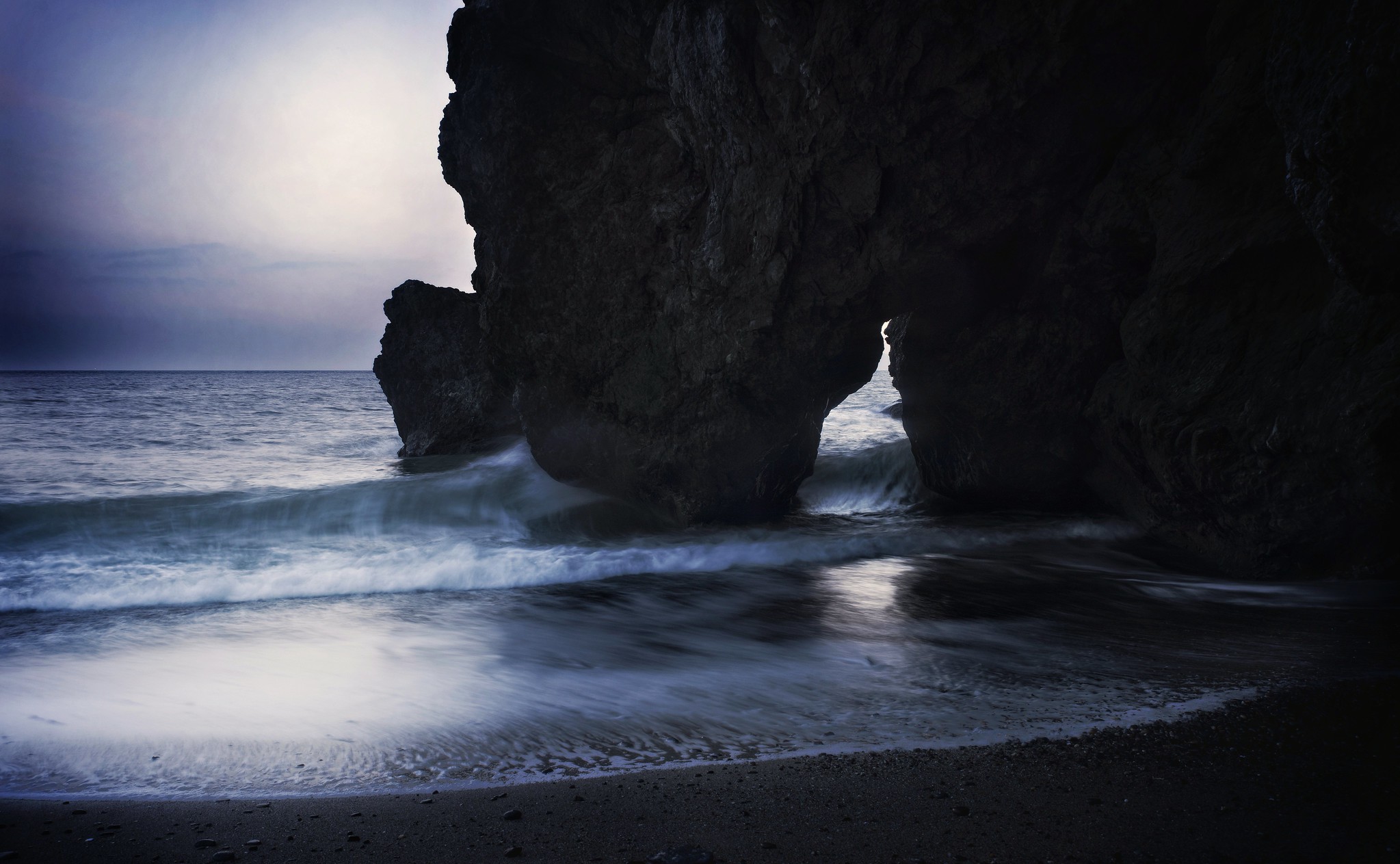 2020-01-01_11-29-56-02-01
 IMGP2221edsm
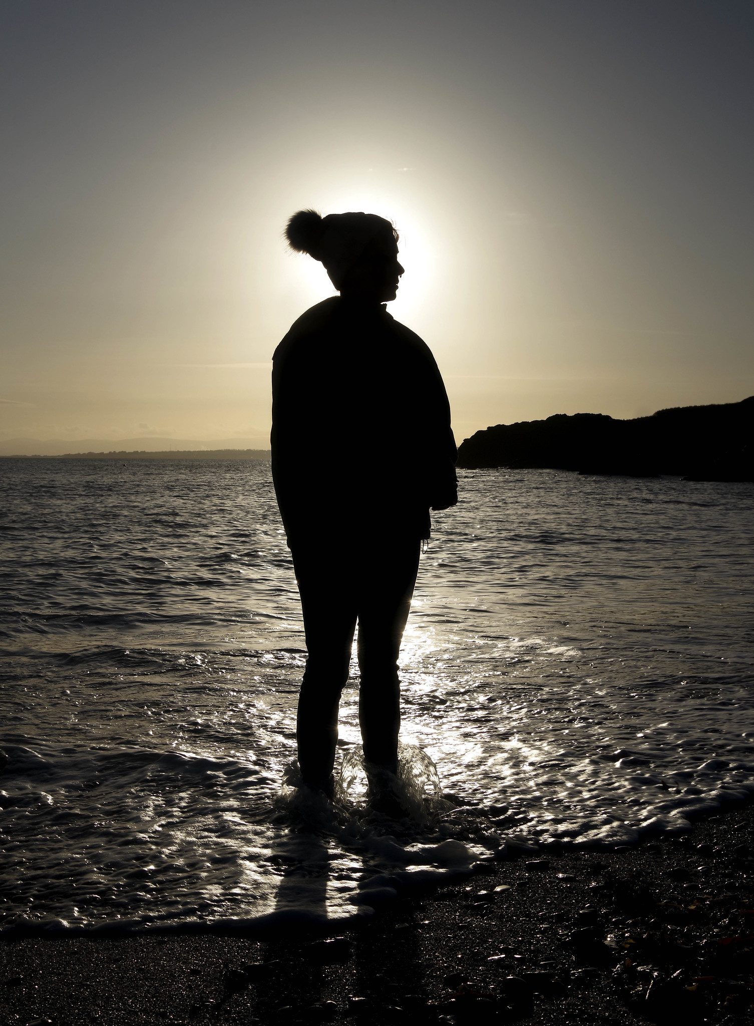 IMGP2194ed2sm
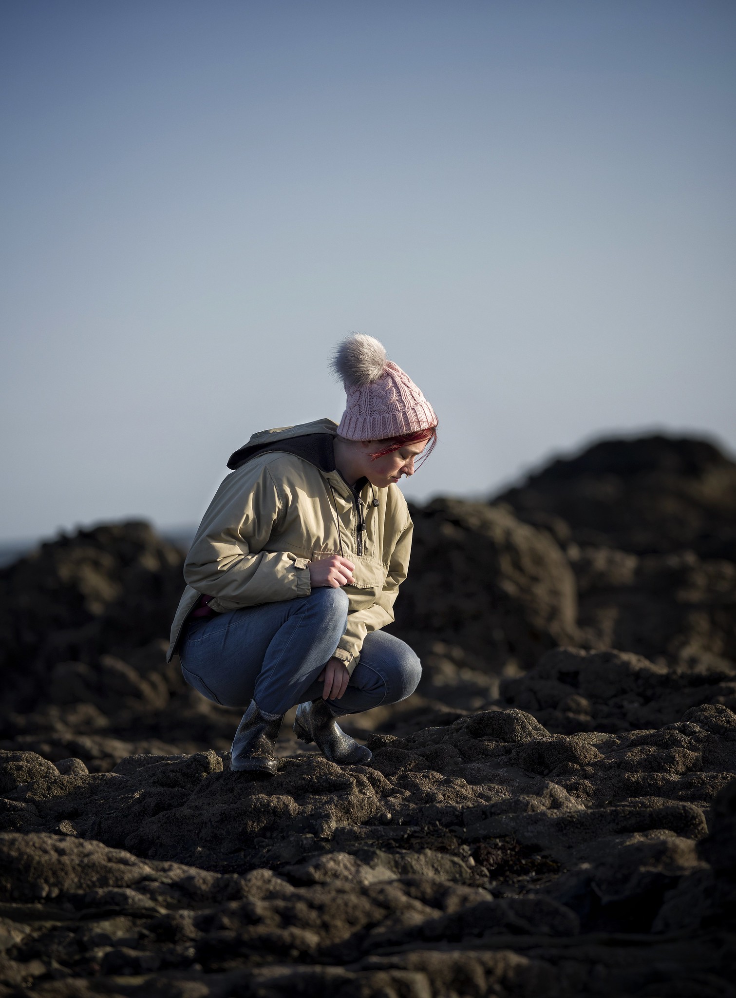 2020-01-04_01-09-07-01
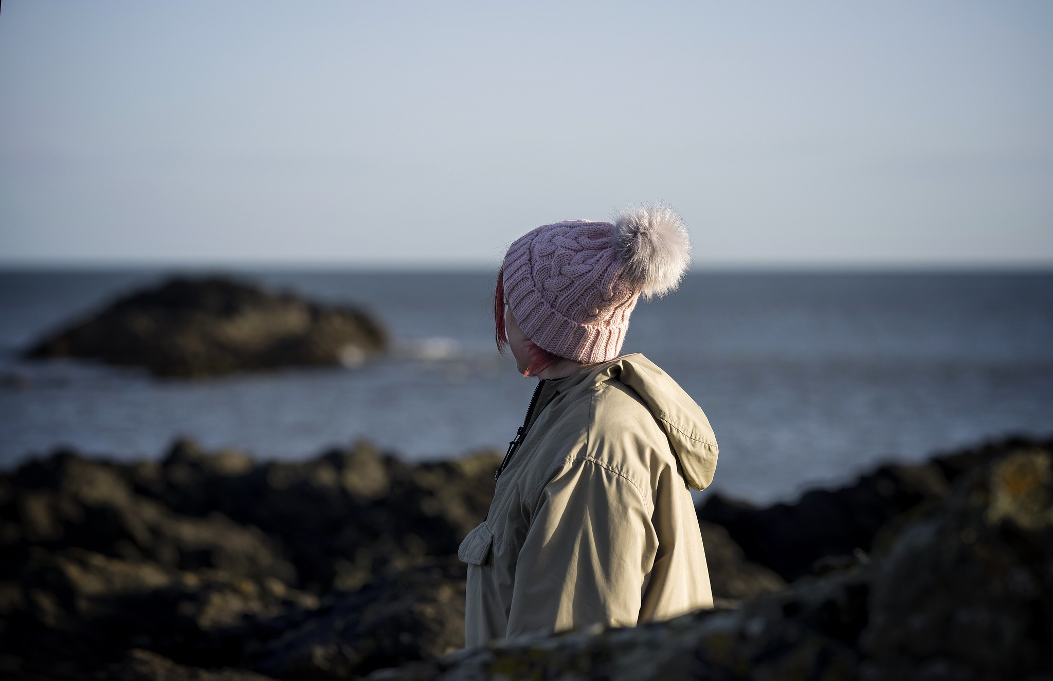 2020-01-04_01-08-26-01
 IMGP2304edsm