- Messages
- 103
- Name
- Joe
- Edit My Images
- Yes
I wasnt really sure if these images fit into this forum or not so I do apologize if they don't.

")
I'd probably have put them in 'general' but there are urban aspects too and it really doesn't matter.
It's much easier to offer crit if you can embed them, either via an external host like Flickr, or by uploading them to TP's galleries, and then posting the full size images in the page - otherwise one is switching back & forth between image and text box.
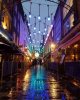
1) Nice colours, good lead lines & composition, looks soft (possibly because of small size). The junk to the right of the lamps & ladder spoils the skyline for me, & I'd try to clone it out if possible.
2) Nice colours (again) good strong lead lines, looks soft. It's not quite level, image tilting down to the right.
3) Not keen on the image over an image effect here. Main image tones need controlling a little more, lifting shadows, holding back highlights, otherwise comments above apply. Image tilting down to the right.
4) Nice simple abstract, otherwise comments as 1). If it were mine I'd want to soften the onionrings in the very dominant bokeh-balls.
5) Least impressive of the set as presented here. Main image - blown highlights & garish colours, needs better control over highlight & shadow tones plus lack of contrast and excitement. IMO image needed to be shot to place the subject higher, although if I hide the background image with my arms over the screen the main photo looks better balanced.
This is only intended to be helpful, and not personal in any way.
Thank you so much for the very good critique I look forward to more from yourself when I post in the future as it was extremely helpful.