Never seen one of those before what great colours.
Thanks Bryn, and thanks for taking the time to consider all the images and make specific suggestions about them.
For the most part I think we're seeing things rather differently, but that's fine of course, and please don't let my responses below put you off. They may come across as overly defensive, but they are certainly not intended as a brush off. It's just that in this case I really think I'm seeing things differently, perhaps in a rather fundamental way, and it wouldn't be helpful say nothing and/or seem to go along with your suggestions out of politeness. Whether we (not just you and I, but us generally here) agree or not on such things, it's good to be discussing them, having things pointed out to us that we may not have noticed, trying alternatives, explaining our different perspectives, incorporating what we have learnt into our routine capturing and processing techniques and our experiments. That way lies progress and improvement.
Incidentally, on the subject of seeing things differently, my experience with one of the little groups I run is reinforcing just how differently different people can see things. One of the ladies in one of the groups has very discerning eyes and we have discussed a number of images in minute detail. It turns out that her visual system and interpretations place more of an emphasis on colour than line compared to how I see things. For example, I was convinced in one pair of images we were scrutinising that image A, was sharper than image B. The other member of the group present thought the same as me. She insisted though that image B looked sharper. It turned out that I was concentrating on edges but she was seeing very subtle nuances in colour in the plainer areas and was interpreting that as greater texture and therefore more detail. It's a subtle business, and no right and wrong I think. I suspect that some sort of visual system difference(s) may be playing into our impressions here.
Actually, thinking through your comments in detail brings another thought to my mind. You are very much into getting in close, whole subject or part of subject, I am very much into working further out, subject in context or at most whole subject. On reflection I think that may be a significant element in our different feelings about the compositions.
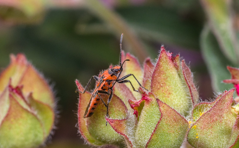
#3 is my personal fav though background needs to be blurred more as rather cluttered. Maybe a situation a mounted background would work.
The clutter, soft of line and colour, looks fine to my eye; in fact it is one one of the main attractions of that shot for me. I certainly wouldn't want to use a mounted background. I'm photographing animals in their natural context, and in any case I prefer more going on in backgrounds, and more randomness in what is going on in backgrounds, than can be provided by a mounted background.
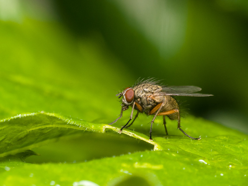
#1 crop off flower head bottom left by cropping from lhs
For me that would unbalance the image, moving the subject too close to the lhs for comfort unless there were a corresponding (lesser) cut of the right edge and top, but this would move the image more towards a subject shot and away from a subject and context shot, which is what this was about for me. In that light, irrespective of any top and rhs cuts, cutting off the lhs would remove a nice (for me) piece of context.
The square crop with central subject is deliberate, with the two cut off leaves on left and right at the bottom acting symmetrically as "stabilisers"/"anchors". A cut on the left would destroy that effect.
maybe clone out leaf on that side
This too would unbalance the twin stabilisers effect, and remove some context that to my eye adds to the image.
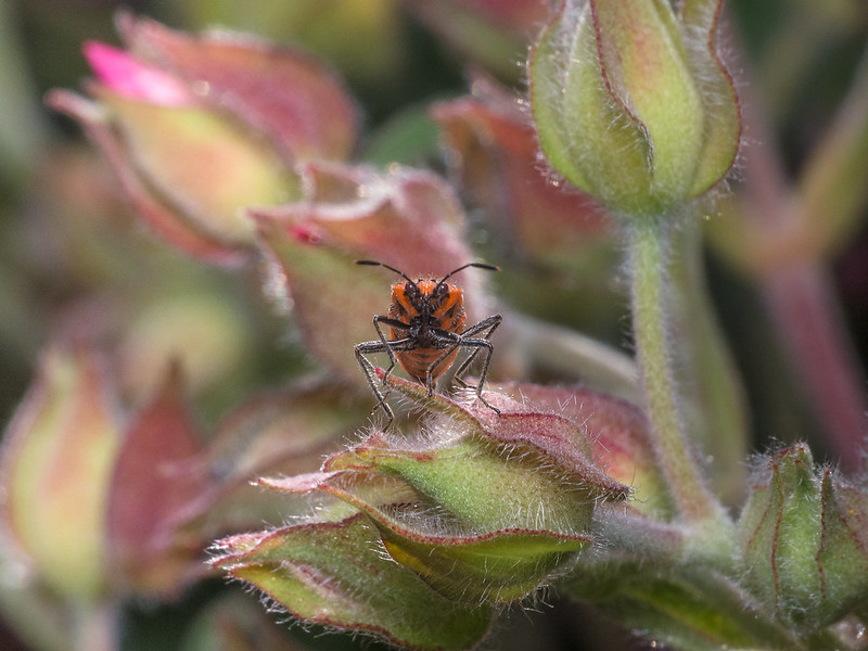
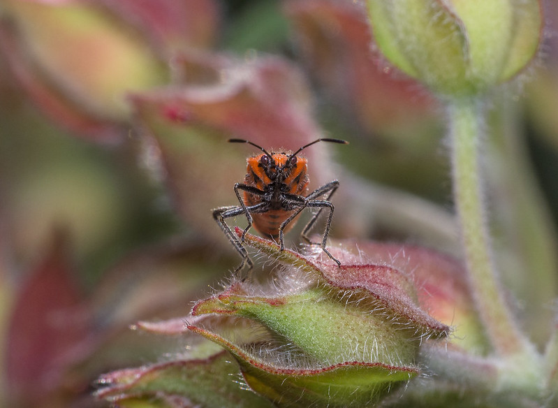
#3 crop tad off top but only to put bug on 3rd line
No! The whole point is that it is looking straight at us, and centralised. Let's not get fixated by 3rd lines, it can stifle creativity.
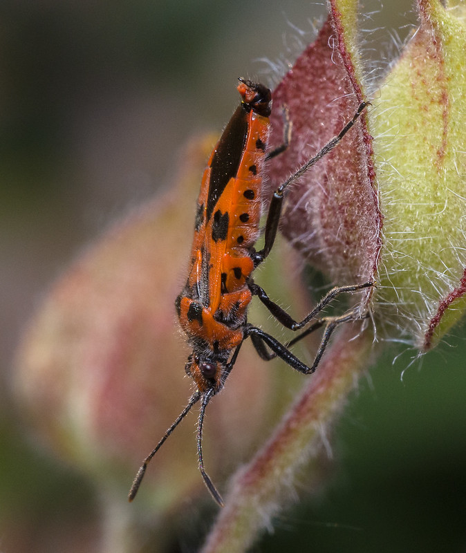
#4 portrait crop imho would improve it.
That's one I thought about too, but decided to leave it like it was. I decided that the greater "mass" at the sides reinforced the impression of it being "down in amongst the foliage, peering out", especially as its right antenna and front right "foot" are obscured by the leaf. A portrait crop would lose that effect I think.
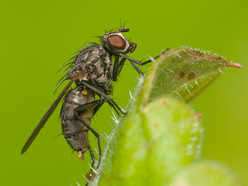
#7 crop a little off top again to put subject on top 3rd Line.
Possibly a slice off the top, but not that much. Putting the subject on the 3rd line would I think move the line with all the refracted colours too close to the top for my taste, and that line is an integral part of the image for me. Besides which, I'm happy with the centrality of the subject with this one.


")