
- Messages
- 4,288
- Name
- Neil
- Edit My Images
- No
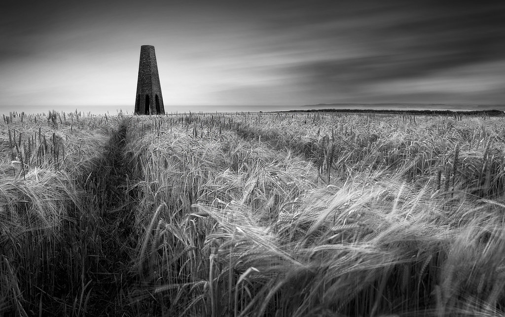
Really can't make my mind up on this one! Light was poor so I've done a mono conversion which i was pleased with at first, but not so sure now!
Last edited:

Nice, as the path leads to the monument on the horizon.
")
I like it a lot, Neil.
It works Neil, a keeper for sure. The light doesn't look so bad, the corn is glowing and the clouds are lit.
Nice, as the path leads to the monument on the horizon.
Perfect and exactly how I feel about this shot
Good work Neil
I like it Neil. The detail is in the corn and the textures give the shot lots of depth.
Yes Gary it is indeed! Thanks for the comment.Lovely, is that above Kingswear
Thanks Chris, much appreciated.Cracking shot, like it alot.
Always hard on myself Rob, thanks for the comment.works for me
Don't be so hard on yourself!
Thanks youExcellent image
James
Thanks Mark, The horizon and Daymark are straight , I think it's the sloping field that makes it look like it's leaning slightly.I really like this. Although there's movement everywhere the monument anchors it all. The mono works very well too. Defo a keeper.
Is the monument leaning very slightly to the left? Probably just me........
Thanks RobertWorks for me.
Many Thanks GaryCracker mate, at one of my favourite locations, guessed it was one of yours from the thumbnail on the front page
Thanks RogerI really like this. The sky, the monument and the corn all sit nicely together. I bet the colour version looks good also.
Many Thanks Ruth, really appreciate it.I'm not seeing much wrong here either.
Nice conversion, good lines, simple composition.
I like it a lot.
I like that Neil, plenty of detail. Is there a colour version at all?