Beginner Creative In Newcastle

Messages
114
Name
Steve
Edit My Images
Yes
Hi guys, My first post here so go easy…

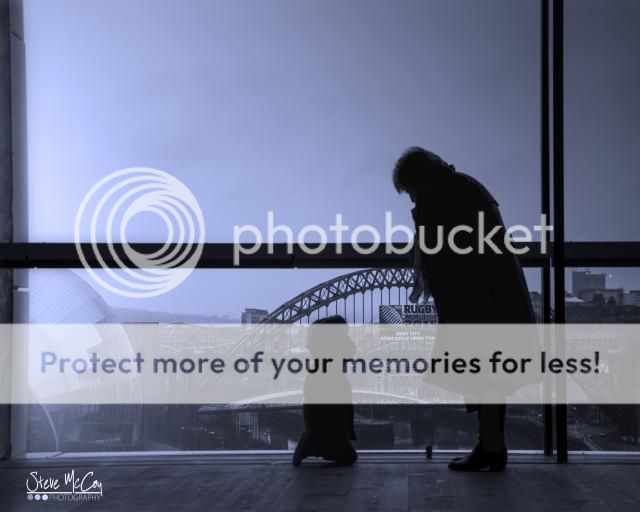
Couple of pictures where i attempted to be a be a bit creative at the top of the Baltic Mill, Newcastle.

Neither are posed shots believe it or not, I just snapped away while my wife, 2yr old and mum where admiring the view.

I've had a play in photoshop with them (obviously) just to try make them into something more, Any CC or opinions are welcomed.


Liking the 1st - strong sky and striking viewpoint - did you apply lens correction as RH wall looks to be leaning in? Profile of boy on 2nd is non too flattering though!
 
I think they are very good, the first is probably the stronger as the figures are clearer in silhouette.
 
Liking the 1st - strong sky and striking viewpoint - did you apply lens correction as RH wall looks to be leaning in? Profile of boy on 2nd is non too flattering though!


Thanks for the comments, No lens correction which may be why ?

The 2nd isn't a favourite of mine either tbh, Little boy's got one of those trapper style hats on which may explain the unflattering profile though.
 
Lens correction important, especially when there are lots of verticals. Should be 1st port of call when brought into LR or PS. Hope this helps.
 
I like No.1 the most - the detail and contrast are spot on as is the colour processing.

The horizon on No.1 is sloping to the left slightly but this might mean the verticals need a tweak too?
 
I like No.1 the most - the detail and contrast are spot on as is the colour processing.

The horizon on No.1 is sloping to the left slightly but this might mean the verticals need a tweak too?

I'll have a play about and see what's what, didn't notice everything sloped so much untils it's been pointed out so thanks for the advice too.
 
Hi Steve,

I like really your first image...more on that in a mo'.

The second one is flawed, in my opinion, as you've focussed on the background when you should've been focussed on the interaction between the youngster and his gran, the background would probably still be instantly recognisable even tho' a little out of focus, and you'd still have a dramatic image due to the silhouette.

The first image is great, and could be improved by tweaking the angles of the architecture, and I would've cropped in a little - but that's purely down to personal preference, others may hate my crop...
Baltic_zps35f9868f-Edited.jpg

The post-processing on this image looks fine at small web sizes, but when viewed any larger (eg. if you were to get it printed) you'd see that the manipulation of the sky is a little unsubtle (obvious brush marks, rough selection, no grain/noise in sky etc.).

However, take that all with a massive pinch of salt. The take away should be that I really like your first picture - well done (did that sound a tad patronising, it wasn't meant to).

Good stuff. Keep shooting and keep improving and refining your technique.
 
Last edited:
Back
Top