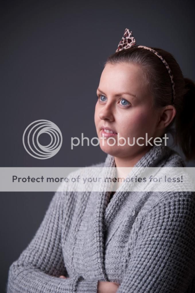
Critique: bit moodier?

Messages
493
Name
Craig
Edit My Images
Yes
I received my new bessel octa and vinyl and am going to be shooting some portraits this Friday for the school I work at. They're doing a fancy dress for world book day and the theme is graphic novel characters. I wanted to shoot something a bit moodier and originally planned to go b&w in style of the halloween in brooklyn series by Joey L but wasn't mad keen on my interpretation of it, I find my black and whites lacked dimension, so thought I'd try something more of a "cinematic" feel.

These are very much test shots with just a quick mouse only retouch, my wife would also probably kill me if she new I'd uploaded them as she was having a comfy day catching up with some work and wasn't very happy being forced to pose for lighting tests. Looking for thoughts and suggestions given the theme so I can get my ideas sorted before the shoot.
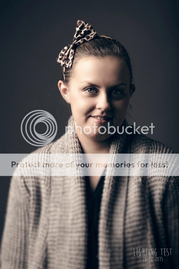
_DSC2353-edit_1.jpg


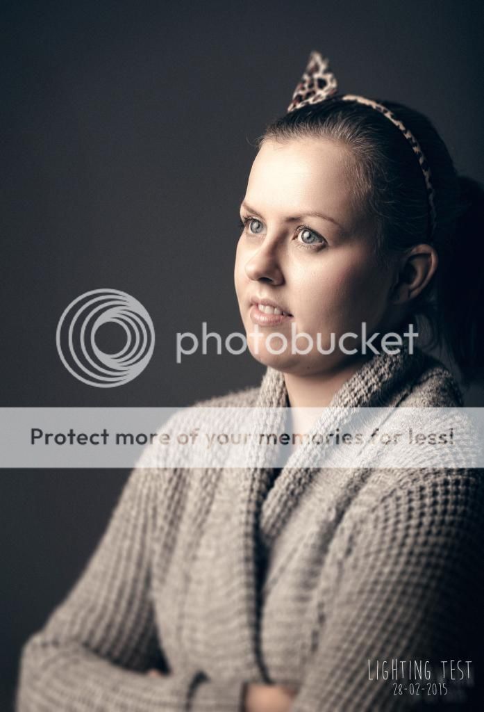
_DSC2359-edit_1.jpg


nikon d700, tamron vc 70-200 @f4 135mm, lencarta smartflash 2, bessel 120cm oct with grid, bessel grey vinyl background.
 
Last edited:
They look a little under exposed (may be my screen?), but oddly on the second one her forehead is almost blown and you've got an orange glow around the highlight of her forehead. I've very little experience with using anything other than a speedlite so can't offer any advice. lThe main thing though is the DoF, as her jumper is OoF. If you are taking shoots of the kids because they are in fancy dress then I think mummy and daddy would like the costume to be in focus - most won't see it as an 'arty' shot I suspect.
 
Cheers Ian, not arguing the critique but just to clarify, they're not being done to sell to parents or in any way a commercial job. It'll only be senior sixth year students and staff over a short period in the afternoon and will just be used for promoting world book day at the school and for me to practice some portraiture.

The bottom being oof is a tilt shift blur filter in ps and not the lens, I may or may not use it depending on how important the clothing is and how wide thes shot is being taken in final images. I'm not seeing the glow though it's just a quick edit on my work pc which has a pretty horrendous monitor so will need to check it at home.

The teacher organising the events is an English teacher who is very into graphic novels and has chosen that as the theme for this year. I'm trying to go for a a darker mood quite low sataturation fairly high contrast to attempt to capture that style of shadowy with white pen drawing styles like The Crow, Batman or Sin City where the scenes are very dark going to blown where the light is. I love Joey L's work especially Halloween in Brooklyn but don't think I want to go full b&w or push contrast to where it stops looking like a photo.

here's the ssoc of 2nd I'm open to suggestions to get them more with the theme?
_DSC2359-sooc.jpg
 
Ah...ok....seems like I got the wrong end of at least two sticks, sorry! Looking at the links you posted maybe B&W is the way to go? I tend to cheat and use DxO Filmpack, they were giving away version 3 a while back and it does a pretty decent job of replicating B&W film types. I get much better results than just doing it in PS.

Re the "glow" it's the centre of the forehead (which looks fine on the SooC shot) and a little on the tops of the cheeks. It's there in the first shot as well, but not as much. Can you see what I mean? It goes from almost blown highlight in the centre, to a slight orange hue and then to normal skin colour. Might not be noticable if you went B&W? Then again it could be my screen at work (which is crap at best!) so if anyone reading this has a decent screen it might help confirm if I'm talking ******* or not! More than likely TBH.
 
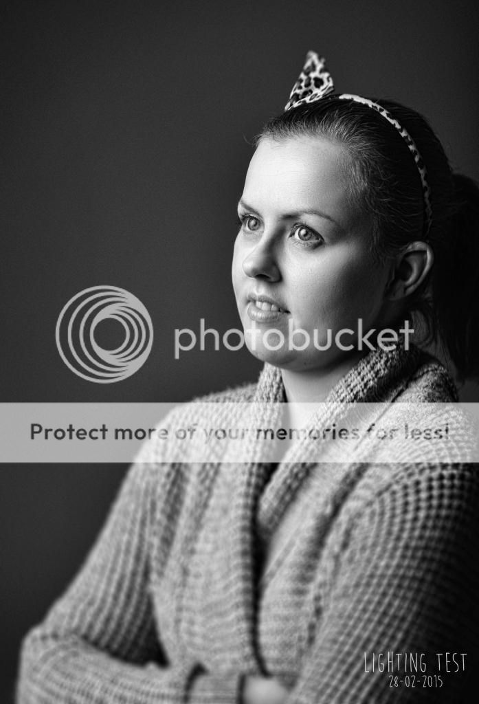
have looked at it on my phone now and it looks completely different from when I edited it, think I've pushed colour curve to far but can pull that back easy enough. Will try to finish them on a better monitor if I stay in colour. Here was my b&w edit, don't know that I like it, I feel it looks a bit bland but when I push the contrast more I loose detail I want and it starts to look a bit forced.

_DSC2359.jpg
 
I was going to knock the shallow DoF as being a bit forced but that last B&W conversion changed my mind. I think that looks great. Minor niggle - is her mouth totally sharp? The eyes are which is the crucial thing but I'm not 100% (looking on mobile) her teeth are as sharp (if you see what I mean!).

PS I like your watermark font. What is it?
 
Yeah could be right, especially on the 2nd shot where she's in 3/4 profile I probably am losing it a bit on the mouth. Would be easier to shoot a bit more closed as had to add a 2 stop nd to get the exposure at f4 with the light in close to get the fall off so 5.6 might give a bit more and let me get a bit of extra sharpness without the filter. I do want to keep it fairly shallow though to keep that kind of painterly vibe and if the outfits aren't amazing I'm thinking less detail might play as an advantage.

The font is Moon flower not really intended as a watermark but I plan to label the final shots in case some of the characters are a bit obscure so just there as a place holder at moment on the tests.
 
Back
Top