

You are using an out of date browser. It may not display this or other websites correctly.
You should upgrade or use an alternative browser.
You should upgrade or use an alternative browser.
weekly d00d's 52 in 2017 ~ 51 Festive & 52 Weather
- Thread starter d00d
- Start date
OP
- Messages
- 9,073
- Name
- David
- Edit My Images
- Yes
My thoughts exactly! Great background and nice and sharp too....
") Mark
Marktimeless black and silver all roundPerfect dof and his clothes choice couldn't have been better - timeless black and silver all round. Great shot
Thank you Emma.Thanks SteveNice of him to pose for you, I've yet to get the courage up to approach people in the street to either pose or help with shots. As others have said the nice green OOF background sets off the camera perfectly.
... I think approaching people in the street must be hard but a place like Kensington Gardens is easy with people just hanging around.Cheers ChrisHold - awesome dof and the subject is crisp and sharp with plenty of detail. Nice job.
OP
- Messages
- 9,073
- Name
- David
- Edit My Images
- Yes
Thanks MimNice one David, although if I was him I'd have it on a wrist strap
... don't thinks he's quite got the hang of not having it dangling around his neck. I use a wrist strap a walk around with camera at that level when not in its bag.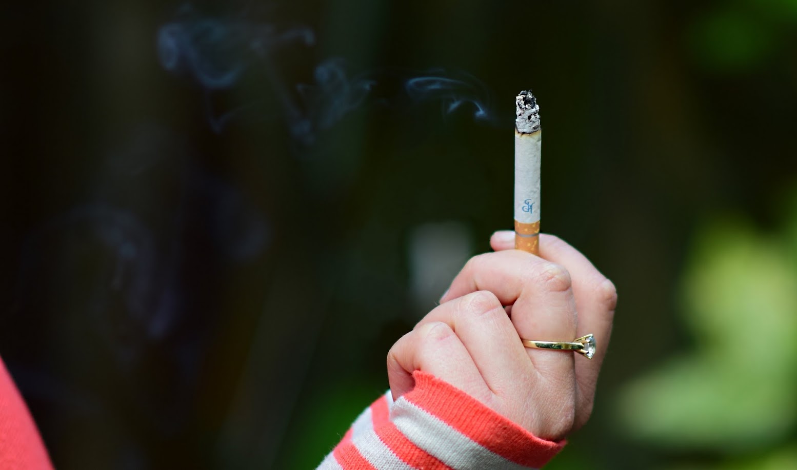
- Messages
- 13,760
- Edit My Images
- Yes
You did well finding somebody that uses the real thing nowadays, the inclusion of the red top sure adds some colour to the shot, and the focus is on the cigarette rather than the smoke, but a cigarette is smoking so can't argue

OP
- Messages
- 9,073
- Name
- David
- Edit My Images
- Yes
It's a pity the focus seems to be just in front of the cigarette, and I feel like it would be nice to see a bit more shoulder on the left - but as on theme as you can get and a nice oof background
Smoke, on theme and well done.
You did well finding somebody that uses the real thing nowadays, the inclusion of the red top sure adds some colour to the shot, and the focus is on the cigarette rather than the smoke, but a cigarette is smoking so can't argue
I agree with Emma about the crop a little more arm on the left, excellent take on the theme, the first thing that comes to mind for me
Great take on the obvious, would be nice to have a bit more shoulder in the frame.
Thanks all. This is another example of me not looking closely enough at what I've got on camera. Looking later on PC, I see faults mainly with aperture ... I took a No. of shots all at f/1.8 when something like 2.8 would have been better. My neighbour, a wayward Aussie posed for this, I waited 48 hrs for her to reappear for a reshoot but no sign so PABD.
HERE is the one I liked most until getting a proper look ... the ring and parts of the hand not sharp, orange around thumb, smoke not showing up too well.

Last edited:
- Messages
- 104,466
- Name
- The other Chris
- Edit My Images
- Yes
Just to chip in a bit late and pretty much agree with everyone else, a really nice capture for the theme, like the colours and the way she is holding the ciggy, may be loose the LHS and have a tighter (portrait) crop on the hand?
OP
- Messages
- 9,073
- Name
- David
- Edit My Images
- Yes
Thanks ChrisJust to chip in a bit late and pretty much agree with everyone else, a really nice capture for the theme, like the colours and the way she is holding the ciggy, may be loose the LHS and have a tighter (portrait) crop on the hand?
The space LHS is there because the smoke is drifting in that direction, if you can see it! Also, I'm not a fan of portrait orientations, never do them.
Last edited:
OP
- Messages
- 9,073
- Name
- David
- Edit My Images
- Yes
Hi susie ... soooo sharp ... in all the right places I hope. Thanks and I hope all's well with you.Hi d00d that photo is soooo sharp, I love it, great idea or the theme too.
- Messages
- 7,548
- Name
- susie
- Edit My Images
- Yes
Hi susie ... soooo sharp ... in all the right places I hope. Thanks and I hope all's well with you.
ooooops didn't notice you'd done your Smoke pic, I was talking about the camera one!
Smoke ...does what it says on the tin, but as I hate smoking that's about it
I am fine thank you, just busy with the grandkids running them here there and everywhere, never seem to have a minute to think ...back in London in June though
OP
- Messages
- 9,073
- Name
- David
- Edit My Images
- Yes
Hi David,
I agree with your thoughts that f/2.8 might have been better, I think a bit more DoF might have been better.
I'd like to have seen the smoke in sharper focus.
Good work finding a smoker, rather than a vaper.
Good pose and set up. I like the striped sleeve and the way she is holding the sleeve as well, also like the nicely OOF background. I think I would clone out the bit of arm on the left hand edge if it was mine.
Thanks guy ... I know 1 or 2 smokers well enough to ask them to pose, but don't know anyone who Vapes
OP
- Messages
- 9,073
- Name
- David
- Edit My Images
- Yes
Last edited:
- Messages
- 1,075
- Name
- Georgina
- Edit My Images
- Yes
Hi David, Getting round to playing catch up again Love all the dates on the wall in evolved, really makes you think about how long this vandalism has been going on Hold is great, love the bold black and the out of focus green and as others have said for smoke, I think it either needs more shoulder or non at all, but bang on theme and good strong colours too
Love all the dates on the wall in evolved, really makes you think about how long this vandalism has been going on Hold is great, love the bold black and the out of focus green and as others have said for smoke, I think it either needs more shoulder or non at all, but bang on theme and good strong colours too
OP
- Messages
- 9,073
- Name
- David
- Edit My Images
- Yes
Good to see you Georgina. Thanks for the input ... yes that girls shoulder is much talked about.Hi David, Getting round to playing catch up again
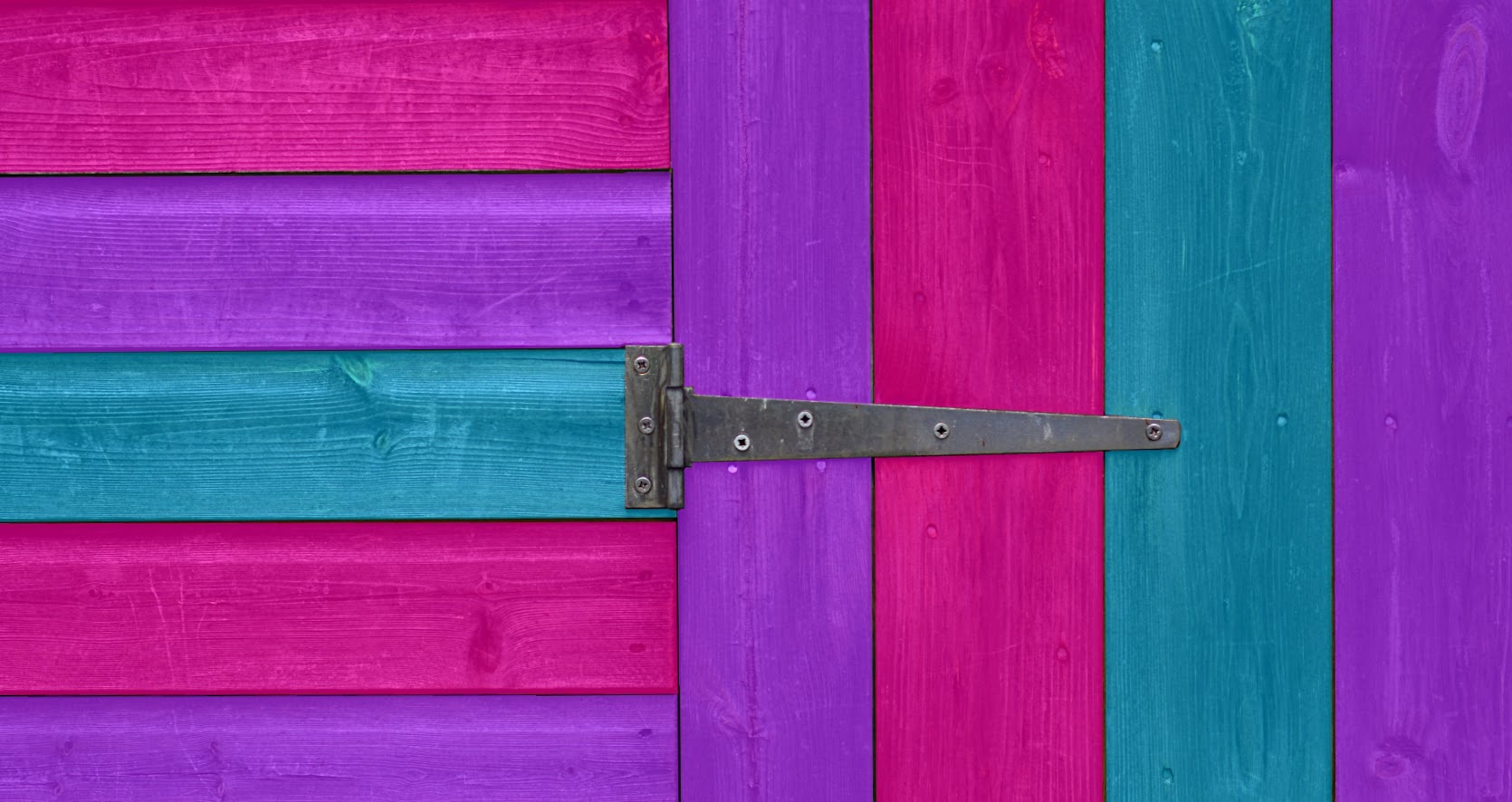
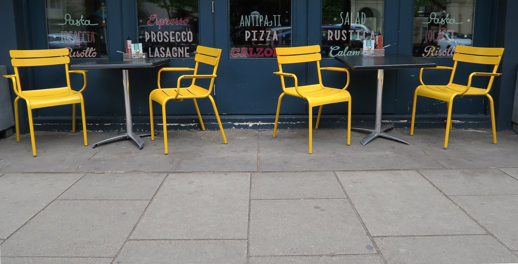
Both work, would perhaps like to see a bit more of the shed, really like the chairs and the placement in the frame
Yes it did take rather a long time but all good shoppery practice. I've now added a link to the original just above the vivid shed post above.Like the shed, must have taken ages to paint it all stripy like that. I like the placement of the hinge and it is very vivid
Vivid, like both shots, and like the hinge on the shed, but my choice is the placing of the vivid yellow chairs
Thanks EmmaI'm guessing the shed is wishful thinking after seeing the discussion thread?! But makes a very attractive shot. I love the chairs with the leading lines of the pavement slabs - nicely seen
... yes I left a few hints on the discussion thread. Click the link above for the original. Pleased you like the slabs, hope they don't look too wonky.- Messages
- 671
- Name
- Nigel
- Edit My Images
- Yes
Hi David, like you shed shot for Vivid work's well and bang on theme, not sure I would want that in my back garden thou.
OP
- Messages
- 9,073
- Name
- David
- Edit My Images
- Yes
Two very bright and vivid shots. Clean and sharp focus on the first, love the inclusion and bang on centre of the hinge.
Really nice shot (#1) for Vivid, David. Simple yet sharp and of course, very colourful! Well captured and nicely framed / composed.
graphic feel#1 for me, a nice graphic feel to it and very vivid.
Cheers.
OP
- Messages
- 9,073
- Name
- David
- Edit My Images
- Yes
Shed door for me David.
The colours are really bright and there is order to them. It just works... It's the sort of thing you could see hanging in restaurants at the seaside.
(Maybe you should put a for sale sticker on it).
.. you get first refusal Tim.Hard to choose a favourite as I really like both of your Vivids. But if I have to ill go for the shed as I simply love the colours .
Your are getting really good at shed painting
Hi David, like you shed shot for Vivid work's well and bang on theme, not sure I would want that in my back garden thou.
a proper garden, no. But we have a tiny space and those colours certainly bring it alive. Thanks Steve ... I find this theme just so easy I saw an op. for some shoppery ... then thought I'd include a #2 a proper pic.Hadn't realised that the shed one was edited to add the colour! Great job and it would still be my pick for vivid.
Last edited:
OP
- Messages
- 9,073
- Name
- David
- Edit My Images
- Yes
Wow that's a brilliant bit of editing on that shed d00d, I love it, it would definitely make a great picture on a canvas.
Chairs are well spotted too
- Messages
- 667
- Name
- Nick
- Edit My Images
- Yes
Hi D00d
Hold - Cool to do something so relevant and well done for asking comeone to pose - although it would obviously have been better to ask the pretty girfriend to hold the camera...
Smoke - I'd have cropped it tighter. Did anyone else mention that? Bang on theme though.
Vivid - The shed shot is stunning, a shame it's fake but I'd never have known so even more props. I love this. Belongs on a wall.
[goes off to paint shed]
OP
- Messages
- 9,073
- Name
- David
- Edit My Images
- Yes
Thanks so much for you input Nick ... appreciated.Hi D00d
Hold - Cool to do something so relevant and well done for asking comeone to pose - although it would obviously have been better to ask the pretty girfriend to hold the camera...
Smoke - I'd have cropped it tighter. Did anyone else mention that? Bang on theme though.
Vivid - The shed shot is stunning, a shame it's fake but I'd never have known so even more props. I love this. Belongs on a wall.
[goes off to paint shed]
Thanks BerndSo the shed is not real? Disappointing, but it's still my favourite. I wonder if a square crop would work even better. Think of the seaside restaurant crowd!
The second one is good, but I think the chairs are a bit high in the frame.
... re the yellow chairs ... they were in the centre in the sooc, then I cropped, uncropped, cropped again, deciding I liked the leading lines as Emma @Emja points out.