OP
- Messages
- 9,071
- Name
- David
- Edit My Images
- Yes
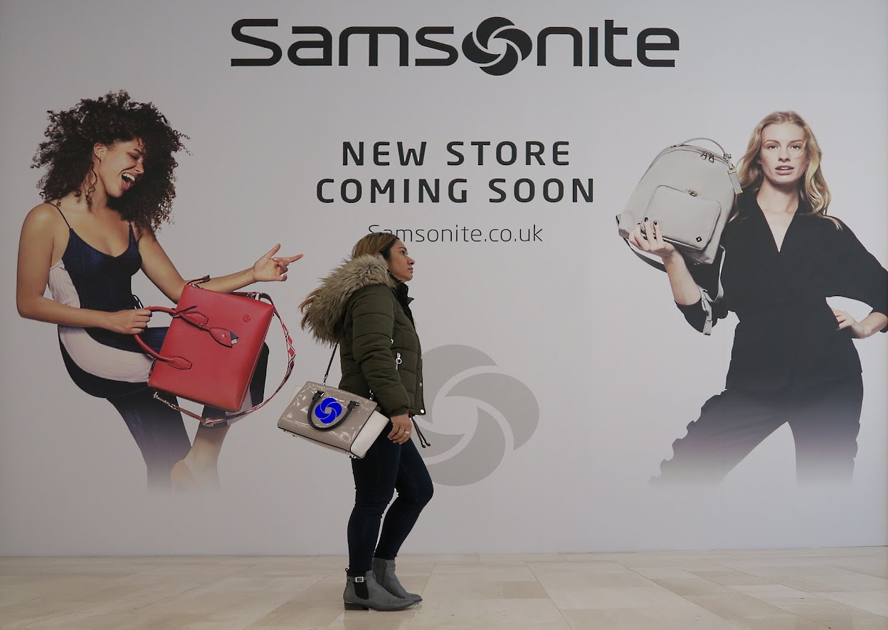
Well I got it straight offI find the vignette a bit heavy and the samsonite logo perhaps a little unsubtle (but then reading the comments above perhaps not) but the composition works with the model in the photo pointing at the juxtaposed subject, I found it a tough theme and this certainly meets the brief for me.
Thanks Chris and AllanWorks for me, agree about the vignette otherwise a worthy attempt at the theme
The 'vignette' was a mistake so I've undone it. Here is my edit with nothing but the logo added.
")