OP
- Messages
- 9,071
- Name
- David
- Edit My Images
- Yes
Great Shot for over as well David, there's a lot of interest in there top marksy)

Great Shot for over as well David, there's a lot of interest in there top marks
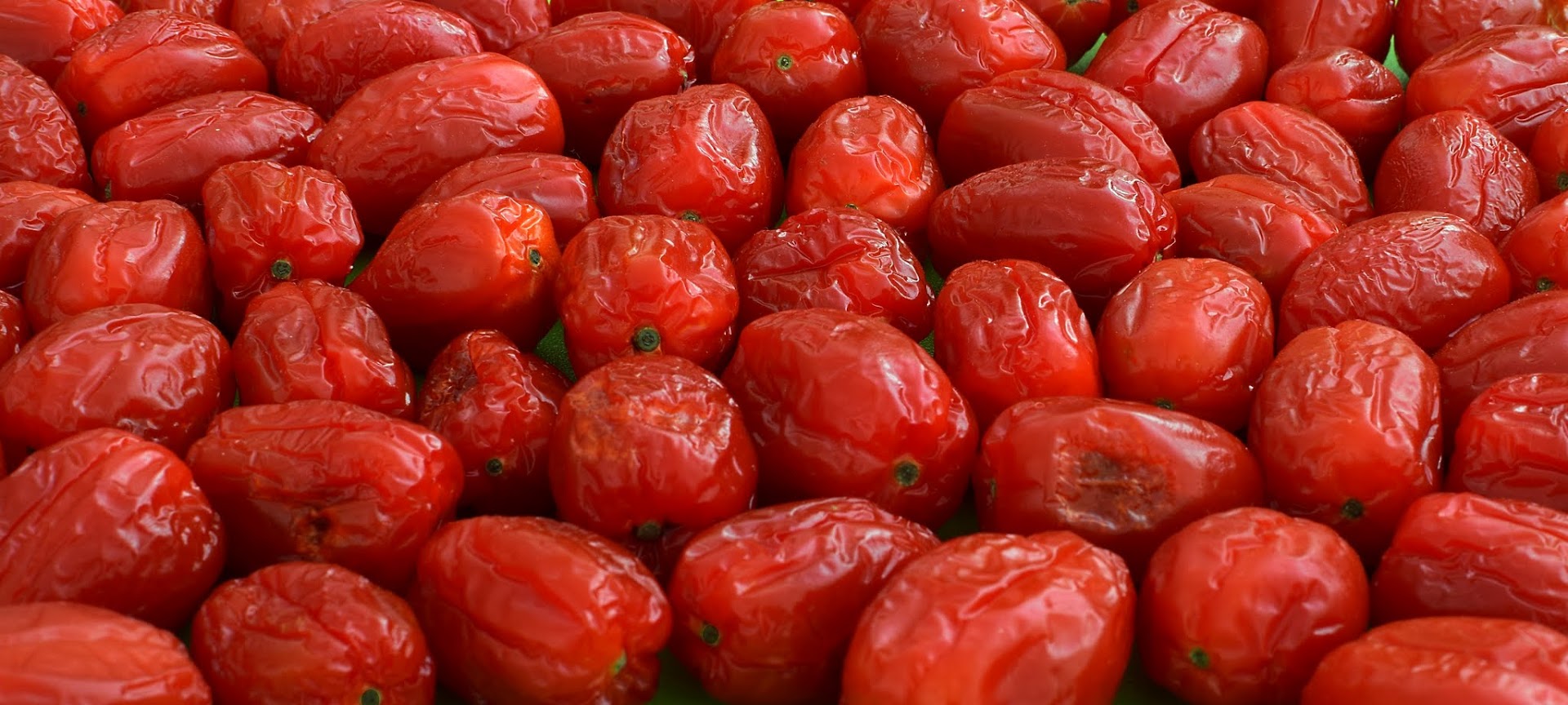
Agree they are ageing and need to go in the bin, nice clear colourful shot David.
Can't quite make up my mind what they are but a nice colourful photo for the theme
Very red and definitely ageing I like it
They look like either plum tomatoes or peppers. Something a little different for the theme David lovely vivid colour.
Thanks Pete.Nice bold colours.
They are nearly dried tomatoes. BTW I hate toms
Pete.
Nice shot, great colours and good take on the theme. Some of those are looking decidedly dodgy
Thanks Lee & Dominic.I like it and I like that you've filled the whole frame with them.
Cheers DKVery nice idea indeed, I love that you have filled the frame with them David, cool image for the theme, it would make a nice print for a kitchen
Great colours, great light and I like the crop
... thanks brrndThanks Mark

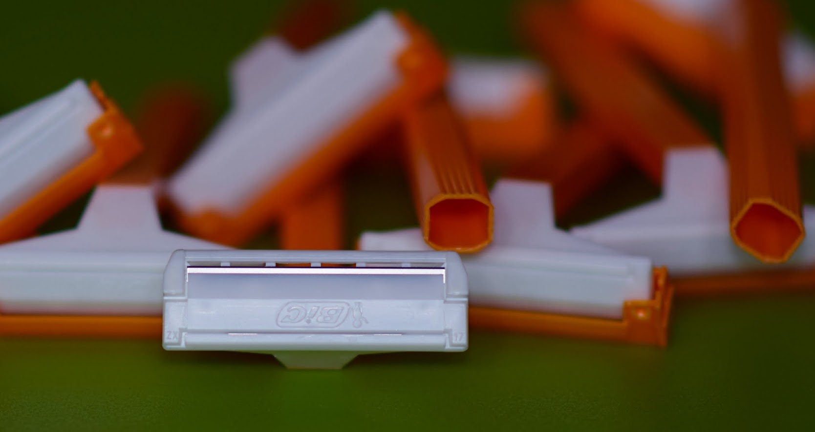
Great minds David, I tried with my mach three but gave up. You did well with the focus for sharp.
Sharp
Good dof and composition and I like the simplicity of the colours.
Cracking shots for Ageing and Sharp David, love the reds in the Toms and I think you've cropped it perfectly!
Nice sharp image there, and a nice sharp blade too - on theme - well done
Can't get much 'sharper' than that.
... busy !!! ... 10 razors for £1 innit.Certainly works for the theme
Your really nailed the light and focus on the one visible blade, spot on for the theme
ChrisHey d00d,
Ageing - A lovely simple depiction in red. You've somehow made something which ought to be busy, look serene. The letterbox crop suits it.
Sharp - Not sure on the composition of this one. I like the contrasting colours, and the business of it, but I think I may have re-positioned to the two handles that are in focus, so that they were actually oof.
Dunno though. I suspect you tried many different compositions.
Hey dudes .... thanksGreat light on the sharp blade, so right on theme! Nice colours too, and not too many of them, but I'm not so sure about the composition...
... maybe I tried too hard on making the compo look random.Thanks Michael ... Underexposed, just an effect I used to emphasis the light bouncing off the blade.Like the composition, looks a little underexposed.
Thank you minx.Sharp - good take on the theme. My first idea was based around a razor, but glad I didn't as yours is a much better shot.