

You are using an out of date browser. It may not display this or other websites correctly.
You should upgrade or use an alternative browser.
You should upgrade or use an alternative browser.
weekly dmb's 52 of 2017 ( Wk 52 - Weather) - Made it to end :-)
- Thread starter dmb
- Start date
- Messages
- 9,095
- Name
- Mandy
- Edit My Images
- Yes
Smooth - 
- Messages
- 3,925
- Name
- Carl
- Edit My Images
- Yes
Excellent take David. I like the combination and composition with the silk overflowing from glass. Spot on.
- Messages
- 485
- Name
- Chris
- Edit My Images
- Yes
Nice idea, only possible niggle for me is the stitching no the seam. As I often find when seeing somebody else's ideas a different take comes to mind like using two scarves (or something similar) one black and one cream, guess you can see where I'm going with this one.
OP
- Messages
- 2,435
- Edit My Images
- No
Week 5 - Mineral
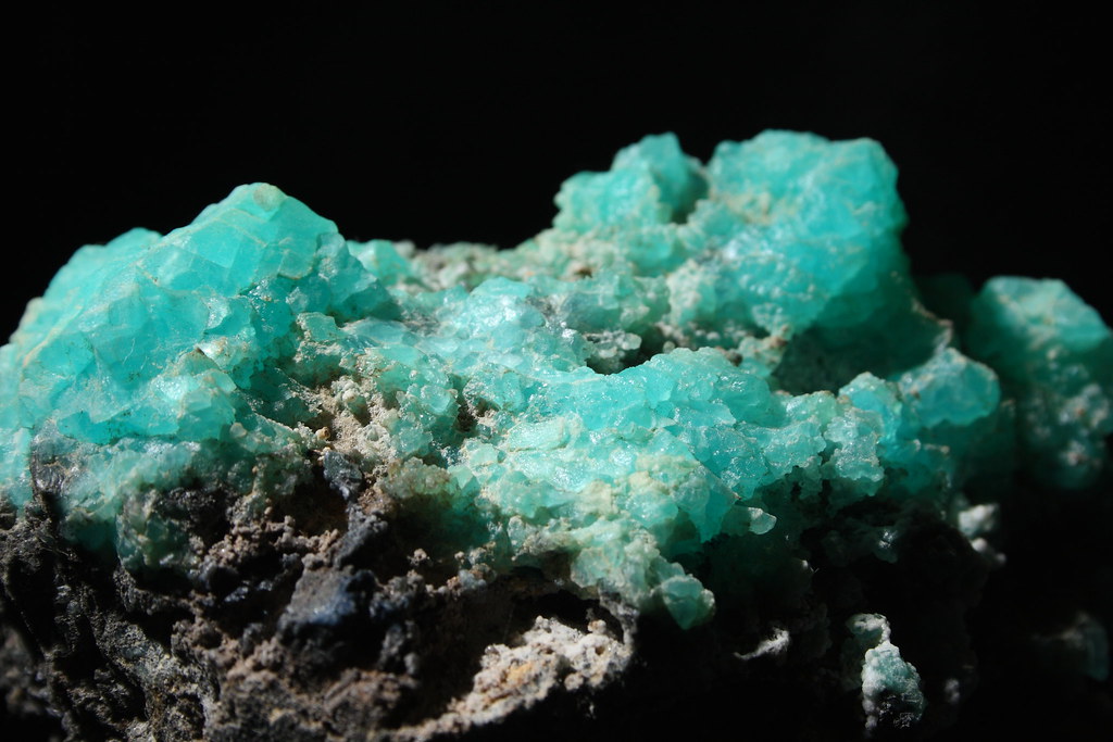
NaCl_and_ Ti by David M Bloor, on Flickr
Not a natural mineral. Raw product of the Hunter Process that used to be the method for making pure titanium. The blue crystals are actually just common salt but with the occasional titanium atom caught in the crystal lattice that gives the blue colour. The grey substrate is the very pure titanium which was used for jet engine parts. Taken with off camera flash and a +3 add on lens.
Last edited:
OP
- Messages
- 2,435
- Edit My Images
- No
This is one I rejected - fabric was not silky enough and could not get a nice emerald green background.Nice idea, only possible niggle for me is the stitching no the seam. As I often find when seeing somebody else's ideas a different take comes to mind like using two scarves (or something similar) one black and one cream, guess you can see where I'm going with this one.
 20170131_264ec1 by David M Bloor, on Flickr
Last edited:
OP
- Messages
- 2,435
- Edit My Images
- No
The mineral photo is great with the beautiful turquoise against the deep black background. But I would have chosen a slightly deeper DoF to get more sharpness throughout.
This is a close up using an add on lens (not a very good one), even at f11 there is a limit to DOF you can get unless you start stacking and I don't think that would add to the picture.
- Messages
- 3,925
- Name
- Carl
- Edit My Images
- Yes
Yes, I too like the colour of the mineral .. could maybe do with a bit more in focus though.
- Messages
- 9,095
- Name
- Mandy
- Edit My Images
- Yes
Mineral - I do love that blue/green colour, Im just wondering if you could not bring us a bit closer to see the intricate detail of each little crystal.
- Messages
- 13,760
- Edit My Images
- Yes
I'm liking both of your smooth images David, a real clever idea, especially the two colours in the second image, and in my opinion it doesn't matter if the materials were not smooth, its the reference to the smooth Guinness that nails it for me ")
Mineral, a nicely lit lump of rock that, couldn't be closer theme wise, nice colour and detail too
Mineral, a nicely lit lump of rock that, couldn't be closer theme wise, nice colour and detail too
- Messages
- 5,787
- Name
- Storm Trooper
- Edit My Images
- Yes
Smooth.....interesting take on the theme, double smooth.
Mineral....lots of detail, suits the black background.
Mineral....lots of detail, suits the black background.
- Messages
- 3,250
- Name
- Emma
- Edit My Images
- Yes
Very clever idea for your smooth shot David - the seam is the only thing that niggles with me, but I love the lighting on the silk. More depth of field would have been good on your mineral pic but wonderful colour and thanks for the background info!
OP
- Messages
- 2,435
- Edit My Images
- No
Week 6 - Whole
<sing> Nuts! Whole Hazel Nuts! Cadburys take them and they cover them in chocolate. </sing>
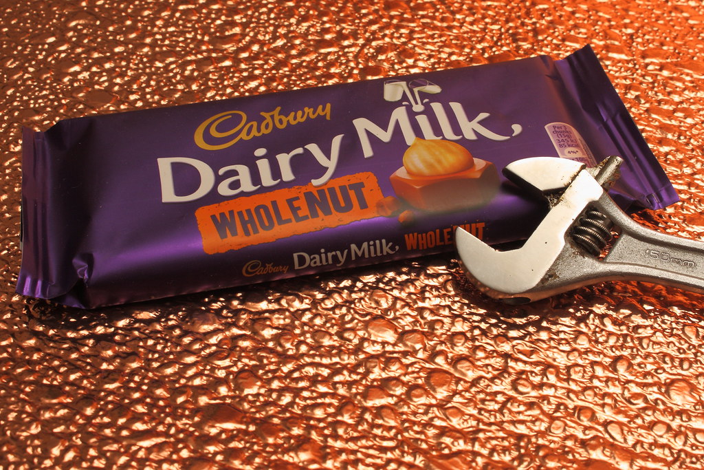
Nuts! Whole Hazel Nuts ... by David M Bloor, on Flickr
... and no I will not eat the 'Whole' bar, not good for my blood sugar
<sing> Nuts! Whole Hazel Nuts! Cadburys take them and they cover them in chocolate. </sing>
Nuts! Whole Hazel Nuts ... by David M Bloor, on Flickr
... and no I will not eat the 'Whole' bar, not good for my blood sugar
Last edited:
OP
- Messages
- 2,435
- Edit My Images
- No
WB looks fine to me. White being white. [emoji15]Popular choice. WB is off
Cheers.
- Messages
- 19,461
- Name
- Andy
- Edit My Images
- Yes
WB looks fine to me. White being white. [emoji15]
The white text looks a little warm on Mac. I'll post an edit if you want
If it looks OK to you, job done
Cheers.
OP
- Messages
- 2,435
- Edit My Images
- No
Ah. The 'white' text will be getting reflections off the copper background which does not bother me. I adjusted it on the specular reflection of the flash on the spanner which otherwise would be colder.The white text looks a little warm on Mac. I'll post an edit if you want
If it looks OK to you, job done
Cheers.
- Messages
- 3,925
- Name
- Carl
- Edit My Images
- Yes
Sadly, the song is now lingering in my head ha ha. Good take David. The copper does seem to give the surface a liquid chocolate look so a good choice there I think ... as well as the spanner of course for added interest.
- Messages
- 9,095
- Name
- Mandy
- Edit My Images
- Yes
Whole -
Minx
Papillon
- Messages
- 2,513
- Edit My Images
- Yes
Smooth - Clever idea nice and sharp I dont mind the seam
Mineral - lovely colour great subject for the theme even if its not really a mineral. I would prefer it if it was sharper.
Whole - good composition. I like the inclusion of the spanner and the interestin background
Mineral - lovely colour great subject for the theme even if its not really a mineral. I would prefer it if it was sharper.
Whole - good composition. I like the inclusion of the spanner and the interestin background
OP
- Messages
- 2,435
- Edit My Images
- No
Week 7 - Structure

Decaying Structure 2 by David M Bloor, on Flickr
The former 'Hanley Shopping Centre' next to the brand new bus station. Using my tiny Canon Ixus 70, this is not a place to carry a flashy camera.
Decaying Structure 2 by David M Bloor, on Flickr
The former 'Hanley Shopping Centre' next to the brand new bus station. Using my tiny Canon Ixus 70, this is not a place to carry a flashy camera.
Last edited:
OP
- Messages
- 2,435
- Edit My Images
- No
@Emja @posiview @Carl Ayling @d00d @brrnd @Pinkbikerbabe @minx @Dave70D @gremlin16 @wallyboy @Bearair @CliveNX @Dark Knight @foggy4ever @LC2 @susiejb @KernowChris
Thanks for the comments over the last few weeks, it all helps.
Thanks for the comments over the last few weeks, it all helps.
Last edited:
- Messages
- 3,925
- Name
- Carl
- Edit My Images
- Yes
No it doesn't look like a particularly safe place to be but that is a good take for the theme David. Colourful street scene .. .like the blue sky too.