weekly dmb's 52 of 2017 ( Wk 52 - Weather) - Made it to end :-)

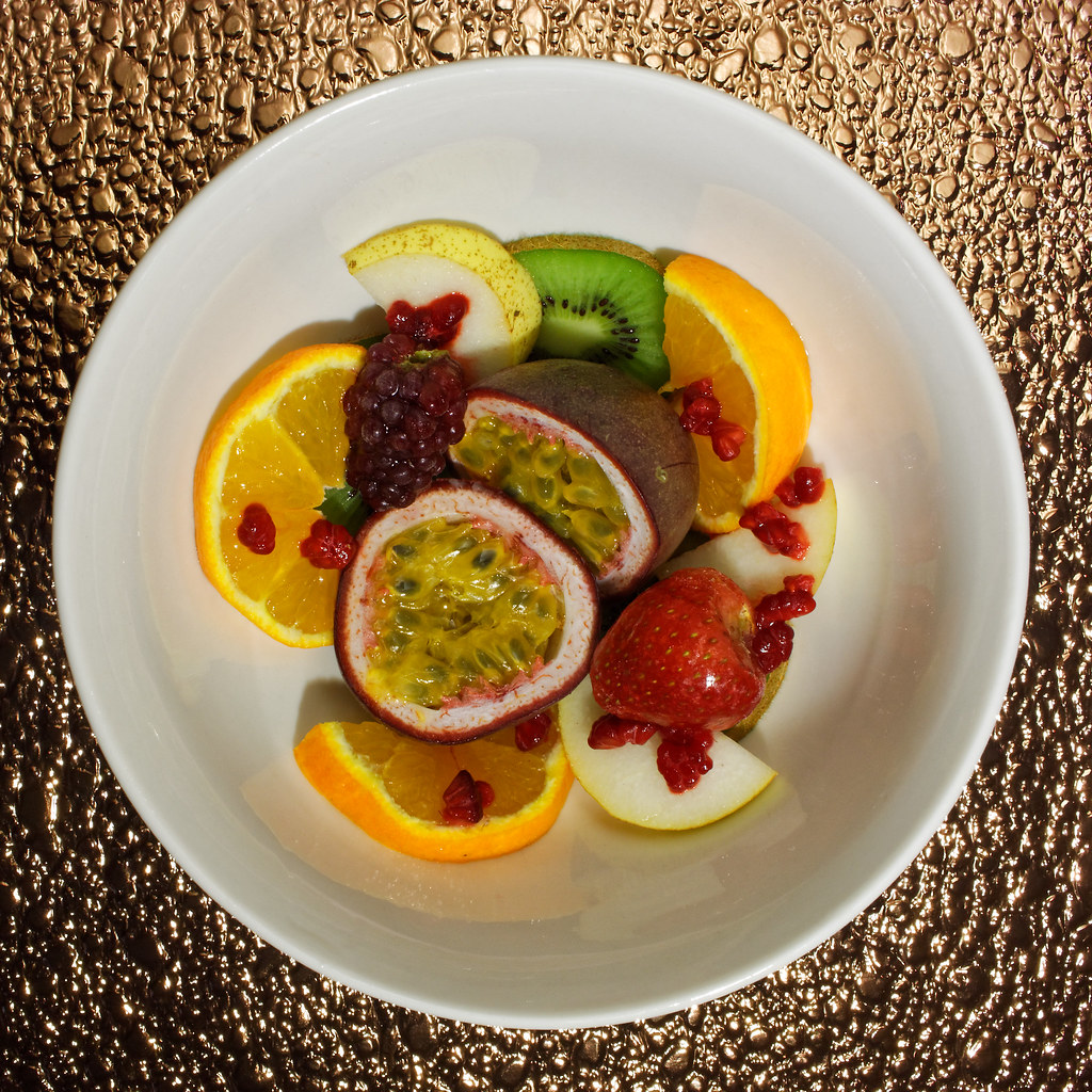
Symetrical ...they do look very realistic and very well positioned, perfect for the the theme.
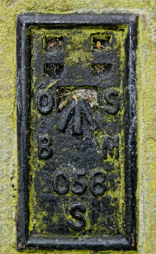
Worn ... the photo comes to life with the explanation, focus is spot on.
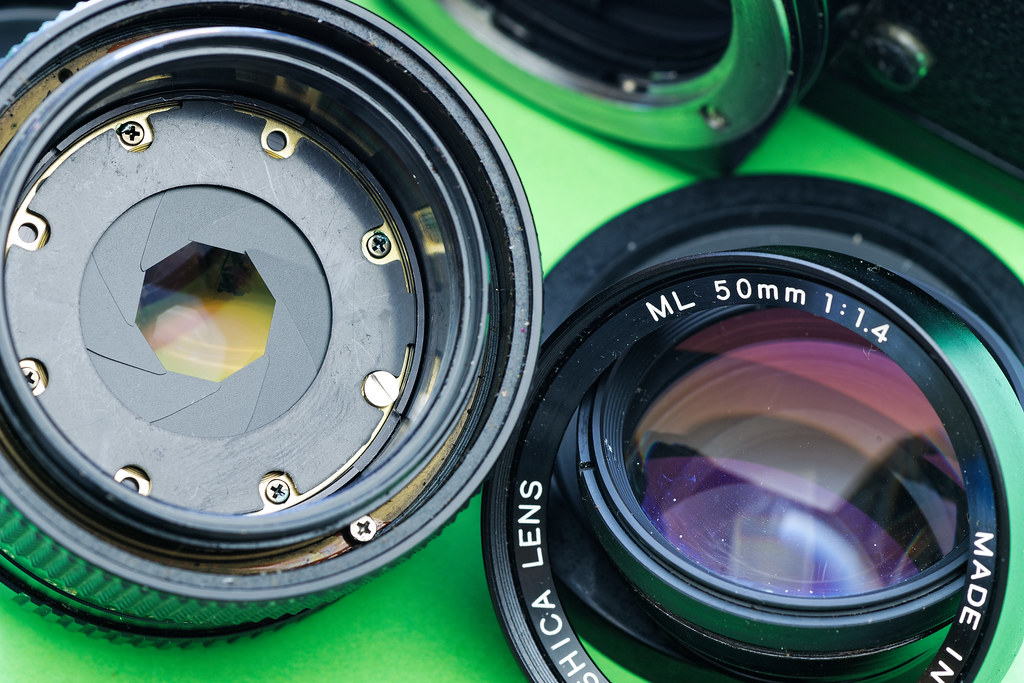
Colourful, that's sounds very complicated and well out of my league, I like the idea of showing the different images, very well done to you for sticking at that one.
 
Yikes, puts me to shame...almost, as I'll still be out tonight with my OMD.

Good work (y)

Cheers.

I suppose I could have waited - but what if it had been raining? It wasn't.

63_70_94s.JPG

However the only reflections would have been in puddles on the cricket ground. (with my charity shop Canon PowerShot SX120 IS)
 
Last edited:
That's well thought out. It's not something I would be able to do.
 
well done on the fruit image, I won't pretend to understand your trickery!! :clap:

and fireworks sure are colourful. (y)
 
No 1 for me David, though love the safe working practices;) Oddly the orange "pedestrian warning" is the bit that really catches the eye. Well spotted
 
No 1 for me David, though love the safe working practices;) Oddly the orange "pedestrian warning" is the bit that really catches the eye. Well spotted

The other beer crate 'Warning sign' from the premises was yellow - but just out of shot. Perhaps appropriately the place is called "Ten Green Bottles"
 
Love the detail and growth on the trig point. Well captured, though maybe a bit more space needed at the bottom (if there was space that is).
Good to see that the work has his safety flat cap on in the second image ;) To the untrained eye, #2 sells height more effectively, but #1 is my fav of the two.
 
The OS bench mark is a great idea for the theme. And the old guy did well to get on top of the steps like that.
 
....though maybe a bit more space needed at the bottom (if there was space that is).....

The BM is 18 inches off the pavement on what used to be the Guildhall and is now the Police Station. I was kneeling as low as I could get with a bemused Bobby watching me through the window above. I suppose I could have laid on the floor, then again ....
 
Nice shots for the theme David. I like the guy up the ladder, I don't think I'd be stood on the top step like that :)
 
Love the first image for the interesting details, the second not si much....
 
Hi David, you've posted some excellent images since my last visit. Both images for Height convey the theme well, but that second one is excellent for the sheer sense of danger with him standing on the very top rung like that!

My favourites of your recent images are Wall with those strong converging lines and the added interest from the carved names, and Worn with the great indents caused over the years by ropes. I like the other colours contrasting with the white paint, and it's fascinating to think of the years of use that has caused it to get so worn away. Great find!
 
Week 46 - Remote


Remote Farms

by David M Bloor, on Flickr

On A54 between Buxton and Congleton near Wildboarclough looking towards Three Shires Head. Not only is it remote up there but darned chilly.
 
Last edited:
Certainly looks remote, for me it looks a bit over processed but certainly has plenty of detail.
 
@sirch @Allan.H @Dark Knight , Perhaps should have gone with this,

DSC_0831_Dhas.jpg

DXO's single shot HDR instead - but I did have fun masking and contrast boosting the skies in Photoshop (not something I usually do).
 
My initial thought was over saturated and I can see I wasn't the only one.
I too feel the second edit is better (certainly the sky is), but perhaps a little flat.
Tell you what though, if you d a little levels editing, choosing the black part of the clump of grass bottom left as black, a white part of the cloud as white, and the big expanse of grey on the hill mid left as the grey point, it gives it a bit more ompfh, lifting a good image into a really nice essay on remote :)

Something like this ?

DSC_0831_Dhaslc2.jpg
 
I like the Height above sea level .... interestingly different with good colour and detail. But I must say it fits the frame a bit too neatly, I'd be inclined to capture it in landscape orientation, showing what's to the side/s of it.

Remote is a perfectly good landscape .... unsaturated for me.
 
Remote
It certainly looks remote and in your second shot, it also looks a bit bleak.
 
Build
For me, that green background really helps to show off the bits of lens.
 
@sirch, @LC2, @Dark Knight and @Nostromo - Thanks for the comments on BUILD. When taking things like this apart I spread out an old (and well washed) terry nappy, which acts as a soft surface and an anti bounce safety net for any errant screws, springs and ball bearings. On top of that a sheet of A4 paper to reduce any dust or lint. It just so happened that SWMBO had green paper on her printer. Saw the contrasts in colours and went for the photo. Lens took a bit of work to get back to smooth movement but working fine now.
 
Nicely lit, spot on for the theme, could perhaps be a tad sharper?
 
@sirch and @d00d - Just checked processing - I forgot to apply the sharpening ! :facepalm: - Replaced copy on Flickr. Might take a while to show on Forum as the images are cached but will show if you click through.

@rpn - single point light and a matte reflector, did not want to lose the sparkle - perhaps could have reflected more light.
 
Back
Top