

You are using an out of date browser. It may not display this or other websites correctly.
You should upgrade or use an alternative browser.
You should upgrade or use an alternative browser.
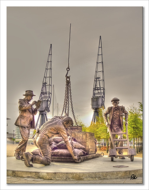
Dockers at work
- Thread starter RVW
- Start date
- Messages
- 2,138
- Edit My Images
- Yes
I don't like it.
But having said that I really really don't like the way the left crane is attatched to the left statue's book.
But having said that I really really don't like the way the left crane is attatched to the left statue's book.
joescrivens
Suspended / Banned
- Messages
- 15,052
- Name
- Joe
- Edit My Images
- Yes
too heavy and overdone for me, , i looks more like a drawing than a photo
- Messages
- 794
- Name
- Gordon
- Edit My Images
- Yes
Unfortunately this is the type of photo that gives HDR a bad name. Sorry, don't like the over processing and halos.
joescrivens
Suspended / Banned
- Messages
- 15,052
- Name
- Joe
- Edit My Images
- Yes
Here's my effort
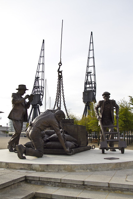

I mean, what is wrong with it as it is? The sky is overexposed and uninteresting but thats to do with the time of day you have shot it.
I mean, what is wrong with it as it is? The sky is overexposed and uninteresting but thats to do with the time of day you have shot it.
OP
- Messages
- 428
- Name
- Ray
- Edit My Images
- Yes
Here's my effort
I mean, what is wrong with it as it is? The sky is overexposed and uninteresting but thats to do with the time of day you have shot it.
That's it precisely uninteresting as is, hence the PS version.
I accept it does not suit everybody but I like HDR in most forms.Some can be OTT some you are hard pressed to notice.
Photography is an art form as much as anything else.
A pile of bricks in the Tate modern is classed as art by some, by others just a pile of bricks.
So I go back to my question How can it be improved?
")
joescrivens
Suspended / Banned
- Messages
- 15,052
- Name
- Joe
- Edit My Images
- Yes
But I think the problems with the shot are to do with when you shot it and your composition -these two things are what need to happen to improve it, not doing over the top processing. The photo needs to be taken again at a different time from a different angle.
and I am a fan of HDR and have done lots of it.
Sometimes you can't polish a turd - just an expression, not saying your photo is turd, just that pp will only improve what is possible in the first place.
and I am a fan of HDR and have done lots of it.
Sometimes you can't polish a turd - just an expression, not saying your photo is turd, just that pp will only improve what is possible in the first place.
- Messages
- 9,818
- Edit My Images
- No
By going back and shooting at a different time of day?
Personally it's not a shot I'd spend much time on. I would probably have gone for closer shots, framing to avoid the obviously modern plinth, bringing the distant cranes into the backgrouns, maybe processing into b&w.. basically de-emphasising the modernity of the memorial to bring out the feel of the industry it's representing. If you crop off the top 1/4 and the plinth steps at the bottom you'll get the idea for what I would have gone for.
Could be a really nice location for a foggy evening or early morning.
OP
- Messages
- 428
- Name
- Ray
- Edit My Images
- Yes
Going back at shooting at a different time of day is not an option.
Have done a B&W and yes I like it but my original quest was to emphasise the statues.Admit there is possibly a bit too much glow/halo but I am happy with it.
Bw version on the suggested lines.
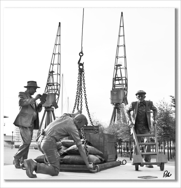
Have done a B&W and yes I like it but my original quest was to emphasise the statues.Admit there is possibly a bit too much glow/halo but I am happy with it.
Bw version on the suggested lines.
OP
- Messages
- 428
- Name
- Ray
- Edit My Images
- Yes
Unfortunately this is the type of photo that gives HDR a bad name. Sorry, don't like the over processing and halos.
Interesting comment. Would you care to expand??
Lynton
awkward customer
- Messages
- 10,606
- Name
- Lynton (yes really!)
- Edit My Images
- No
Interesting comment. Would you care to expand??
erm overprocessing and halos - compare original to the HDR jobbie.........
HDR looks like computer generated image........(which I guess technically it is) and halos.... well there are halos
- Messages
- 9,818
- Edit My Images
- No
I think the b&w tighter crop is an improvement. What do you think about it?
I have a hard-drive of images where I've seen the shot I should have taken with the benefit of 20:20 hind-sight, and no option of a return visit.
To me, if it's a good HDR it shouldn't be obvious to someone that doesn't understand exposure that the image has been heavily processed. However there are a large number of people that go for the over-saturated tone-mapped look.. I think that's what's meant by giving HDR a bad name. It's a matter of taste.
- Messages
- 22
- Name
- Ady
- Edit My Images
- Yes
I can see that perhaps a better photograph should have been achieved in the first place but apart from that then I obviously have no taste as I think the picture is cracker. I see it more as a poster or a wall hanging but think it would look great like that.Well done for making something smashing out of your shot!
OP
- Messages
- 428
- Name
- Ray
- Edit My Images
- Yes
I think the b&w tighter crop is an improvement. What do you think about it?
I have a hard-drive of images where I've seen the shot I should have taken with the benefit of 20:20 hind-sight, and no option of a return visit.
To me, if it's a good HDR it shouldn't be obvious to someone that doesn't understand exposure that the image has been heavily processed. However there are a large number of people that go for the over-saturated tone-mapped look.. I think that's what's meant by giving HDR a bad name. It's a matter of taste.
Well improvement is a statement in personal tastes. Yes I do like the b&w version although it could do with a bit more work.
Surely if a HDR pic is not obvious in general terms then what is the point of doing it in the first place? You may as well make a good job of it in CS5 or whatever.
As for giving HDR a bad name I think that is a terse statement.
You could say that all the bad/indifferent/poorly processed pics that appear on different forums give photography a bad name.
Just because a particular style does not conform to a persons thinking,it does not make it bad. It just makes it different
Just look at some of the so called art in art galleries. :bonk:
Freedom of choice and speech is a wonderful thing
We learn much from others as we do making mistakes.
- Messages
- 9,818
- Edit My Images
- No
Part of the problem is that the term HDR is applied to more than one technique..
You can do it with three or more (and usually seven or more) RAW exposures, combined with HDR software and tone-mapped, then exported to a better editting package to be finished. Done right it will be instantly recognisable that something has been done to someone that understands exposure, but to a person off the street it might just look like a very good photo. Call this HDR.
Others will include taking a single raw exposure, adjusting the exposure in post to get three pseudo-bracketed images, then combining and tone-mapping and editting as above. It won't capture the same dynamic range, but done well it can look realistic. Call this pseudo-HDR.
But the term is also applied to taking a single exposure and running it through tone-mapping software to get the "HDR look". Call this tone-mapping or the "HDR look".
What gets people wound up is that HDR does not have to have the HDR-look, and the HDR-look does not capture a high dynamic range. So when you do "HDR" with an image you will always get judged by people's ideas about what is and isn't HDR.
The above are only my opnions.. and I have those about art in galleries as well..:shrug::thumbsdown:
.. and the great thing about opinions (as a good friend used to tell me) is that opinions are like a******es, everyone has one
You can do it with three or more (and usually seven or more) RAW exposures, combined with HDR software and tone-mapped, then exported to a better editting package to be finished. Done right it will be instantly recognisable that something has been done to someone that understands exposure, but to a person off the street it might just look like a very good photo. Call this HDR.
Others will include taking a single raw exposure, adjusting the exposure in post to get three pseudo-bracketed images, then combining and tone-mapping and editting as above. It won't capture the same dynamic range, but done well it can look realistic. Call this pseudo-HDR.
But the term is also applied to taking a single exposure and running it through tone-mapping software to get the "HDR look". Call this tone-mapping or the "HDR look".
What gets people wound up is that HDR does not have to have the HDR-look, and the HDR-look does not capture a high dynamic range. So when you do "HDR" with an image you will always get judged by people's ideas about what is and isn't HDR.
The above are only my opnions.. and I have those about art in galleries as well..
:shrug::thumbsdown:.. and the great thing about opinions (as a good friend used to tell me) is that opinions are like a******es, everyone has one
- Messages
- 794
- Name
- Gordon
- Edit My Images
- Yes
Sure... the halos are extreme and in my opinion not complimentary to the photo. The grey sky also does not work for the image.Interesting comment. Would you care to expand??
I think you have tried to produce something more dramatic from the wrong starting point. It looks like you have not taken multiple exposures and combined them, which would have enabled a higher quality result in both terms of definition in the statue, the cranes, the sky, the trees and prevented the halos.
Extreme processed HDR can look good... but just not in this case. Just my opinion and if you're happy with that is all that really counts.
OP
- Messages
- 428
- Name
- Ray
- Edit My Images
- Yes
Sure... the halos are extreme and in my opinion not complimentary to the photo. The grey sky also does not work for the image.
I think you have tried to produce something more dramatic from the wrong starting point. It looks like you have not taken multiple exposures and combined them, which would have enabled a higher quality result in both terms of definition in the statue, the cranes, the sky, the trees and prevented the halos.
Extreme processed HDR can look good... but just not in this case. Just my opinion and if you're happy with that is all that really counts.
Fair comment.
It was from one image although in fairness the sky was grey and would not have benefited from 3 or more exposures.The main thing I was trying to do was produce a more dramatic result from what was a bland start. Probably that was the problem.
Thanks for your comments.
- Messages
- 794
- Name
- Gordon
- Edit My Images
- Yes
Fair comment.
The main thing I was trying to do was produce a more dramatic result from what was a bland start. Probably that was the problem.
Thanks for your comments.
OK... one point though, multiple image HDR can bring interest in overcast sky's that are quite bland as viewed at the time. This is a 9 exposure shot taken on an overcast day.

- Messages
- 992
- Name
- Dave Pickett
- Edit My Images
- Yes
I really like it, small crop to remove the sky above the crane hook and its excellent, well done!
The only problem with this photo is that it's taken at the wrong point of time in the universe.
No interesting sky or weather and totally bland lighting. That's why it pretty much just looks like a snapshot of a sculpture.
All the PP in the world won't really reverse that.
No interesting sky or weather and totally bland lighting. That's why it pretty much just looks like a snapshot of a sculpture.
All the PP in the world won't really reverse that.
