Dovercourt lighthouse 2 new edit version

Messages
1,729
Name
paul
Edit My Images
Yes
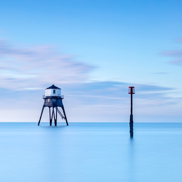
Last one from Dovercourt from the other day early morning rise and shine. Decided on a square crop and left in colour.
150sec Long exposure as the tide was going out.

Dovercourt 3 by Paul__100, on Flickr

Listened to the advice and made a couple of changes, personally I like the cooler version so thanks for taking the time to comment everyone :)

Dovercourt 3 cool by Paul__100, on Flickr
 
Last edited:
Nice simple image and good colour, although I'd like to see the sunlight looking a little warmer where it strikes the side of that structure. Which way did the rest of the frame extend? I wonder if it would benefit from just a little more space, either to the sides or above & below.
 
Nice simple image and good colour, although I'd like to see the sunlight looking a little warmer where it strikes the side of that structure. Which way did the rest of the frame extend? I wonder if it would benefit from just a little more space, either to the sides or above & below.
Cheers Toni, There's a little more space each side so will have another look.

That would make a nice print.
Thanks for the comment Mark.

A most excellent image. Slight crit would be to lift shadows slightly on the lighthouse and maybe reduce the saturation/vibrance ever so slightly. But tbh if I produced that, I'd be happy
Thanks Steve, will have another look at the saturation, think it was only a slight increase with the blues. But now I look again, it does look a little cooked.

Really nice that Paul, I agree with Steve about the slight tweaks, but not a necessity as it's very nice as is!
cheers Neil, as always appreciate the comments.
 
Back
Top