Early morning at Dovercourt New L/E added

Messages
1,729
Name
paul
Edit My Images
Yes
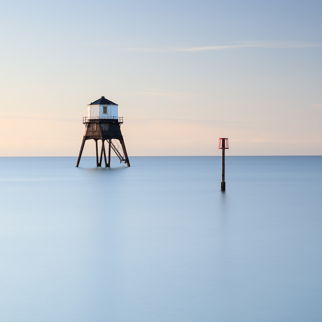
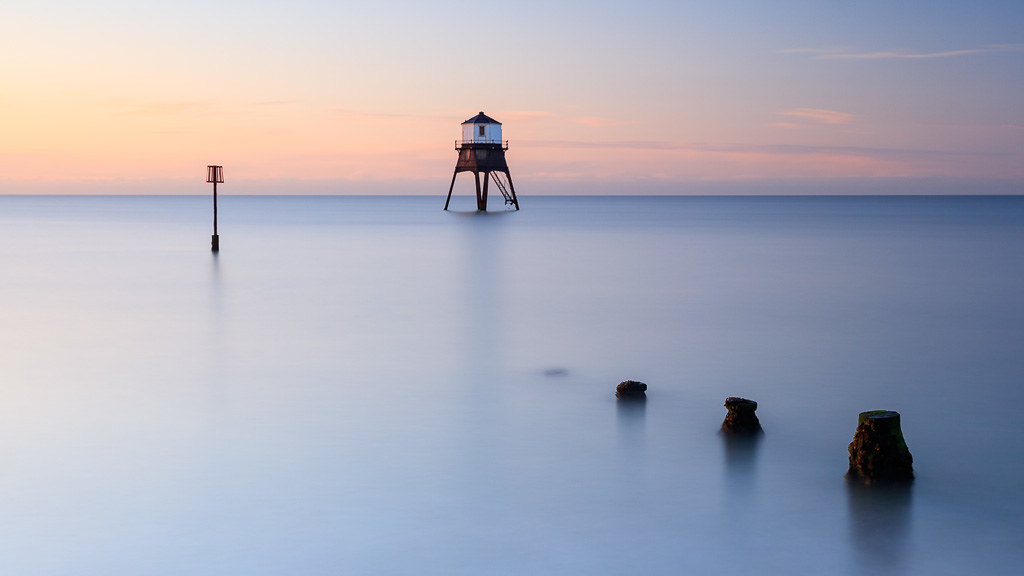
Decided to get up early and give the camera an airing. Weather looked ok for sunrise and coincided with high tide. Sadly the sun did rise above the horizon but with hardly any colour in the sky or cloud :crying: Gotta love this landscape game.

Anyway, decided on a little swooshery on the first and squared the second with a long exposure of 130 secs.

Dovercourt victorian lighthouse by Paul Cronin 1, on Flickr

Dovercourt victorian lighthouse by Paul Cronin 1, on Flickr

Added a long exposure of the first one for Ash :)

Dovercourt victorian lighthouse by Paul Cronin 1, on Flickr
 
Last edited:
As above - number 2 is sublime, one is just excellent haha! What filters have you used (the brand I mean) ?
 
#2 for me but I think I would have preferred the more natural water of #1. It is the light of #2 that wins for me.
 
Much prefer the second one mate although the first one is great too.
Cheers Mark.

As above - number 2 is sublime, one is just excellent haha! What filters have you used (the brand I mean) ?
Thanks Chris, all my filters are now Lee filters. The new thinner polariser which is slightly warmer than the old one, Lee 0.6 soft grad and then the Lee 10 stopper.

Another vote for the second. I find the surf in the first a bit distracting. It would look better (to me) cropped just below the right hand post.
Thank you Jan.

Second is an excellent shot, Im with Jan and I also find the surf slightly distracting in #1 but the #2 would look lovely on the wall.
Thank you Graham.

#2 for me but I think I would have preferred the more natural water of #1. It is the light of #2 that wins for me.
Cheers Charles.
 
Nice shots Paul, I prefer the second one too
 
Two very nice snapotos Sir, liking bothe of these very much, with #2 just edging it for me.(y)

George.
 
Second one is a killer and could also look great in a b/w conversion - one question, is the horizon straight - looks like it might be slightly uphill left to right (or could just be my eyes!). Would also really like to see the first composition (or similar) done as a longer exposure as I think the posts lead your eye to the marker and then from there onto the lighthouse(???), but as others have said currently the surf is a bit distracting.
 
2nd image is a stonker, not that the first is shabby.
 
And yet another vote for the second. A cracker (y)
Cheers Paul

Nice shots Paul, I prefer the second one too
Thank you Tilly

love the 2nd one
Thank you Pierre

Two very nice snapotos Sir, liking bothe of these very much, with #2 just edging it for me.(y)

George.
Cheers George (y)

Second one is a killer and could also look great in a b/w conversion - one question, is the horizon straight - looks like it might be slightly uphill left to right (or could just be my eyes!). Would also really like to see the first composition (or similar) done as a longer exposure as I think the posts lead your eye to the marker and then from there onto the lighthouse(???), but as others have said currently the surf is a bit distracting.
Cheers Ash, I've just checked and yes slightly dropping off the left so thank you. And a L/E for you ;)

2nd image is a stonker, not that the first is shabby.
Appreciate that Dale, looks like No.2 is the winner :)
 
Back
Top