

Off of the feedback I received last time posting @The Big Yin
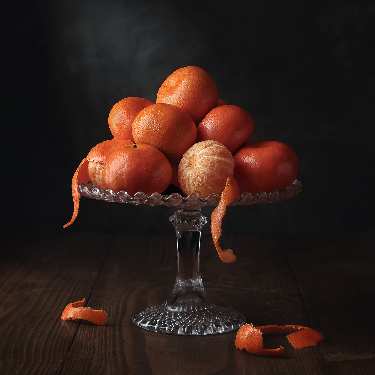
Last night I tried again, as was mentioned, there was no way easy way to peel these little critters.
Anyways this is what I managed.
I have one with bits of pith on the base which I thought looked ok but my better half reckons this cleaner version is better.
Any feedback would be most welcomed.
Gaz
Older post.
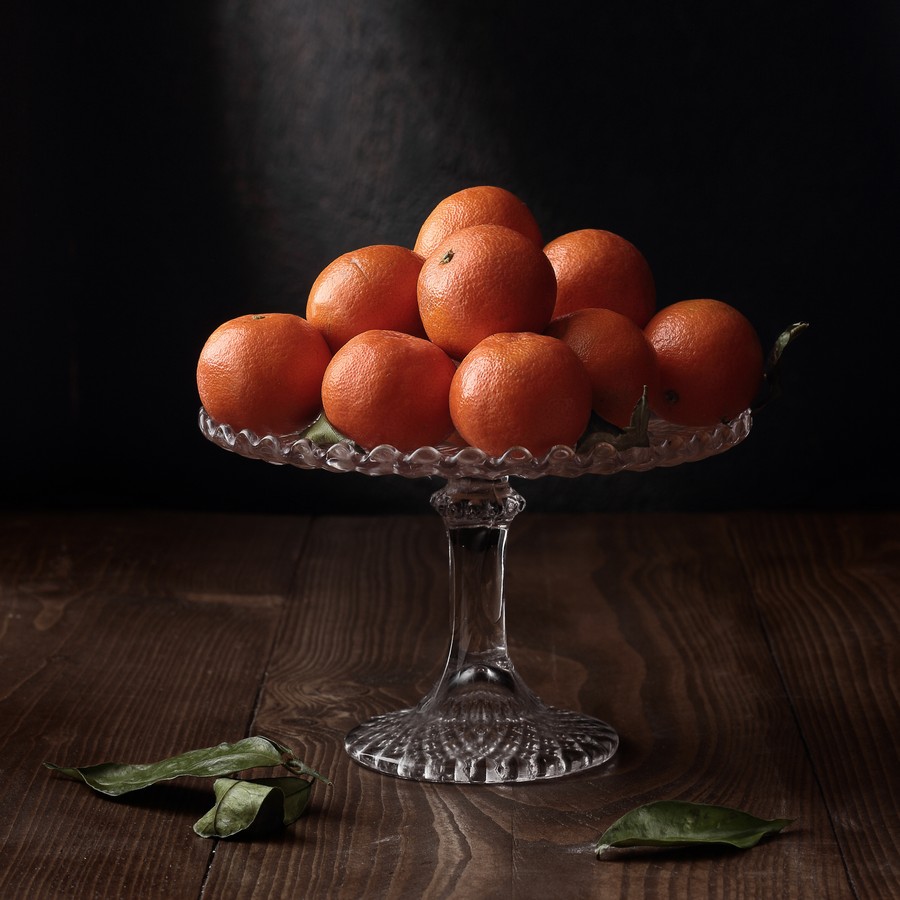
Last edited:

")
