Elgol in mono

Messages
2,654
Name
Martin
Edit My Images
No
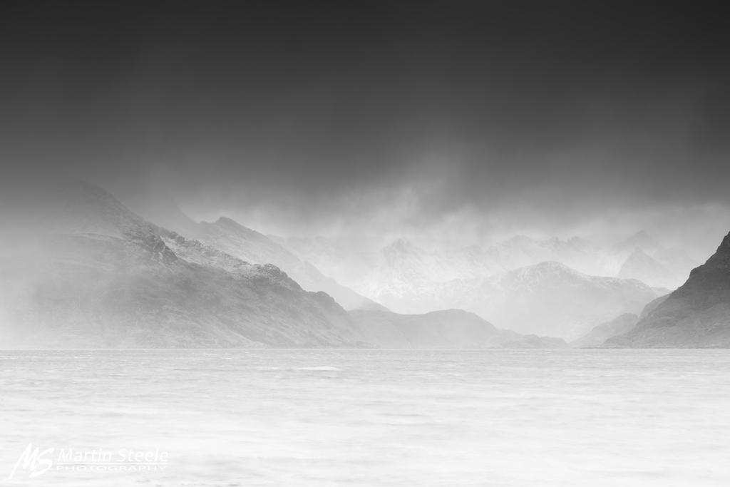
Elgol. The Cuillins from across Loch Scavaig.

Not sure I posted the original of this shot here or not, but decided to give mono a go this morning....

Elgol by Martin Steele, on Flickr
 
it very nice
but just for my eye some places need to be a bit darker to make it more moody
maybe some doge n burn
 
it very nice
but just for my eye some places need to be a bit darker to make it more moody
maybe some doge n burn
:agree:

I think a PP vignette to darken the bottom of this would make a stronger image- image spans almost full range of black to white but how it's applied in this instance which leaves it needing a bit more IMO
 
It wasn't a greatly moody afternoon, believe it or not...it's photographed as it was....if it was moodier, it would be moodier, but it is how it was. Yeah I can over process shots to look moody, but I won't change a photo and a memory (of a fantastic 5 day Skye workshop ran by myself and Nick) for the sake of it. I appreciate the comments, but it's generally not how I go about my photography. :)


I said it elsewhere Martin, it's one of the very best Elgol mono's I've seen, it really is.
If it were mine I wouldn't change anything.
By the way, I wish it was mine.

Cheers Scott, appreciate that mate. :)
 
It's your image to do with as you want :). Not looking for a fight but for my own curiosity, are there any ND grads on the lens for this image?
 
Still on the wider colour shot mate you posted back months ago. The cool tones visible in the colour add to the sense of "squal" and cold you get when the weather is its most typical of Skye.

Maybe on a large print with white mount and black frame I might change my mind, but to me the colour has the feeling, atmosphere and soul of a wet windy day on Skye.
 
The colour version does even fuller justice, IMHO, to that heart-rendingly beautiful and so so subtly hued scene- a marvellous image.
 
Still on the wider colour shot mate you posted back months ago. The cool tones visible in the colour add to the sense of "squal" and cold you get when the weather is its most typical of Skye.

Maybe on a large print with white mount and black frame I might change my mind, but to me the colour has the feeling, atmosphere and soul of a wet windy day on Skye.

Cheers mate, I do love the colour, I have it printed on a 4' canvas on my wall in the 2:1 I posted....although this mono doesn't look as good resized, it looks much better full size on my 27" monitor, so might get it printed and see what it's like. :)
 
  • Like
Reactions: ST4
I liked the mono version when I saw it, and I still do, but the colour version is simply beautiful. My favourite by a country mile.
 
Certainly colour version. The colour toning is pleasing and I'm particularly drawn to the slightly sunny patch on the right. You just don't have that in the mono version.

My suggestions would be to darken the base of the image a little and adjust the brightness of the cloud so that it feels more natural.
 
I like both, bit hard to pick! The B+W has some nice tones, and the colour has that nice bottle blue of the sea.
 
Back
Top