

You are using an out of date browser. It may not display this or other websites correctly.
You should upgrade or use an alternative browser.
You should upgrade or use an alternative browser.
Em's 52 for 2017 - You added
- Thread starter Emja
- Start date
- Messages
- 5,921
- Name
- Dominic
- Edit My Images
- Yes
Transport
I had thought about doing something like this, but i haven't got any toys whatsoever, let alone a vw camper van.
I like the orange surrounded by the green of the grass and those daisy flowers holding in (if you see what I mean) framing the little camper.
TOP JOB")
I had thought about doing something like this, but i haven't got any toys whatsoever, let alone a vw camper van.
I like the orange surrounded by the green of the grass and those daisy flowers holding in (if you see what I mean) framing the little camper.
TOP JOB
OP
- Messages
- 3,250
- Name
- Emma
- Edit My Images
- Yes
Thanks Allanvery good love the setting, its all been said above
Thank you Andrea!That's a lovely shot! Pretty flowers, great DOF, contrasting colours, and humour as well
That's what I was thinking of - thanks ChrisI think thats a great little shot. The daisies add to the kind of 'hippy/flower power' theme often associated with early VW buses. Well done.
Cheers BerndGreat idea, I like the water droplets and the tall grass and daisies. Very flower power-ish. And great DoF.
Lol - thanks TimI think that works really well Emma.
Having friends who either have or have had VDub vans, that is about as close as you want to get too.
Thank you David. The macro lens & I are rarely far apart this time of year...I can't promise it will be the last shoehornOut & about with the macro lens again ... top shot of little insect on a stick, that's ... erm ... Broken.
Transport ... Bernd said it ... Very flower power-ish.
Thanks ChrisThat made me smile, lovely shot of the camper amongst the daisies.
Thanks DominicTransport
I had thought about doing something like this, but i haven't got any toys whatsoever, let alone a vw camper van.
I like the orange surrounded by the green of the grass and those daisy flowers holding in (if you see what I mean) framing the little camper.
TOP JOB
My son found the van abandoned in a flower bed on a holiday many years ago - it was good to bring it back to its flowery roots!
OP
- Messages
- 3,250
- Name
- Emma
- Edit My Images
- Yes
Week 22 Minimalistic
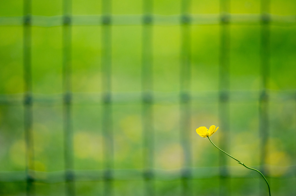
I often try and blitz backgrounds in my nature shots, but just to be awkward decided I didn't want to do that for this theme. I love those minimalist shots that feature bright architecture with texture/pattern, but couldn't think of anywhere close by where I could find that type of set up. So here's the countryside version (maybe!)
 Week 22 Minimalistic by Em's TP 52 2017, on Flickr
I often try and blitz backgrounds in my nature shots, but just to be awkward decided I didn't want to do that for this theme. I love those minimalist shots that feature bright architecture with texture/pattern, but couldn't think of anywhere close by where I could find that type of set up. So here's the countryside version (maybe!)
Week 22 Minimalistic by Em's TP 52 2017, on Flickr- Messages
- 1,036
- Name
- Donna
- Edit My Images
- Yes
Great shot, textures and colour. Draws you into the buttercup
OP
- Messages
- 3,250
- Name
- Emma
- Edit My Images
- Yes
Thank you Donna - that's what I was trying for...!Great shot, textures and colour. Draws you into the buttercup
OP
- Messages
- 3,250
- Name
- Emma
- Edit My Images
- Yes
Thanks Mark - you are right about the grid not being level. I was sure I was straight on to it as I took it, but struggled to fix it in pp. Maybe I rushed this one a little...Hmmm, not convinced on this one Em.The BG is what fails the image I think, the "grid" feels way to harsh for the softer frontal subject and to add insult to injury, its not level in the frame either.......
Sorry.....
OP
- Messages
- 3,250
- Name
- Emma
- Edit My Images
- Yes
Thanks Chris - I'm glad you get something from the shot. I think I saw it as the buttercup looking out through the fence to a freer life...imagination gone wild perhaps?! This was the type of shot I was influenced by...some people seem to think it's minimalist - but as you say I know diddly-squat too!I think it's a really interesting shot with the lovely sharp buttercup and the OOF grid but I think there is a little too much going on for a minimalist shot, but hey, I know exactly diddly-squat about minimalism.


OP
- Messages
- 3,250
- Name
- Emma
- Edit My Images
- Yes
I do like the sharp buttercup Emma, and the little spiders web on it too but for me the green fence in the BG does the shot no favours at all Sorry
Thank you Dave and Stan - I felt it was blurred enough to carry the shot...but maybe not!I like the idea, the main subject, buttercup, is nicely captured with an interesting curved stem, however, I'm not too keen with the confusing square grid background.
- Messages
- 104,470
- Name
- The other Chris
- Edit My Images
- Yes
Thanks Chris - I'm glad you get something from the shot. I think I saw it as the buttercup looking out through the fence to a freer life...imagination gone wild perhaps?! This was the type of shot I was influenced by...some people seem to think it's minimalist - but as you say I know diddly-squat too!
View attachment 103475 View attachment 103473 View attachment 103474
Again from the stand point of complete ignorance and purely considering my idea of minimalism, the thing that to my eye differs from you photo and those examples is the color/tonal complexity of the background. I guess there are buttercups on the other side of the fence giving those yellow “blobs”. If the background behind the fence was all green and the fence was a bit sharper, for me you would have nailed the minimalism idea. But then the photo might not have been as good overall, I like your escapism message, and as it stands it works well. Sorry to harp on

OP
- Messages
- 3,250
- Name
- Emma
- Edit My Images
- Yes
No apology needed Chris - thanks for your thoughts!Again from the stand point of complete ignorance and purely considering my idea of minimalism, the thing that to my eye differs from you photo and those examples is the color/tonal complexity of the background. I guess there are buttercups on the other side of the fence giving those yellow “blobs”. If the background behind the fence was all green and the fence was a bit sharper, for me you would have nailed the minimalism idea. But then the photo might not have been as good overall, I like your escapism message, and as it stands it works well. Sorry to harp on
I think I understand what you wanted to achieve, but it doesn't quite work for me. I think the background behind the fence is too busy, and the fence stands out too harshly against that poor little buttercup...
I know what you're aiming for, and I really like that oof BG grid ... but I feel the FG flower could be stronger, more contrasty.
Thanks all for your helpful comments - I think I was way off the mark on this one! I also took this shot - maybe there's still too much texture in the grass, but it's certainly less busy than the other. So here's minimalism mark II...just to hopefully get a better shot in before the next theme. No need to comment of course!I'm with the others on this one Emma, I don't think it quite works for the theme, it's a bit tooo 'busy' but it's good to try new ideas, so well done for that.
 evening blue by Emma Varley, on Flickr
Last edited:
OP
- Messages
- 3,250
- Name
- Emma
- Edit My Images
- Yes
Very good indeed, great colours in the butterfly against the nicely muted background
No need to comment, I will
Thank you all...sometimes it's better to stick to what you know!Much more like it Em - I was going to suggest your Goldfinch shot for this theme for similar reasons. Youve got some great stuff on your flickr of late.
- Messages
- 1,645
- Name
- Steve
- Edit My Images
- Yes
Hi Emma,
I'm so far behind on my comments, trying to catch up a bit:
Broken - A lovely image, great detail in the fly and a nice smooth background.
Transport - A good fun image, I like the battered paint of the VW, gives it a lot of character.
Minimal - Well done for having a go at something different, I like the idea but like some others I think it's the yellow flowers in the background that stop it working. Nice backup with the butterfly though.
Please don't! I think it's one of the best parts of the 52 project, seeing people try news things and how they interpret different themes.
I'm so far behind on my comments, trying to catch up a bit:
Broken - A lovely image, great detail in the fly and a nice smooth background.
Transport - A good fun image, I like the battered paint of the VW, gives it a lot of character.
Minimal - Well done for having a go at something different, I like the idea but like some others I think it's the yellow flowers in the background that stop it working. Nice backup with the butterfly though.
Thank you all...sometimes it's better to stick to what you know!
Please don't! I think it's one of the best parts of the 52 project, seeing people try news things and how they interpret different themes.
- Messages
- 1,075
- Name
- Georgina
- Edit My Images
- Yes
Hi Emma, catching up again! so far behind its going to take me ages
Architecture - Lovely old wall looks great against the blue sky and nicely framed by the trees. Is that a little tree growing out of the top?
Hairy - really like this on the slant, lots of detail and very hairy but also very creepy
Broken - Another great bug shot and the stick is broken lol
Transport - love this, the camper looks fab amongst the daisies. It's looks like it is what we call well loved too
Minimalism - I think the buttercup is just not big enough in the shot, it is a little lost. Maybe if you cropped it a bit but the butterfly on the grass is beautiful
- Messages
- 485
- Name
- Chris
- Edit My Images
- Yes
Bit lare here too. I'm going to pretend your butterfly was your minimalist shot because I think it's a cracker.
OP
- Messages
- 3,250
- Name
- Emma
- Edit My Images
- Yes
Thanks Allan - there's something I still like about it too, minimalist or notI have to say there is a lot about it i like, its good to try something different it would have been easy to do it without the fence but it says something more with it, extends the separation and isolation in a way
OP
- Messages
- 3,250
- Name
- Emma
- Edit My Images
- Yes
I think I understand what you wanted to achieve, but it doesn't quite work for me. I think the background behind the fence is too busy, and the fence stands out too harshly against that poor little buttercup...
I know what you're aiming for, and I really like that oof BG grid ... but I feel the FG flower could be stronger, more contrasty.
Thanks for all your comments - I thought the defined stem and colour of the buttercup were strong enough...but I really appreciate your feedbackI'm with the others on this one Emma, I don't think it quite works for the theme, it's a bit tooo 'busy' but it's good to try new ideas, so well done for that.
OP
- Messages
- 3,250
- Name
- Emma
- Edit My Images
- Yes
Very good indeed, great colours in the butterfly against the nicely muted background
Thanks Steve...I think it's the best bit of the 52 as well...just frustrating sometimes!Hi Emma,
I'm so far behind on my comments, trying to catch up a bit:
Broken - A lovely image, great detail in the fly and a nice smooth background.
Transport - A good fun image, I like the battered paint of the VW, gives it a lot of character.
Minimal - Well done for having a go at something different, I like the idea but like some others I think it's the yellow flowers in the background that stop it working. Nice backup with the butterfly though.
Please don't! I think it's one of the best parts of the 52 project, seeing people try news things and how they interpret different themes.
Thanks so much for taking the time to catch up Georgina...so you spotted my shoehornHi Emma, catching up again! so far behind its going to take me ages
Architecture - Lovely old wall looks great against the blue sky and nicely framed by the trees. Is that a little tree growing out of the top?
Hairy - really like this on the slant, lots of detail and very hairy but also very creepy
Broken - Another great bug shot and the stick is broken lol
Transport - love this, the camper looks fab amongst the daisies. It's looks like it is what we call well loved too
Minimalism - I think the buttercup is just not big enough in the shot, it is a little lost. Maybe if you cropped it a bit but the butterfly on the grass is beautiful
Bit lare here too. I'm going to pretend your butterfly was your minimalist shot because I think it's a cracker.
Thank you both - glad you like the butterfly...I've got a bit of a grass bokeh fetish going on at the momentNow that is perfect, great shot and right on theme!
OP
- Messages
- 3,250
- Name
- Emma
- Edit My Images
- Yes
It's that time of year...I will try and catch up with comments soon...sorry!
 Week 23 'Progress' by Em's TP 52 2017, on Flickr
Week 23 'Progress' by Em's TP 52 2017, on Flickr
Last edited:
OP
- Messages
- 3,250
- Name
- Emma
- Edit My Images
- Yes
Thanks Dave - all fixed nowLinky is not working Emma
OP
- Messages
- 3,250
- Name
- Emma
- Edit My Images
- Yes
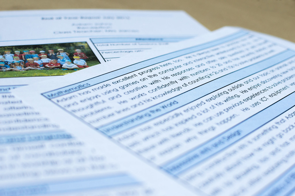
Lol...and there I was thinking parents appreciated all the hard workGreat subject for the theme, couldn't be more appropriate and nicely done. Rather you than me though, it's enough of a chore having to read 2 each year
- Messages
- 9,075
- Name
- David
- Edit My Images
- Yes
Thank you all...sometimes it's better to stick to what you know!
It's good to try different things whilst it's also good have your own style/identity. And you are certainly good with those outdoor macros.
"Excellent Progress ... " ... bet you're pleased. Nice idea for the theme.
SamuelSlade007
RENEGADE!!!!!!
- Messages
- 7,802
- Name
- Frank
- Edit My Images
- No
your minimal shots are great, first using the fence to isolate, or frame the flower
as much as i shun using just words for the theme, i've done it so i cannt talk..good use of DOF, now if you had made the document up as a bio about yourself and your project, i'd have forgiven you in an instance, just stand at the back of the class til thursday please..
as much as i shun using just words for the theme, i've done it so i cannt talk..good use of DOF, now if you had made the document up as a bio about yourself and your project, i'd have forgiven you in an instance, just stand at the back of the class til thursday please..