
- Messages
- 3,654
- Name
- Mark
- Edit My Images
- Yes
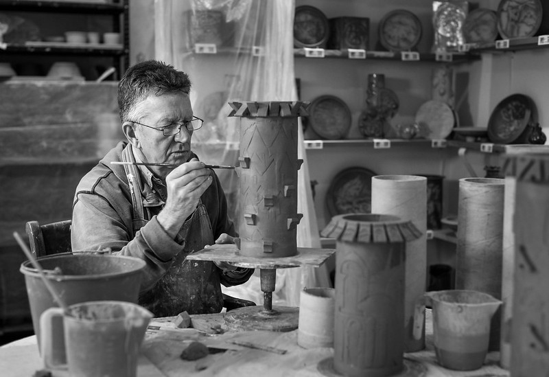 Potter at Work by Mark, on Flickr
Last edited:
 Potter at Work by Mark, on Flickr
•would prefer a halfway house between yours and mine.
And I thank you for that, need to brush up on my old dodging and burning skills!•
Just wanted to show a possible way with no pretension of any kind.
I like the way you see your father.
Love it but would burn/vignette the top right to focus the light more on your dad

•
I love this… and thinking in the same direction than Andrew, I tweaked…

This is great.
I'm generally not a fan of vignettes added in post; they rarely make sense with the light that's there and are often an attempt to remedy poor composition. In this case though I agree with Andy - you could darken the right. At the same time I'd lighten the left with a gradient and crop a smidge.
View attachment 50608
This was not my idea of doing it (I have no right to interfere with Mark's artistic intent)Woah... too much IMO.
•have updated the original image in post #1
•
Great rendition Mark!