Farm Building Triptych

Messages
404
Name
Paul
Edit My Images
Yes
Tried out a few triptych arrangements, but quite liked this one of a series of shots I took of a farm I found. Can't decide whether having the brick+sky image in the middle works on not ... any thoughts?


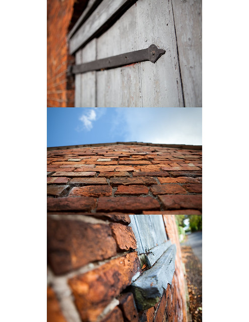
Weathered Farm by Mr-Davies, on Flickr

The more I look at it, I think I'm also going to try it on a black background!
 
I like the 3rd one down the best, great angle + DOF, I'm not feeling the brick wall and sky shot either unforuntely, I think the first shot would benefit in B&W the grain in the wood would really pop i feel.
 
Hi there!

its certainly got protential, you might want to consider aswell, horizontally and made be put some space between each image. IMHO the black BG will add more punch to the images.

Look forward to seeing the final outcome.

Graham.
 
I like the 3rd one down the best, great angle + DOF, I'm not feeling the brick wall and sky shot either unforuntely, I think the first shot would benefit in B&W the grain in the wood would really pop i feel.

Thanks for taking the time to comment, really appreciate it!

The texture on the first is lovely in full 21mp glory ... I think I just really liked the paint colour, so resisted the conversion (also wanted to have a set of 3 in colour). I tried a tighter crop to see more of the grain etc, but due to the composition, it didn't work.

Let me see what I can do with a conversion!

The brickwork was all about the texture of the blown out bricks and the varied colours against the vivid blue sky. Also continuing the theme of the wearing effects of time and the elements. Again - perhaps it suffers from being quite low res?

#3 was my favorite too ;)


Hi there!

its certainly got protential, you might want to consider aswell, horizontally and made be put some space between each image. IMHO the black BG will add more punch to the images.

Look forward to seeing the final outcome.

Graham.

Thanks Graham ... I did try a horizontal layout, but as they are all landscape images they seemed a little lost on the page (a lot more white space than image). Perhaps these just need to be seen as standalone pictures?
 
Last edited:
Back
Top