Feedback on my images - More images added 8/2/16

Messages
37
Edit My Images
Yes
Hi all

Looking to get some feedback (good or bad) on some of my images as I'd like to learn how to get better.

I've been doing photography on and off for a while but now want to start taking it more seriously.
I'm currently shooting with a Canon 50D and have a few different lenses.

All images were taken at Victoria Country park.
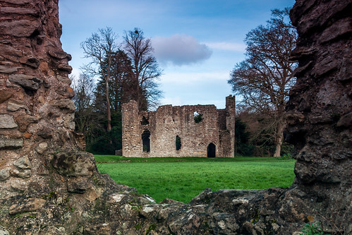
IMG_4107-Edit by Nick Perry, on Flickr

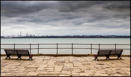
IMG_4082-Edit by Nick Perry, on Flickr

This was a pipe going out into the sea and was trying to play around with long exposures with a filter
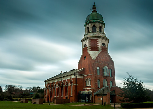
IMG_4073 by Nick Perry, on Flickr

Longer exposure used to smooth the clouds.
 

#1
Good sharpness, cool composition and charming tones.
Sky doesn't look realistic…
if you toned down the clouds then not just half way

#2
Lovely colour, interesting zen composition but
much too soft: DoF is ok but not the sharpness

#3
Interesting subject, good sharpness and DoF, poor composition,
uncorrected perspectives, inadequate PP, presence of haloing
artefacts.

Conclusion: I like you eye for composition (strong point) but your
PP (weak point) needs to be more consequent
 
Thank you Kodiak, really appreciate the critique.
My PP and LR definitely need some refining and I must resist the temptation to go too mad in order to keep it looking more natural.

With the 1st and 2nd image definitely understand what your saying.
With the composition of the 3rd image what would you suggest I can do to make it better. (Possibly less centered and more to the right,?) and also not 100% sure what you mean by uncorrected perspectives.

Thanks Nick
 
not 100% sure what you mean by uncorrected perspectives.

…uncorrected perspectives — done through the keystone tool in your RAW converter.

In a case like this church (with a somewhat surprisingly disproportionate bell tower) the
better way to do it is to get more room around the subject to allow for eventual keystone
tweaks —which won't go without pixel loss— and maybe centre the bell tower and not
the building it self… possibly leaving more room at the front.

IMG_4073pp.jpg
 
ah ok yeah understand what you mean.

thanks again Kodiak for the help.
 
Thank you Dade_f. Finding intresting subjects seems to be half my battle. Think I just need to keep getting out and possibly get driving a little further afield to find more things to shoot.
 
Very nice shots by the way, on the 3rd one the exposure on the building is a bit uneven, there are dark and bright spots when you look closely, the first one maybe toning down the sky a bit and it will look better
 
I'm sure "keytoning" makes it look like the tower has been made more bulbous than it really is - i've seen it done on other buildings and to me it looks rather unnatural
 
I'm sure "keytoning" makes it look like the tower has been made more bulbous than it really is

Just have a look at the original Adrian,
the disproportionate bell tower…
 
Really like No.1 very atmospheric and typical of British 'seaside'. I like the added PP on the clouds to give them focus and drama.
 

…on your post #12

1, a slanted but cool composition, the couple is a nice feature in there
2, slanted too and the main land needs tweaking, nice comp.
3, keystone tool required but over processed
4, the rendition should be rethought as it is not convincing
 

…on your post #12

1, a slanted but cool composition, the couple is a nice feature in there
2, slanted too and the main land needs tweaking, nice comp.
3, keystone tool required but over processed
4, the rendition should be rethought as it is not convincing

Cheers Kodiak will have to revisit them in LR to straighten them up. Some times I can spend ages deciding if their straight or not and then still not be right lol

Still trying to get to grips with the key stoning so will keep trying with that. As well.
 
I can spend ages deciding if their straight or not
The horizon water line is the better reference in these cases.
 
Back
Top