

- Messages
- 1,564
- Name
- Graham
- Edit My Images
- No
I literally can't decide between the colour and mono versions of this one...
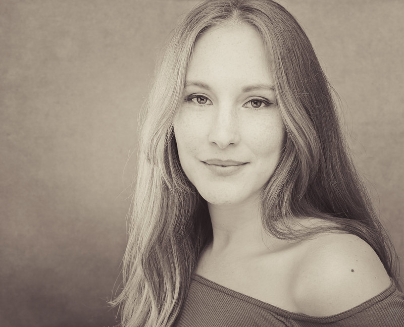
FelicityJayne-045-Edit-Edit-bw by Graham Mayers, on Flickr
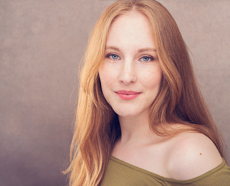
FelicityJayne-045-Edit-Edit by Graham Mayers, on Flickr
FelicityJayne-045-Edit-Edit-bw by Graham Mayers, on Flickr
FelicityJayne-045-Edit-Edit by Graham Mayers, on Flickr
 I think the colour works much better, I love the colour of her hair and those bright blue eyes. Makes the portrait.