Fraser Euan White
Suspended / Banned
- Messages
- 3,062
- Name
- Fraser White
- Edit My Images
- Yes
February entry; Abstract & Odd:
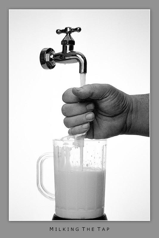
Milking the tap - Film by Fraser White, on Flickr
Purchased a 'floating tap' from eBay for £15 as the prop & filled it with milk. The hand (my ugly one) is supposed to be miking it like you would milk a cow!
Milking the tap - Film by Fraser White, on Flickr
Purchased a 'floating tap' from eBay for £15 as the prop & filled it with milk. The hand (my ugly one) is supposed to be miking it like you would milk a cow!
Last edited:
")
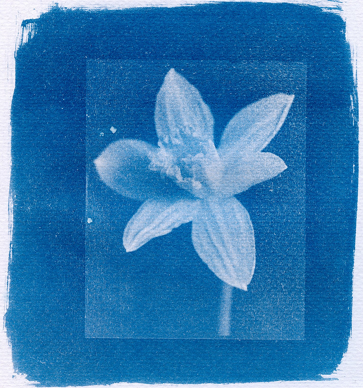 CyanotypeDaffofil
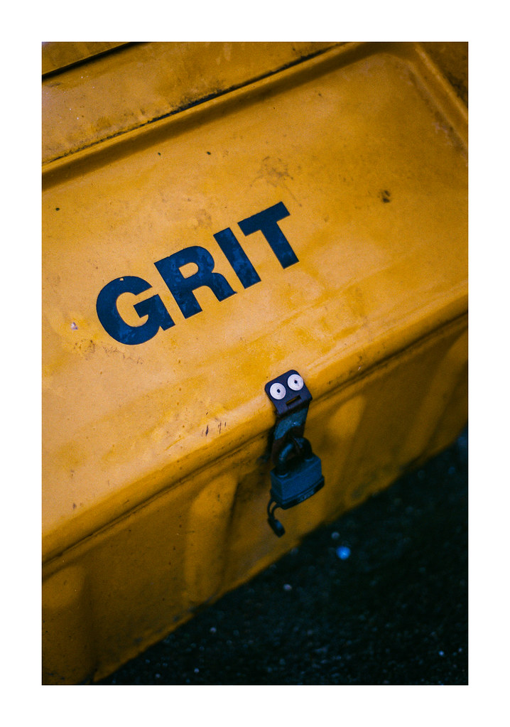
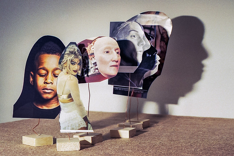 FaceOff