

moomike
TPer Emeritus
- Messages
- 5,783
- Name
- Mike
- Edit My Images
- Yes
Hi all,
Has been a good few years since I did any proper studio work. Was great fun & definitely something I'm looking forward to doing more of")
Know some of these may be a bit too "arty" for some but any constructive c&c welcome & appreciated.
Cheers for looking,
Mike
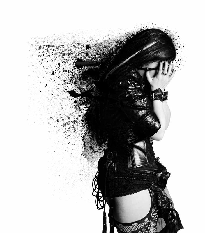 Anguish. by michaelgartonphotography, on Flickr
 Classic style. by michaelgartonphotography, on Flickr
 Phex_Studio. by michaelgartonphotography, on Flickr
 Little dark riding hood. by michaelgartonphotography, on Flickr
Has been a good few years since I did any proper studio work. Was great fun & definitely something I'm looking forward to doing more of
Know some of these may be a bit too "arty" for some but any constructive c&c welcome & appreciated.
Cheers for looking,
Mike
Anguish. by michaelgartonphotography, on FlickrClassic style. by michaelgartonphotography, on FlickrPhex_Studio. by michaelgartonphotography, on FlickrLittle dark riding hood. by michaelgartonphotography, on Flickr