

You are using an out of date browser. It may not display this or other websites correctly.
You should upgrade or use an alternative browser.
You should upgrade or use an alternative browser.
weekly Flyphot's 52 for 2020: Week 52 'Decorate' added
- Thread starter FlyPhot
- Start date
- Messages
- 5,184
- Name
- Fi
- Edit My Images
- Yes
I really like the idea and the processing on the eggs is good . My only issues are the plate / background though. I think it would have popped more with a stark white background and a plain plate - ideally also white.
OP
- Messages
- 4,159
- Name
- Jim
- Edit My Images
- Yes
I agree about the plate.... However, we don't have any plain white plates or I'd have used oneI really like the idea and the processing on the eggs is good . My only issues are the plate / background though. I think it would have popped more with a stark white background and a plain plate - ideally also white.
") and, the background is white, it may be the pp on the yolks has affected it globally
and, the background is white, it may be the pp on the yolks has affected it globally
Last edited:
OP
- Messages
- 4,159
- Name
- Jim
- Edit My Images
- Yes
" I do like Green Eggs and Ham" Great interpretation and fits the technique.
Cheers, much appreciated
LC2
Negan
- Messages
- 10,451
- Name
- Tim
- Edit My Images
- Yes
That's better JimOK, for those ultra picky ones, new image now uploaded
You get the T mark now I do love the Dr Seuss reference and the work that went into changing the tint of the yolks. Yay for local adjustments
OP
- Messages
- 4,159
- Name
- Jim
- Edit My Images
- Yes
That's better Jim
I do love the Dr Seuss reference and the work that went into changing the tint of the yolks. Yay for local adjustments
cheers (no hard feelings, it's all in jest, which i know is hard to convey in the written word on an internet forum).
LC2
Negan
- Messages
- 10,451
- Name
- Tim
- Edit My Images
- Yes
I could feel the smile on your face as I read your posts and hope you could mine.cheers (no hard feelings, it's all in jest, which i know is hard to convey in the written word on an internet forum).
OP
- Messages
- 4,159
- Name
- Jim
- Edit My Images
- Yes
Jim that is eggcellent, nice composition and great processing, makes me glad that eggs are yellow.
haha, thanks Clive
OP
- Messages
- 4,159
- Name
- Jim
- Edit My Images
- Yes
Ability - I am guessing lawn still not mown with the weather we have been having
Winter - very wet, indeed a sorry sight.
Book - no doubt about the book, I think a plainer plate might have been better, good processing though
Thanks, yes the lawn is still long (and getting longer!). Book - as I said in an earlier post, I don't have a plain whit eplate, so needs must i'm afraid.
Scots_quine
In memoriam
- Messages
- 1,753
- Name
- Joan
- Edit My Images
- Yes
Very clever but I think it would have been better on a white plate. The eggs are fighting with the fruit and would stand out better on a plainer background.
- Messages
- 2,833
- Name
- Pete
- Edit My Images
- No
Well worked and no doubt about the title. Don't fancy eating the eggs much though!
OP
- Messages
- 4,159
- Name
- Jim
- Edit My Images
- Yes
Very clever but I think it would have been better on a white plate. The eggs are fighting with the fruit and would stand out better on a plainer background.
It's all been said about the background of the plate - but the processing of the tools is great, and the book is absolutely unmistakable!
Well worked and no doubt about the title. Don't fancy eating the eggs much though!
Nice interpretation Jim, but green eggs,?
Good shot there, the green eggs certainly add to the image! I'm please I had my breakfast before seeing this
Guessed this one straight away. Excellent take on the theme and well processed.
Thanks all for taking the time to cemment, much appreciated.
OP
- Messages
- 4,159
- Name
- Jim
- Edit My Images
- Yes
Haha - we have a copy if that book somewhere - nice one
cheers I was watching some videos on YouTube earlier with my grandson, fantastic 1970s stuff with brilliant illustration and animation.. And, in fact all of the Dr Seuss stories carry a really good message too.
- Messages
- 4,562
- Name
- Mark Gameson
- Edit My Images
- Yes
Great take on the theme, nicely take and processed and edible props too (although I don't like eggs)
)
OP
- Messages
- 4,159
- Name
- Jim
- Edit My Images
- Yes
Great take on the theme, nicely take and processed and edible props too (although I don't like eggs
Thanks, the eggs were delicious (they are from a local farm, so very free-range, very organic, very tasty and also very cheap!)
- Messages
- 1,036
- Name
- Donna
- Edit My Images
- Yes
Isn't it amazing how the different colour turns you green . I see there are already the comments about a white plate, but well taken, and good processing, great fun to see.
. I see there are already the comments about a white plate, but well taken, and good processing, great fun to see.
OP
- Messages
- 4,159
- Name
- Jim
- Edit My Images
- Yes
Isn't it amazing how the different colour turns you green
Thanks
- Messages
- 115,214
- Name
- The real Chris
- Edit My Images
- No
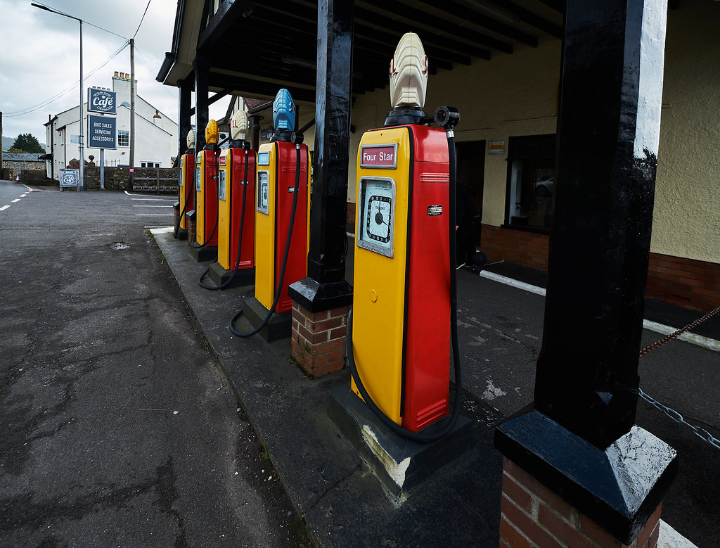
Nice set Jim, fits nicely. #1 for me, I like the abandoned look.
It say's a lot about transport these days
And that's an interesting set of old pumps, I remember them being in use. Are they the mechanical type?
There was a garage, slightly out of town, must have been mid '70's and there was a little old guy that used to run "Petrol Station"
I used to call in there just to watch him "pump" the fuel... to look at him, wouldn't think he had it in him ...
OP
- Messages
- 4,159
- Name
- Jim
- Edit My Images
- Yes
Nice set Jim, fits nicely. #1 for me, I like the abandoned look.
It say's a lot about transport these days
And that's an interesting set of old pumps, I remember them being in use. Are they the mechanical type?
There was a garage, slightly out of town, must have been mid '70's and there was a little old guy that used to run "Petrol Station"
I used to call in there just to watch him "pump" the fuel... to look at him, wouldn't think he had it in him ...
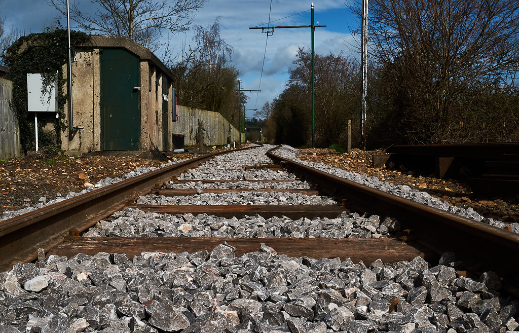
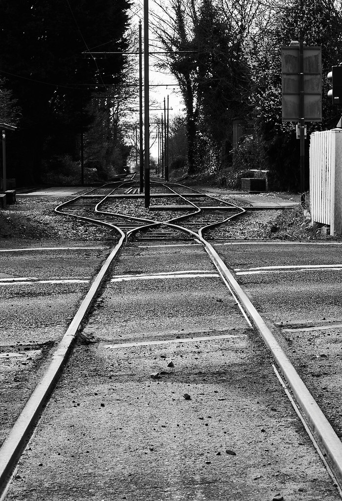
Thanks, I was torn between #1 and #2 but chose #2 as there was some more interest in the shape of the tracks. They are taken at Seaton Tramway. I was actually laying between the tracks to get #1 (lucky it's a seasonal tramway
I'm not sure about the pumps, they aren't in use anymore as the petrol station is now a cafe.
Last edited:
OP
- Messages
- 4,159
- Name
- Jim
- Edit My Images
- Yes
Love the one you chose.
Really nice conversion.
Think the pumps could be a nice shot, but the light's a bit flat.
They remind me of the garage that's now a house in Angmering.
They look like the same pumps. Yep, its been a grey day (in parts) today.
LC2
Negan
- Messages
- 10,451
- Name
- Tim
- Edit My Images
- Yes
I prefer #1 to #2, because of the lower angle, though the track is less interesting.
However, it's never wise to assume track is out of use. Even when out of season there can be trains / vehicles running on them, for instance for engineering works.
However, it's never wise to assume track is out of use. Even when out of season there can be trains / vehicles running on them, for instance for engineering works.
OP
- Messages
- 4,159
- Name
- Jim
- Edit My Images
- Yes
I prefer #1 to #2, because of the lower angle, though the track is less interesting.
However, it's never wise to assume track is out of use. Even when out of season there can be trains / vehicles running on them, for instance for engineering works.
Cheers. I checked with a bloke working at the station, it was all perfectly safe
- Messages
- 115,214
- Name
- The real Chris
- Edit My Images
- No
They had a big handle I *think* it was on the front.I'm not sure about the pumps, they aren't in use anymore as the petrol station is now a cafe.
I guess it may have been removed, aesthetics if it was that type.
Looking closer iirc the handle would have been right where the red dots are.
OP
- Messages
- 4,159
- Name
- Jim
- Edit My Images
- Yes
Nice shots - #4 for me, and I quite like the subdued lighting. It seems to fit the subject somehow - especially with the age of the pumps.
No 2 for me with its high contrast B&W processing and the lines of the rails looking as if they were forced to split by the line of poles.
Thanks both for the kind comments.