

You are using an out of date browser. It may not display this or other websites correctly.
You should upgrade or use an alternative browser.
You should upgrade or use an alternative browser.
weekly Flyphots 52 for 2021: Week 52 'Showcase'
- Thread starter FlyPhot
- Start date
OP
- Messages
- 4,159
- Name
- Jim
- Edit My Images
- Yes
Lots to see in the Gate image, but the bird on the pole is nice and simple. All very good.
Pete
Thanks Pete
OP
- Messages
- 4,159
- Name
- Jim
- Edit My Images
- Yes
Wow that is a huge puddle! I often use my walking poles to help me get round puddles, but I'd have to pole vault around that one!
All on theme. I like the golden light in the gate, but the pole is also a strong image.
Thanks, it's a strange one because that puddle is actually run off from a small brook and it is constantly like that, it continues to a very small fall then onward as a brook. I'm unsure why there is even a gate there to be honest!

Thanks for the comment, appreciate it.
- Messages
- 4,331
- Name
- Martin
- Edit My Images
- Yes
Bird on the pole, no doubt in my mind.
OP
- Messages
- 4,159
- Name
- Jim
- Edit My Images
- Yes
Week 10 - Rough + tech Low Key
As it's been very windy the last couple of days I thought i'd nip to the seafront on y way to work - it was very windy and cold! Anyway, here are some of the images I made, and i've processed one to hopefully fulfil the low key technique ...
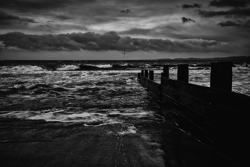


As it's been very windy the last couple of days I thought i'd nip to the seafront on y way to work - it was very windy and cold! Anyway, here are some of the images I made, and i've processed one to hopefully fulfil the low key technique ...
Last edited:
OP
- Messages
- 4,159
- Name
- Jim
- Edit My Images
- Yes
Best one in the main thread Jim, very moody and a nice low key shot I'd say.
Cheers Dave
OP
- Messages
- 4,159
- Name
- Jim
- Edit My Images
- Yes
I think you chose the right one - I like it.
Thank you Paul
OP
- Messages
- 4,159
- Name
- Jim
- Edit My Images
- Yes
#1 is the best IMO Jim, and I'd say it fits right in on both accounts.
Thank you, appreciate the comments
OP
- Messages
- 4,159
- Name
- Jim
- Edit My Images
- Yes
Yes it’s #1 for me too, very brooding and atmospheric, perfect for the theme.
Thanks Susie
OP
- Messages
- 4,159
- Name
- Jim
- Edit My Images
- Yes
Cheers for the comments, I see what you meanRough
They're all pretty good looking to me. The low-key works in the most part. I'd maybe just lighten the breakwater.
- Messages
- 8,304
- Name
- Ian
- Edit My Images
- No
A bit too over-processed for my liking. The triangle thing has a halo around it. (which often happens to me when I get trigger happy with the Clarity slider) Something halfway between the original and the edit would work better in my humble opinion.
It looks like a really aggressive ocean. And for me, it doesn't need the barrier thing in it. Images don't always need foreground interest or leading lines if they don't add to the photo. I think I prefer image 3 out of all of them because the barrier literally "points" to the triangle thing which then becomes the focus of the image. It's not "rough" in my mind though like #2 could be if it was #1 dialled down by 50%.
It looks like a really aggressive ocean. And for me, it doesn't need the barrier thing in it. Images don't always need foreground interest or leading lines if they don't add to the photo. I think I prefer image 3 out of all of them because the barrier literally "points" to the triangle thing which then becomes the focus of the image. It's not "rough" in my mind though like #2 could be if it was #1 dialled down by 50%.
OP
- Messages
- 4,159
- Name
- Jim
- Edit My Images
- Yes
Yep No.. 1 for me too. Nice moody scene.
A bit too over-processed for my liking. The triangle thing has a halo around it. (which often happens to me when I get trigger happy with the Clarity slider) Something halfway between the original and the edit would work better in my humble opinion.
It looks like a really aggressive ocean. And for me, it doesn't need the barrier thing in it. Images don't always need foreground interest or leading lines if they don't add to the photo. I think I prefer image 3 out of all of them because the barrier literally "points" to the triangle thing which then becomes the focus of the image. It's not "rough" in my mind though like #2 could be if it was #1 dialled down by 50%.
I like it personally - moody, gritty and works for low key for me.
Thanks for the comments folks, much appreciated.
- Messages
- 5,097
- Name
- Helen
- Edit My Images
- No
I like the pov and perspective on #1 but like others have said it looks a little over processed / contrasty. It looks a little wonky to me but could be the hills on the right hand side throwing out my eyesight. My horizons are always on the wonk so don't trust my judgement ")
OP
- Messages
- 4,159
- Name
- Jim
- Edit My Images
- Yes
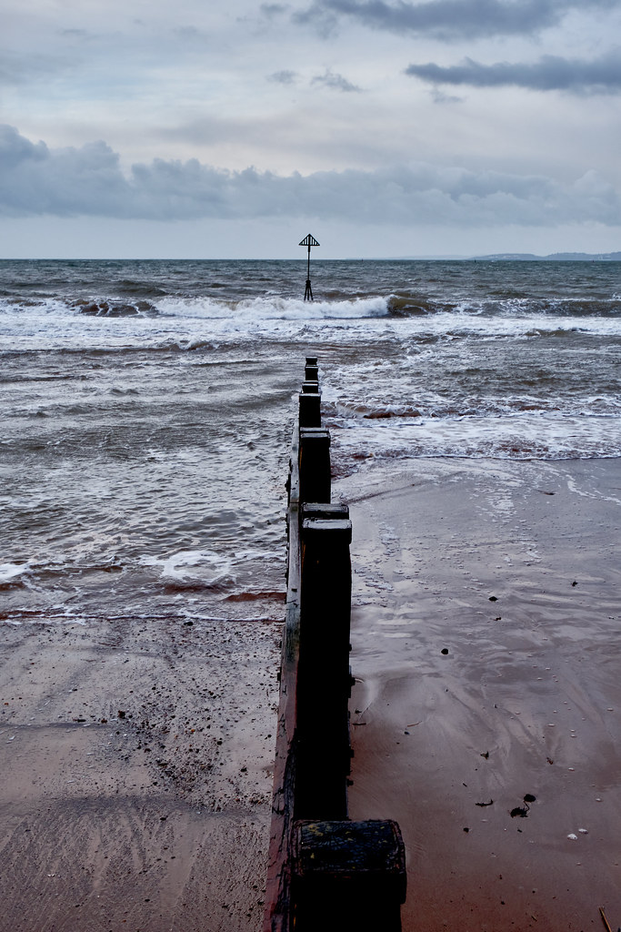
I like the colour version the neutral colour tones are great the first one is a little over processed I feel.
I like the pov and perspective on #1 but like others have said it looks a little over processed / contrasty. It looks a little wonky to me but could be the hills on the right hand side throwing out my eyesight. My horizons are always on the wonk so don't trust my judgement
Thanks both. Yes I agree it does look a bit overprocessed, and yes Helen it does look slightly wonky but it is definitely the hills doing that as I straightened it twice to make sure i'd got it right in camera .
- Messages
- 1,293
- Name
- Stuart
- Edit My Images
- Yes
Reflection
The mirror image on the gate photo is super sharp, I can just imagine reaching that point on a walk and realising I need to go through the water to reach my destination!!
Rough
I like the 4th image where my eye can look from left to right, reach the wall which then diverts my view vertically to the triangle.
- Messages
- 4,331
- Name
- Martin
- Edit My Images
- Yes
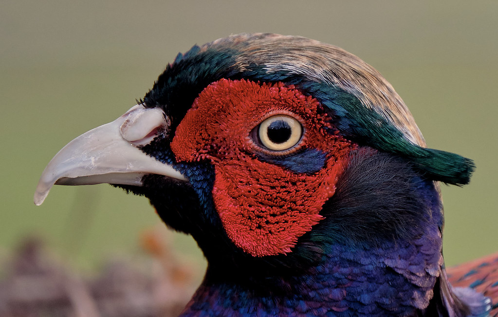
It's an optical illusion. If you stare at the brown top of the bird's head for a short time then stare at his eye, the top of his head seems to move. Of course I could be having a stroke
OP
- Messages
- 4,159
- Name
- Jim
- Edit My Images
- Yes
It's an optical illusion. If you stare at the brown top of the bird's head for a short time then stare at his eye, the top of his head seems to move. Of course I could be having a stroke
I see what you mean, it does! haha
OP
- Messages
- 4,159
- Name
- Jim
- Edit My Images
- Yes
That's a very colourful shot Jim, very nice.
That's a beautifully detailed shot that really shows the lovely colours. I have a pheasant that will feed from my hand in my garden. I can vouch for the fact that his beak is not very smooth
Lovely detailed shot but yeah - the mighty horn of shoe.
Thanks all, appreciate the comments
- Messages
- 8,304
- Name
- Ian
- Edit My Images
- No
Very detailed and nicely composed. It might be a shoehorn but I'm struggling with this theme so I say that's ok
OP
- Messages
- 4,159
- Name
- Jim
- Edit My Images
- Yes
Very detailed and nicely composed. It might be a shoehorn but I'm struggling with this theme so I say that's ok
Cheers Ian