OP
- Messages
- 4,159
- Name
- Jim
- Edit My Images
- Yes
Lovely! And a very original approach for the theme.
Thank you

Lovely! And a very original approach for the theme.
Well that’s definitely one idea I’d not thought of, what a super choice for the theme and loads of excellent detail, I like the way it emerges from the dark side, a very eye catching shot.
I looked at the moon Thursday night but it was obscured by clouds so didn't bother
a great idea for the theme and nicely done, good detail
And I thought it was made of cheese.
That's cool moon shot. Something I've never tried. That looks pretty detailed to me.
I predict that's the biggest bit of rock we see in this week's theme!
Nicely done Jim. Lots of detail and fascinating to look at.
Great shot of the best rock in space, cracking detail too.
Great minds think a like
Our nearest neighbour. Is it a single image or several stacked together? Some are ever hundreds stacked together. I've tried loads of times shooting the moon but never able to get all these details.
Good idea, and great to find a night clear enough to shoot it currently
Plenty of detail there. I note the EXIF says 560mm on a 100-400. So 1.4 tc too then?
Rock
Very sharp image of the moon. Lots of detail.
Great take on the theme and truly breathtaking shot.
The most interesting rock you can see from Earth. I have a similar picture that I took several years ago, strangely, nothing much seems to have changed
Definitely rock, and top marks for original take on the theme! Lots of detail in there as well.
Jeez... I wish people would stop making me want the 100-400 !
That's really nicely done.... Love it!
Brilliant. That's what I enjoy about these 52s. I tend not to look at what others have done until I've done mine. This was one of those "yep. well thought out" images that made me stop and click through.
Well done.
I like that very much, a great shot of the moon and perfectly on theme.
Great take on the theme and a lovely clean and sharp image.
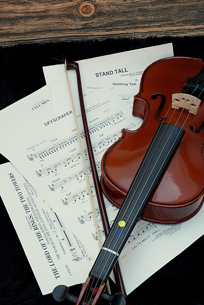
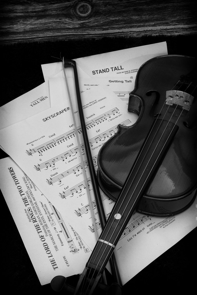
I have to agree on both these points.Colour one for me. The violin has a gorgeous colour that shouldn't be hidden. I like the picture but have reservations about the wood panel at the top.
Colour one for me. The violin has a gorgeous colour that shouldn't be hidden. I like the picture but have reservations about the wood panel at the top.
I have to agree on both these points.
The colour version is just great! A fine image. Cropped nice & tight, I like.
Slightly odd thing for the theme. I would have saved that for the ultimate impossible theme like 'Envy'
a well shoehorned take on the theme and nothing wrong with that.
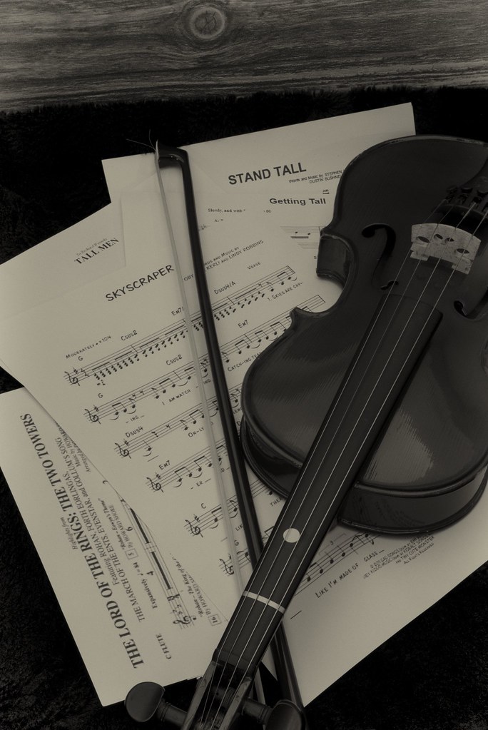
I prefer the rich colours, but the B&W has some nice tones, the sepia version compresses the tones too much for my taste.
Pete
Well done for coming up with a different idea. I love the rich warm tones of the colour version.