
- Messages
- 5,787
- Name
- Storm Trooper
- Edit My Images
- Yes
2 tries 2 incomplete.

")
Yes, there should be feet at the end of the legs, but they are not really visible in that photoI think the feet are there somewhere, good focus.
 wonderful colours and a nice bright image, and another damn song I'll keep humming all day , good luck with the rest of your challenge.
 Order_01 B&W by Scott, on Flickr
 Order_03 by Scott, on Flickr
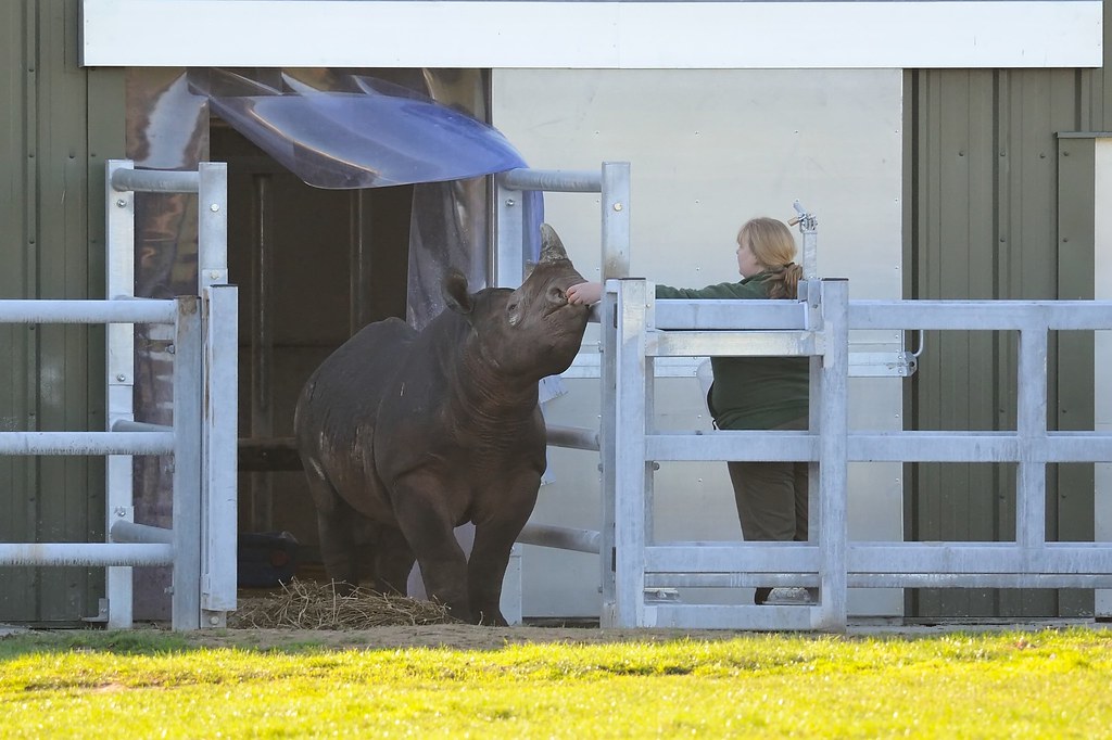 YWP 14-01-2017_23 by Scott, on Flickr
 Comfort-Barbie by Scott, on Flickr
 YWP 15
 Tiger Feet
 Order_02 B&W