From a recent wedding.

Messages
2,775
Name
Ben
Edit My Images
Yes
amysmall.jpg
 
Ben,

Since I presume you are inviting discussion in this section, I will start the C&C going by saying that there is lovely detail in the dress, but would like to see more separation from the background, as the hair outline is largely lost.

(Unless I need to recalibrate my monitor!)

Plus probably too much wasted space behind her compared to in front. Squarer crop might help?
 
Lovely, moody, romantic photo, but I do agree with 'shreds'^ about cropping off the right-hand third or more of the frame.
 
Its very atmospheric and quite ethereal... technically I think her face is too grey, the separation from the background doesn't bother me, in fact I like it a lot, her pose is a bit odd and usually I'd say as your eyes follow left to right it doesn't work all that well compositionally as she's looking out of the frame at the side you start on, so basically you look in the frame, at her and then straight back out. The only thing that actually really bothers me of those points is the pose / way she's stood... it doesn't work, it's I think a candid shot but the way it's been shot looks like it would be with a posed and quite beautiful portrait, there's something that doesn't match up with the 'pose' and the style of shot. It's not crap by any means, in fact it's nice, it's just not quite right 'there' if that makes sense?
 
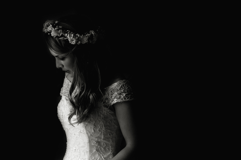
Beautiful Ben, quite tricky given the highlights of the dress to get that right.

Ben,

Since I presume you are inviting discussion in this section, I will start the C&C going by saying that there is lovely detail in the dress, but would like to see more separation from the background, as the hair outline is largely lost.

(Unless I need to recalibrate my monitor!)

Plus probably too much wasted space behind her compared to in front. Squarer crop might help?

Lovely, moody, romantic photo, but I do agree with 'shreds'^ about cropping off the right-hand third or more of the frame.

Its very atmospheric and quite ethereal... technically I think her face is too grey, the separation from the background doesn't bother me, in fact I like it a lot, her pose is a bit odd and usually I'd say as your eyes follow left to right it doesn't work all that well compositionally as she's looking out of the frame at the side you start on, so basically you look in the frame, at her and then straight back out. The only thing that actually really bothers me of those points is the pose / way she's stood... it doesn't work, it's I think a candid shot but the way it's been shot looks like it would be with a posed and quite beautiful portrait, there's something that doesn't match up with the 'pose' and the style of shot. It's not crap by any means, in fact it's nice, it's just not quite right 'there' if that makes sense?

Thanks for the comments.
 
Doesn't spin my dreidel at all, because if nothing else it's not obvious to me either what the message is or what the viewer might be expected to feel on seeing it. And that from somebody who usually rates your snaps highly ...
 
Doesn't spin my dreidel at all, because if nothing else it's not obvious to me either what the message is or what the viewer might be expected to feel on seeing it. And that from somebody who usually rates your snaps highly ...

Thanks!

Probably stronger as part of the full set, Dan.

I'll post the full wedding when it's done.
 
I think there are issue with it as commented above, but I love the use of negative space Ben. Please don't crop it any differently
 
It would be good to see this compared to the "out of camera" picture. As is I'd have binned it.

The brightest part of the image is on the dress and it's so much brighter than the girls face as to make her redundant.

I'm all for something different but this really doesn't work imho.
 
It would be good to see this compared to the "out of camera" picture. As is I'd have binned it.

The brightest part of the image is on the dress and it's so much brighter than the girls face as to make her redundant.

I'm all for something different but this really doesn't work imho.

I agree. OP - can you post the original (as it looks like something has gone wrong in PP) ?

I'm all for negative space, but as others have said, I think it would look better with the subject being on the RHS and space on the LHS.

Thanks for commenting.
 
I'd be tempted to try to lift a bit in her face... but other than that, I love everything about it. I think the negative space works well as it's something different.
 
Ben out of interest what was your 'concept' when taking this image, why did you shoot this moment like this and what was the purpose? You've just posted the image with no background info which makes it hard to understand the point of the photo a bit. It just looks like she was stood in a pocket of light and you just quickly took a snap shot, maybe you can give us some insight as one image can tell a story but sometimes it's not obvious and the photographer might actually have had an awesome concept the viewer has missed :)
 
You've posted an image for critique and have received some valuable comments including a couple of questions. Questions which you have completely ignored with the standard "thanks for commenting". If you're not going to engage with those that have taken the time to comment then, for me, I'm left wondering "why did I bother".

And then we wonder why folks are reluctant to critique on this forum.....
 
due to the lighting I tend to look at her lower area and forget the most important bit being her face, had the light been the other way round it would have been a wonderful image but I still would have been left wondering is this posed or a grab shot as she walked out the door. Im sure she will love it though.
 
I love the photograph,but,for a bride shot it for me is not complimentary. The ambience is about the dress and looks great,but,if I were the Bride I would be a little disappointed.
 
You've posted an image for critique and have received some valuable comments including a couple of questions. Questions which you have completely ignored with the standard "thanks for commenting". If you're not going to engage with those that have taken the time to comment then, for me, I'm left wondering "why did I bother".

And then we wonder why folks are reluctant to critique on this forum.....

due to the lighting I tend to look at her lower area and forget the most important bit being her face, had the light been the other way round it would have been a wonderful image but I still would have been left wondering is this posed or a grab shot as she walked out the door. Im sure she will love it though.

I love the photograph,but,for a bride shot it for me is not complimentary. The ambience is about the dress and looks great,but,if I were the Bride I would be a little disappointed.

Thanks for the comments guys.
 
Your welcome , how do you feel about the comments ? Agree? Disagree? Would you change anything if taking the shot again? Let's talk photography
 
I think the OP is correct with his handling of this image.
It shows the darkness she is leaving behind her, and her trepidation at a short future...
:D
 
Back
Top